
Technology lessons for educational technology integration in the classroom. Content for teachers and students.
Fundraising goal thermometer graphic with Google Sheets
Fundraiser thermometer graphic with Google Sheets. We are using Google Sheets to create our fundraiser thermometer. The sheet will display daily updated totals on the web. The thermometer will be dynamic with changing colors and updated information.

Fundraisers are part of many organizations. In education, we have fundraisers for a variety of needs. A class or a select group of students is usually charged with updating the goal chart with the latest totals. This chart is often placed in a prominent location.
There are several online services and apps built to help track and display a fundraiser thermometer. Many of these services are free and offer basic services.
We are using Google Sheets to create our fundraiser thermometer. The sheet will display daily updated totals on the web. The thermometer will be dynamic with changing colors and updated information.
Use the links below to see a preview of the final chart and to get a link to the working document.
Fundraiser thermometer preview
Fundraiser thermometer chart
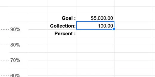
Open the Google Sheet working document. The top of the spreadsheet has a title or the goal for the fundraiser. There is a box with information about the fundraiser on the left. The fundraiser goal for this example is $5,000.
The chart will use percentages to represent our progress. The percentage is based on the total collected and the goal. Place $100.00 in the collection cell.
Click the currency button to convert the collection into dollars—use the currency for your part of the world.

Select the cell to the right of the percent label; enter the formula below.
=K10/K9
This formula divides the collected amount by the goal amount; it calculates the percentage. Leave the calculated percent as a decimal; we will format the percentage later.

Some of the cells in the template are merged to provide formatting. Select the merged cells G27-28. They are at the bottom of the chart.
These grouped cells will display the current percentage as it relates to the colored section of the thermometer.

Type the expression below into the merged cells.
=IF(K11\<=0.1,K11,””)
The expression uses the IF function. The function evaluates if something is True. The function needs three parameters. Each parameter is separated by a comma. The first parameter evaluates if something is True. The second parameter applies a value to the cell if the evaluation is True. The third parameter applies a value if the evaluation is False. The function reads like this—If…Then…Else.
This is what it evaluates; if the value in cell K11 is less than or equal to 0.1, 10-percent, it will display the contents of cell K11. If the value is not greater than or equal to 0.1, it will display nothing; designated by the empty quotes.

Press the Return key. The decimal value appears in the cell.

Go to the button bar; click the Percent format button.

Click the decrease decimal place value twice to eliminate the decimals.

The amount collected stands at 2-percent.

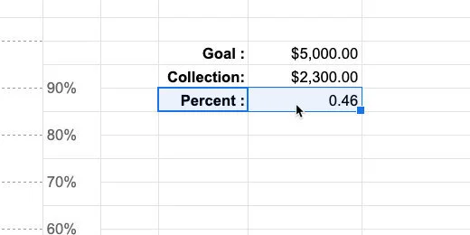
Go to the collection cell; enter $600.00. The percentage collected is now 0.12.

The percentage disappears in the cell. This is what we want to happen. We don’t need to display the percentage for this part of the chart once the value is greater than 10-percent.

Select the cells above—G25-26. Enter the expression below.
=IF(AND($K$11\>0.1,$K$11\<=.2),$K$11,””)
This expression includes the AND function. The function evaluates two expressions to determine if they are both True. Each expression is separated by a comma.
The cell references include dollar symbols before the letter and number. The dollar symbols are used to lock the cell reference. This is called an absolute cell reference. It is a good idea to lock the cell reference if we plan to copy a formula or expression. We will copy this expression to the cells above later.
This is how the expression reads. If the value in cell K11 is greater than 0.1 AND less-than-or-equal-to .2; apply the value in cell K11; else leave the cell blank.

We have now collected 12-percent. Click the decrease decimal button twice to remove the place values.

We are going to use this expression up to the 90-percent indicator. This will save lots of typing and possible errors. Make sure the cell is selected. Copy the cell contents. Go to the grouped cells above and paste.

Double-click the cell to enter edit mode.

Change the value 0.1 to 0.2; change the value 0.2 to 0.3. Press the Return key. Update the amount collected to $1,200.00. We have now collected 24-percent.

Copy and paste the expression in this cell onto the cell above. Change the value 0.2 to 0.3; change the value 0.3 to 0.4.

Change the collected value to $1,600.00.

Repeat this process for the rest of the cells up to 90-percent.

The final chart indicator has a slight modification to the expression. Enter the expression below.
=IF(K11\>0.9,K11,””)
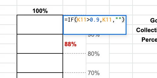
Change the amount collected to $4,600.00. Reduce the decimal place values.

Color indicators
Return to the bottom of the chart. Select cells F27-28.

Go to the menu and click Format. Choose Conditional formatting from the list of options.

The conditional formatting panel shows the selected cells that will be formatted.

Cells are formatted with background colors or type styles based on rules. The default rule applies the default style—green. The selected cell is empty so no color is applied.

We want the first grouped cells to change color if the amount collected is greater than zero percent.
Click the formatting rules selector; select the Greater than rule.

We need to provide a value for the rule to use for comparison; enter the number zero.

Nothing is happening. This is because the formatting rule looks for the value to be in the selected cells. The cells in the chart are not going to have a percentage. The percentage is in cell K11. It is also in the adjacent cell we formatted earlier.
We need to refer to the value in cell K11 for the formatting to work. We need to use a separate rule.
Click the rule selector and choose Custom formula.

Erase the zero and enter the expression below.
=K11\>0

The cell's background color is formatted with the default green.

Click the cell background color selector.

Select dark red 1 or any color you want.

Click the Done button.

Select the cells above the formatted cells.

Go to the conditional format rules panel; click the Add another rule button.
Select the Custom formula rule. Enter the expression shown below into the formula box.
=K11\>0.1

Change the cell background color to dark red 1; click the Done button.

The first and second groups cells are now formatted.

Select the grouped cells above. Add another formatting rule. Choose the custom formula rule. Enter =K11\>0.2 in the formula box. Change the background color and click Done. Repeat this process for the remainder of the cells.

Close the conditional formatting rule panel.

Change the amount collected to different values to see how the chart updates.

We don’t need to show the percentage value below the amount collected cell. That is already shown on the chart. Select the percent label and the value.
Click the Text color button and choose white.

The percentage is still there—because we need it—but not visible.

Final touches
We need one more item to make the thermometer chart complete. The chart needs to resemble a thermometer.
Go to the menu and click Insert; select Drawing.

Click the shapes selector and select the Chord tool.

Click once in the center of the canvas.

The chord has yellow handles to change the width and angle of the chord. Click and drag the top handle to the left. Release the handle when it is opposite from the top left resize handle.

Move the right chord handle so it is opposite the left chord handle. The chord should be horizontal.
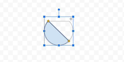
Select dark red 1 from the color fill tool.

Click the Save and Close button.

The drawing is placed somewhere in the spreadsheet.

Move the shape to the bottom of the chart.

Use the resize handles to reshape the drawing. Reshape it until it resembles the bottom of a thermometer.

Publish the chart
Click View and select the Gridlines option. This hides the sheet gridlines.

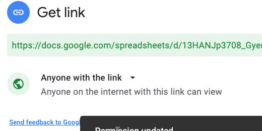
Click the Share button.

Click the link that reads Change to anyone with the link.

Make sure the link is available to anyone on the Internet. Click the copy link button.
Open a new browser tab; paste the link into the tab. Don’t press the Return key yet.

Edit the end of the link. Find the word edit at the end of the link.

Replace the word edit and everything after it with the word preview. Press the Return key to load the sheet.

Use this link to share with anyone interested in your fundraising efforts.

The drawing has a box around it. This appears to be an issue with published drawings in Google Sheets.
Return to the tab with the working Sheet; update the collection amount.

Return to the published sheet to view the updated chart.
Box Plot Charts with Google Drawings
In this lesson, we are creating a Box plot chart. Google Sheets does not have a tool to create a Box plot chart, so we will create our box plot using Google Drawings. We will begin with Google Sheets to collect and organize the information.

In this lesson, we are creating a Box plot chart. Google Sheets does not have a tool to create a Box plot chart, so we will create our box plot using Google Drawings. We will begin with Google Sheets to collect and organize the information.
The chart for this lesson is based on data collected from a paper airplane lesson. Students had a flight distance contest. The distances are measured and rounded to the nearest foot. The worksheet with the data is available in the link below. There is also a link to the finished product.
Box plot final document preview
Box plot chart working document
Box plot Drawing working document
Box plots
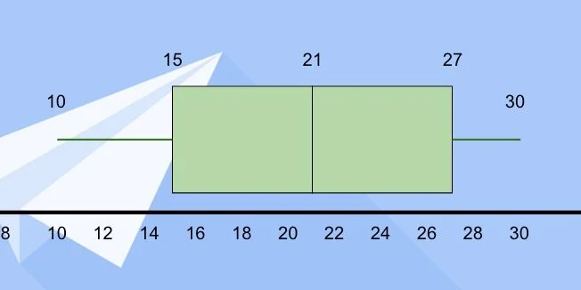
Box plots are used in statistics to visualize data. They show the lowest and highest data points. They show us the median value for all the collected data. It also shows us the median for the values that are below and above the median. These points are called quartiles.
The data is spread into four groups. Each quartile contains 25-percent of the total data. Representing the data with a box plot helps answer several questions about the data. We will explore questions and answers at the end of the lesson.
The Google Sheet contains the data from an airplane contest; 30 students participated; the measurements are in feet. These measurements are an average of three trial runs for each team. Each measurement is rounded to the nearest foot.

We need to pull some information from the data to create the box plot. First, we need the low and high values in the range. We also need the first and third quartile values. I provided a small table to organize the information.
Enter the number 10 under the title for Low and 30 under the title for High.

Let's begin with the second median for all the data. There are 30 measurements. Count 15 measurements down. At the 15th measurement, we have 21-feet. We also have 21-feet on the 16th measurement. Both values represent the median. We average the values and get a median of 21-feet. Enter 21 for the second quartile. I'll refer to this as the second quartile to avoid confusion.
*If the values had been 15 and 21 we would add them together and divide by two. This would have given a median of 18.*

The first quartile is the median value for the measurements between the lowest value and the overall median. There are fifteen measurements from the lowest number to the median. Count eight measurements from the beginning. The median value is 15. This measurement falls right in the middle so we don’t need to average.

Enter 15 for the first quartile.

The third quartile is the median value between the second quartile and the highest measurement. Count eight measurements from the second quartile. The median value is 27.

Enter 27 for the third quartile. We have the values needed to create the box plot.

The Drawing document from my template includes a solid line across the center of the canvas.

The drawing template also includes the values from the table and an image.

Click the text box button.

Click once above the black line.
Stretch the left side of the box to the edge of the canvas.

Repeat the process for the right side of the text box.

The text box is for the number range. Double-click inside the text box; type the number 0; press the Tab key and type the number 2. We use the tab key to space the numbers across the text box.

Repeat the process to enter even numbers from 0 to 30.

Click the justification button; center the text.

Move the text box below the black line. Use the alignment guides to center the box along the black line. Make sure the top of the text box is lined up along the black line.

Click the shape selector and choose the rectangle tool.

Click once above the number line.

Move the box over the number line. Place the left edge of the box halfway between 14 and 16. This is the location of the first quartile.

Stretch the right side of the box halfway between 20 and 22. This is the location of the second quartile.

Go back to the shapes selector. Choose the rectangle shape again. Place the shape above the canvas like the previous shape. Move the square to the right of the rectangle. Align the left edge of the square with the right edge of the first rectangle.

Stretch the right side of the shape so it lines up with the value for the third quartile—27.

Go to the line selector; select the line tool.

Position the line tool to the left side of the first rectangle. Purple dots appear along the edges of the rectangle. These are connectors for lines.

Click on the left dot; move the left side of the line above the number 10. Hold the Shift key to maintain a straight line.

Repeat the process for the right side of the second shape. Extend the line to the number 30. These lines are called the Whiskers. This chart is sometimes referred to as the Box and Whisker plot.

Click the text box tool. Place a text box on the canvas. Enter the number 15. Resize the text box; place it over the left edge of the first rectangle.

Place a text box with the number 21 between the boxes where they meet.

Repeat the process for the third quartile.

Use text boxes to mark the lowest and highest values at the end of the whiskers.

Click on the table—make sure the border appears around the table—press the delete key.

Insert a text box for the chart title. Set the font size to 38 points. Center the text box at the top of the canvas.

Move the image onto the canvas. Align it to the top-right edge.

Stretch the image so it covers the canvas.

The image is wider than the canvas. We need to crop the image. Click the crop tool.
Drag the crop edge toward the black line. Stop when the alignment guides appear to mark the edge of the canvas. Press the Escape key to release the crop tool.

Adjust the color of the boxes to help them stand out against the image background. I changed mine to light green.
One more thing before we are done. Select the left Whisker.

Use the line endpoint selector; select the round endpoint.

Repeat the process for the right Whisker.

Box plot interpretation
This box plot represents a normal distribution; like the normal distribution curve. The low and high values are distributed evenly from the center.
Other box plots include those where the median is closer to one end of the quartiles. When the second quartile is close to the first quartile it is called a box plot with a positive skew. Most of the values are on the right side.

Box plots with the median close to the third quartile have a negative skew. Most of the values are to the left of the second quartile.

Here are some basic questions we can ask about the box plot.
1. What percent of the planes landed beyond 21 feet?
2. All of the planes landed within 30 feet. (T/F)
3. 50 percent of the planes landed less than 21 feet from the start. (T/F)
4. What is the Inter Quartile Range?
5. Any plane landing beyond 30 feet is an outlier. (T/F)
Histogram charts with Google Sheets
Create histograms with Google Sheets. Histograms are used in statistics. They are used to show the frequency of a set of continuous data. Numerical data can be discrete or continuous. Discrete data is counted. Continuous data is measured. Examples of discrete data include the number of students in a class or the number of faces on a die. Continuous data can take any value. Examples of continuous data include a person’s height or weight.

Introduction
Histograms are used in statistics. They are used to show the frequency of a set of continuous data. Numerical data can be discrete or continuous. Discrete data is counted. Continuous data is measured. Examples of discrete data include the number of students in a class or the number of faces on a die. Continuous data can take any value. Examples of continuous data include a person’s height or weight.
The data used in the lesson is from a paper airplane contest. I love paper airplane contents; they involve all sorts of learning opportunities. The contest has one variable—a basic airplane design. The goal is to fly the farthest distance from a starting line.
The distances in this scenario are rounded to the nearest foot. Any plane landing 6-inches or above the nearest foot is rounded up. For example, a plane landing at 10-feet 7-inches is rounded to 11 feet. A plane landing 10-feet 5-inches is rounded to 10 feet.
Resources
Use the links below to get a copy of the working document and previews of the final product.
Airplane contest histogram preview
Airplane contest working document
Pre-requisite
To understand the concepts in the rest of this lesson, we need to understand how to prepare the data for a histogram. The sheet in the working document has a list of students and their attempts. The measurements are not in any order.

The data has a range. The range is the difference between the smallest and largest measurement. The smallest distance is 10-feet; the largest is 30-feet. We subtract these distances to get a range of 20-feet. This information is used to determine the range for each bar in the histogram. The range is the number of measurements held in each bin.
The bars in a histogram are called bins or buckets. The terms are descriptive of what they do. They are bins or buckets that hold content.
We are creating a histogram with five buckets. Five buckets tend to be the typical histogram format. It works well for our information because there isn't much of it.
Take the range and divide it by the number of buckets we want—(30-10)/5. This results in a range width for each bucket of 5. We want five buckets and it so happens that the range of each bucket is also 5.
This is how we construct the bucket ranges and frequencies. We begin with the smallest value; that value is 10. *We don’t want our buckets to begin with the value they are recording; you will see why this is important later.* To make sure this doesn’t happen we subtract .5 from the smallest value and add .5 to the largest value.
Bucket table
We make a table with a range of information. Look at the image below. The smallest value is 10 and we subtract .5 to get 9.5 for the starting value. We calculated each bucket range to be 5; we add 5 to 9.5 and get 14.5. The next range begins at 14.5 and we add 5. The next range is from 14.5 to 19.5.
We repeat this process until we have five buckets.

The information that goes into these buckets is the frequencies or the number of times a value falls within each bucket. In other words; how many times does a distance fall within the values of one of these ranges.
The table below shows that 7 distances fall between 9.5 and 14.5. Five distances fall between 14.5 and 19.5. We continue counting until all the distances are accounted for in each bin.

The histogram we will create needs to represent the information shown in the table.
Google Sheet histogram
We need the raw values for each distance. Histograms are created with one column of data.

Select the values; you can include the names. The names won’t part of the histogram chart.

Click the insert chart button.

Google thinks I want to create a line chart.

Click the chart selector; scroll to the bottom of the options; select the histogram chart.

The histogram looks very good. It creates a good basic chart. The titles come from the titles above the chart data. We will adjust these later.

The Chart editor panel opens on the right. The panel has several sections. Click the Histogram section. The histogram options are basic. The number of buckets is selected for us. The chart shows the data is divided into five buckets or bins. Place a checkmark on the Show item dividers. This helps count the items in each bin. This will help us throughout the lesson.

The bucket selector has options for 1, 2, 5, 10, 25, and 50. These are the common bucket options.

Open the Horizontal axis section. The minimum and maximum values are set from the data. The range of values falls onto the data points. This is not standard. This results in errors like the one in this chart. Let's take a look.
We have buckets with values from 10 to 15, 15 to 20, 20 to 25, 25 to 30, and 30 to 35. The bucket for the range of 30 to 35 shows two values. These are the values from the two 30-foot measurements. Our data doesn't have any values above 30. This is misleading information. The issue with ranges will pop up again later.
Let’s update the range.

Update the minimum and maximum values. Use 10 for the minimum value and 30 for the max.

The chart updates the bucket values. We still have the five buckets. The distribution of data has changed. The counts for each bucket are 7, 4,6,4, and 7. These don't match the ones from the table we created in the Sheet.

The bucket ranges are still misleading. Let's take a look at the count for the bucket that ranges from 22 to 26. The data shows the count of 4 is, that's correct, however, look a the count for the fifth bucket. It shows a count of 7, but 9 values technically meet this criterion.
This is the problem; we don’t know where to place the count for the 26-foot measurement. Does it fall under the fourth or fifth bin? This is why bin ranges should not fall onto values.
It is customary to set the minimum value to a percentage of the lowest and highest number; this is typically .5.
Use 9.5 for the min value and 30.5 for the max.

The ranges in the chart change and so do the counts in the bins. The counts are 7, 4, 8, 2, and 9. The lower and upper ranges are set to the values we placed. The range for each bin is adjusted for us. The counts are set to 4.2; not the 5 we calculated. This causes problems with the counts again.

The count in each bin isn’t exactly correct here. The measurements are in whole numbers. A bin of 4.2 forces us to split the difference when counting the distances and placing them into each bin.
Go to the histogram section; use 5 for the bucket size.

The bucket ranges update. The bucket counts update: 7, 5, 9, 7, and 2.

Use the chart title section to change the main title. Set the title to Paper Airplane Flight Contest.

Select the Vertical axis title option. Set the title to Distance in feet. We don’t need to change the horizontal axis title.

This is an excellent example for students. It demonstrates that they need to understand the manual process. The histogram would have been created with errors if they did not understand what needed to be done and what it needed to look like ahead of time.
Custom 3D Bar charts with Google Drawings
Custom 3D charts with Google Drawings. Creating charts manually provides opportunities to teach and learn. It opens opportunities for students to experience another way to do the same thing. Developing a chart with Drawings provides opportunities for artistic expression. It gives students access to the behind the scenes stuff that’s usually hidden with modern applications.
The development of charts is an easy process with tools like Excel, Numbers, and Google Sheets. Excel and Numbers have excellent tools to develop colorful charts. Google Sheets has good tools to develop basic nice looking charts.
I think we can create some nice charts with Google Drawings and make them look nice. We need to put a lot of work into making something look nice but I believe the effort is worth it. Plenty of teachable moments.
Okay, why go through all the trouble?
I’m glad you asked.
Creating charts manually provides opportunities to teach and learn. It opens opportunities for students to experience another way to do the same thing. Developing a chart with Drawings provides opportunities for artistic expression. It gives students access to the behind the scenes stuff that’s usually hidden with modern applications.
This lesson arises from lessons I did with students.
The process took a couple of class periods; it was part of a much larger lesson. An unforeseen benefit arose from the process of creating charts manually. My students were better able to answer questions related to charts on those standardized tests. They were able to easily dissect the data presented in those charts. I credit this to their intimate experience in collecting data and creating charts manually.
Use the link below to see a preview of the finished product.
Paper airplane contest chart preview
Use the link below to get the template for our project. The template includes a table with the data. It also includes the font and a graphic used in the lesson.
Google Drawings working document
The project
The date for this project comes from a paper airplane contest. This is part of an overall lesson. In the lesson, we learn about the origins of flight and the principles of flight. One of the actives includes the construction of paper airplanes.
Students construct a paper plane. The design is based on several we found on the Internet. Students choose the design they want to use in the contest. All students agree to use the same design so the data is representative of the design. The first chart does not include variables like paper, paper size, and weight.
Students are separated into teams of two. Each team selects a name for their team. The name must come from one of the terms we learned about aviation. Some of the terms are shown on the table in the drawing template. Requiring these names prevents fights over strange unrelated names. The names make a nice connection to the academic vocabulary.
Each team gets three tries. The measurements are done with a member of the team and a member of an opposing team to make make sure there is no cheating. The three distance measurements are averaged by each team.
The averages are placed in a table. The distances are broken down into percentages. Each percentage is based on the longest average distance; the longest distance being 100-percent. The table forms the basis for the bar chart.
The template has two tables. One has all the teams and trials. The other contains the averages and percentages.

On the right side of the drawing is an image. This is an image of a typical paper airplane against a rose background. I will use this image for the chart background later.

Click once inside the average and percentage table. A border appears around the table. Move the cursor to one of the border sides. Look for the arrow to change to four opposing arrows. Move the table from the drawing canvas.

Place the table to the right of the drawing canvas. Place it under the paper airplane image.

Moved the other table to the other side of the canvas.

We are going to resize the canvas. This creates additional room for the bars we need in the bar chart. Click File and select Page Setup.

Select Widescreen 16:10 from the page selector; click the apply button.

Click the shapes button. Select the cube tool from the Shapes list.

Draw a thin rectangle on the canvas. This is technically a rectangular prism.

We have ten values; we need to make sure there is enough room for the bars to fit on the canvas. We also need to accommodate other elements in the chart. These elements include labels and titles.
There is a ruler that runs along the top of the canvas. The canvas is 10-inches wide.

We will leave 1-inch on either side for titles. This leaves 8-inches for the bars. We could divide the eight inches into equal spaces for the bar charts. This, however, would cause the bars to line up against each other. To have some breathing room between each bar the bars will be set to a width of .5 inches.
—Work the steps out with students.
Make sure the shape is still selected and click the Format options button.

Open the Size & Rotation section.

Change the width to 0.5 inches.

The height of the canvas is a little over 6-inches. Leaving an inch on top and bottom for labels leaves 4-inches. Change the height to 4-inches.

This bar represents the largest value; the longest average distance recorded. We need ten bars in total.
Click Edit and select Duplicate. A useful shortcut is the Ctrl+D or Cmd+D keys. This helps duplicate the bar quickly; we need eight more.

Leave the duplicate bar where it is and duplicate it.

Duplicate eight more. You will have nine duplicates of the original with a total of ten. You will have ten bars cascading down when it’s all done.
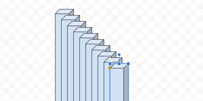
Draw a selection around the tops of all the bars.

Click Arrange in the menu and go to the align option. Select the align to top option.

The bars align with the top of the first bar.

Press the ESC key or click away from the selected bars. Click once on the first bar on the left.

Drag the bar to the left; hold the shift key to make sure the bar remains aligned with the others. Alignment guides follow the bar. Use the alignment guide and the ruler. Align the left guide to the number one on the ruler.

Select the last bar on the right. Drag it to the right; remember to hold the shift key. Align the right guide to the number nine on the ruler.

Draw a selection around all the bars.

Click Arrange in the menu; go to the Distribute option. Select the option to align the shapes horizontally.

The inner bars are evenly distributed between the first and last bar.

Keep all the shapes selected. Go back to the Arrange menu; select the Group option.

Click on the second bar. It should be selected on its own apart from the others. You can tell it is selected separately because the rotation handle appears above the shape.

This bar needs to represent 92.7 percent. This is the percentage of the average distance flown by the second-longest flight.

Open the Format options panel—if it isn’t open. Open the Size & Rotation section. Change the height scale to 93 percent. The scale option does not permit decimal percentage values. Round the percentages to the nearest whole number.

The bar size is adjusted from the bottom up. We will fix this once all the bars are sized.

Click on the next bar.

The next percentage value is 74.4. Round the percentage to 74 and enter it in the height percentage value.

Repeat the process with all the bars.

Press the ESC key to deselect any of the selected bars. Click once on any of the bars to selected the grouped bars.

We can’t arrange the bars while they are grouped.

Use the Arrange menu to ungroup the bars.

The bars remain selected. Use the Align option in the Arrange menu to align the bars to the bottom.

Return to the Arrange menu and group the bars.

The bars represent the percent values from largest to smallest.

Click the color fill tool. Go to the gradient section; choose light cornflower blue 2.

The gradient is applied to all the bars.

The default gradient is a good starting point. Let’s create our own. Return to the color palette and the gradient section. Click the custom option.

The gradient has a light blue on top and a darker shade at the bottom.

Gradients are made with color stops. The left color stop is light blue and the right is a darker blue. The light color stop is selected.

Click the color palette selector. Select light cornflower blue 1.

Click the right color stop.

Use the color palette to choose dark cornflower blue 2.

The gradient is a little darker. I chose blue; feel free to choose a gradient color pattern of your own. Click the OK button.

Click the border-color selector. Choose dark cornflower blue 3.

Values
We are going to use a text box to place the values for each bar. Click the text box tool.

Click once above the bar chart. Change the font size to 11 points. Type the value for the average distance of the longest flight.

Resize the text box and place it above the first bar.

Duplicate the text box; place it above the second bar. Change the value to 200.3. Repeat the process for each bar.

Click on the first text box; hold the shift key and click on the next. Repeat this process to select all the text boxes.

Click Arrange in the menu and select Group.

Axis lines
Charts have an axis that represents the X and Y values. The values for our chart are the team and distance. We need lines to identify these axis values and labels.
Click the Line tool selector; choose the polyline tool.

The polyline tool creates connected lines each time we click somewhere on the canvas. The tool is easy to use but tricky if you have never used it before. You have to remember to stop clicking otherwise you keep making lines.
Click once somewhere on the canvas. Hold the shift key and move the tool down to create a vertical line. Holding the shift key assures we create a straight vertical line. Click once to place the second point of the line.

Keep holding the shift key and move the tool to the right; make a horizontal line. Double-click to finish drawing the shape.
Press the ESC key on your keyboard after double-clicking. This deselects the tool so you don’t accidentally make another line.

We have our coordinate lines.

Move the shape to the lower left side of the bar chart.

Stretch the top part of the shape; place it just above the first number label.

Stretch the right side to the right of the last bar.

Leave space below the bars.

Chart title
Click Insert and select Word Art.

Type Paper Airplane Contest in the input box; press the Return key.

Move the title to the top of the canvas.

Change the font to Fugaz One and resize the word art box. Use the ruler to size the text box and match mine. The left edge of my word art box is at the 1.5-inch mark. The right edge is at the 8.5-inch mark.

Change the text fill color. Use dark cornflower blue 1.

Use white for the word art outline color.

Set the outline width to 3-pixels.

We need to move things around for the labels. The value labels are grouped separately from the bars. To select all the labels we need to pay close attention to the mouse pointer. The pointer will change to four opposing arrows when it is above the grouped labels.

Click once and that will select the grouped labels.

Move the value labels up and to the right. Use the alignment guide to push the grouped box against the bottom of the word art. Use the vertical center alignment guide to center the labels on the canvas. Press the ESC key to deselect the grouped labels.

Click once on one of the bars to select the grouped bars.

Using the mouse to move the grouped bars works fine for most situations. Moving the grouped bars hides the bars and makes it difficult to align them with the labels.

Instead of using the mouse, we are going to use the arrow keys. Press the up arrow key once or twice. Press the right arrow key once or twice. Use the combination of up, down, left, and right keys to position the bars under the values.

Click the axis lines shape; use the arrow keys to position it close to the bars.

Titles
We’ll add titles to the X and Y-axis. Click the text box tool and click anywhere on an empty area of the canvas. Type “Distance in inches”.

Resize the text box and center justify the text.

Drag the rotation handle on the text box to the left.

Hold the Shift key to force the text box to align vertically. Look for the angle measurement to read 270-degrees.

Move the text box to the left of the Y-axis line. Use the center alignment guide to position the title.

Click on the text box tool again; click on an empty area of the canvas. Type the first team name into the box. The team names are in the table we placed on the right side of the canvas. The table is editable. Copy and paste the text from the table for the labels.

Resize the text box. Don't make the width too small. It will need to accommodate the longer titles of team names. Align the text to the right. Change the font size to 11 points.

Rotate the text box to 300.0 degrees.

Move the text box and place it below the first bar.

The name just fits in the space at the bottom. We need more space for long team names. Click once on one of the bars.

Drag the bottom resize handle up. Use your best guess to determine how much additional space we need for the titles.

Click the X and Y-axis line. Move the bottom resize handle up and stop just before you meet the bottom of the bars.

Move the text box up to the x-axis line. Use the alignment guide to push the text box up against the x-axis.

Duplicate the text box. Move it to the next bar. Enter the name of the next team.

Repeat the process for the rest of the team names.

Make sure the first and last titles are aligned directly under their corresponding bar. Draw a selection around all the labels.

Go to the Arrange option on the menu. Use the distribute option to distribute the titles horizontally.

Return to the Arrange menu; use the align option to align the tops.

Return to the Arrange menu one more time and group the titles.

Use the up arrow key to nudge the text closer to the x-axis.

Resizing the bars will offset the value labels. Select the grouped labels. Look for the cursor to change to four opposing arrows before clicking.

Use the bottom resize handle to move the titles up.

The background
Move the background image onto the canvas. Resize the image so it fills the canvas.

The background offers a sharp contrast to the blue bars. This color is fine but I would like to see what other color options do to the design. Keep the image selected and click the Format options button. Open the Recolor section.

Use the recolor selector to choose a color overlay. Let’s see what purple looks like.

Wow! that is bright.

I think I’ll go for a light blue to match the bars.

Text shadow
Click on the main title. Use the format options panel. Add a drop shadow to the text art.

This is our finished custom bar chart.

Cylindrical bars
We aren't limited to 3-D rectangles. We can use cylinders. Select the bars group. Right-click to get the contextual menu. Use the Change shape option to access the shapes tools.

Select the cylinder shape.

We now have a bar chart that uses cylinder shapes.

Not all the shapes work well for bar charts. Here is one with arrows.

Space race infographic with Google Drawings
Infographics are a good way for students to summarize information. It allows them to represent what they have learned in alternate ways. Infographics are highly visual and fact-intensive.
Infographics are useful in many segments of media; people grasp information faster when it is visual.

Introduction
Infographics are a good way for students to summarize information. It allows them to represent what they have learned in alternate ways. Infographics are highly visual and fact-intensive.
Infographics are useful in many segments of media; people grasp information faster when it is visual.
“It (infographic) keeps people’s interest by lending storytelling and visual element to what can be sterile research.” – Caitlin McCabe.
Good infographics require students to collect relevant information and develop some compelling text. Students present information efficiently and concisely.
Research
Research has shown that visual clues help increase the memorability of information. —W.H. Levie and R. Lentz, “Effects of Text Illustrations: A Review of Research,” Educational Communications and Technology Journal 30 (4) (1982): 195-232
Facts and figures lend authority to the text.
We learn things better visually. 90% of the information transmitted to the brain is visual, and that is processed 60,000 times faster in the brain than text.
Studies confirm the power of visuals in learning
Much of the information above came from several resources. These resources are listed on the Visual Teaching Alliance web page. The link is available below.
http://visualteachingalliance.com/
The Lesson
The infographic for this lesson is based on an overall lesson. The lesson covers the history of the space race. This was the space race that ended with the first moon landing. It began during the Cold War and Sputnik. It ended with Neil Armstrong landing on the Moon.
Use the link below to see the final product.
Space Race infographic preview
Use the link below to get the starter template. The template includes the fonts used in the lesson.
Google Drawing starter template for space race project
You don’t need to use the template. The template contains the fonts used in the lesson. The fonts are embedded in the drawing. This, in turn, adds the fonts to your font repository. This saves you and students the trouble of having to go out and find the fonts used in the lesson.

Google Drawing setup
Infographics are not limited by physical size. Most infographics are usually wider than a typical paper document. They are also much longer. Infographics are meant to be part of social media outlets like Facebook, Twitter, and especially Pinterest.
The documents are larger because they need to accommodate images and text. They also need to be visually appealing. They are much like the posters we place in our classrooms. The link below to https://easel.ly provides a nice overview of the basic dimensions for infographics on various social media. The sizes represented on the page are the standard basic measurements. I use them as the minimum requirements.
https://www.easel.ly/blog/cheat-sheet-infographic-size-dimensions/
The Template
Use the link to get a copy of the template. Click File in the menu; select page setup.

Click the page setup selector and choose Custom.

Choose Pixels for the unit measurement.

The dimensions for this infographic are 900 by 1200 pixels. Enter these values in the fields. Click the Apply button.

Graphics and text
There are lots of options for infographic backgrounds. They range from a basic color to images. Our background will have an image.
Click the Insert image selector; Search the web.

Search for space background; use the search panel on the right.

Select one of the space backgrounds —choose one you like.

Click the Insert button at the bottom of the panel.

Use the Zoom tool to zoom out to 50%.

Grab the lower right resize handle. Stretch the image so it fills the Drawing canvas. Blue alignment guides appear to inform you when the image matches the height of the canvas.

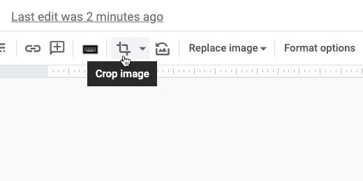
Click the Crop image tool.

Crop handles appear at the edges of the image.

Bring the right side crop handle in —toward the center of the image. A crop guide follows the resize handle. There is a Ruler at the top of the canvas. Match the guide to the edge of the ruler.

The right part of the image appears faded. This is the part of the image that will be cropped out.

Click once outside the image to exit crop mode. You can also press the ESC key on your keyboard.

Click Insert and select Word art.

Type “The Space Race” in the Word art box. Press Enter to render the word art.

Click the Zoom tool and select Fit.

Place the title toward the top of the drawing —center it.

Change the font. Use something futuristic, techno, or sci-fi. The template includes four fonts I found for you. The fonts are listed below. Use one of these or one of your own.
Expletus Sans
Nova Square
Baumans
Orbitron
Your font choice might cause the title to extend beyond the canvas. My choice of Orbitron caused the title to extend beyond the canvas. Use the resize handles to fit the title in the canvas.

Some fonts include other members of the font family. My choice of Orbitron includes type-face options from normal to Black. I chose Bold type-face.

Click the color fill button —choose white.

Word art includes a border option for the letters. Set the border color to transparent.

Keep the text selected and click the Format options button.

Place a checkmark on the Drop shadow option.

Click the disclosure chevron to reveal the drop shadow options. Move all the drop shadow sliders to the left.

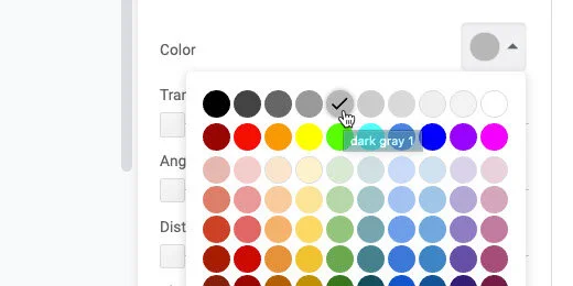
Click the color selector and choose Dark gray 1.
Move the distance slider to the right. Place the slider below the letter “a” in distance. A number pops up as you move the slider. Stop when the number is 6.

This gives our title some depth.

Click the Text box tool.

Click once below the title. Click the font color tool and select white.

Select the Orbitron font or the font you chose earlier, and increase the font size to 32 points.

Type the subtitle—A brief history—into the text box.

Click once on one of the text box borders.

Click the text alignment selector and chose the center-align option.

Move the text box up and toward the center of the main title. Use the vertical and horizontal alignment guides to position the subtitle.

Click the image option selector and search the web.

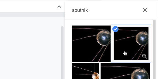
Search for Sputnik.

There are several images. Choose one of the first two that appears. Insert the image.
We used the crop tool earlier. The crop tool doubles as a mask tool. Click the triangle next to the crop symbol.

Choose the circle tool from the shapes option.

The shape is masked by an oval.

Click the format options button. Open the Size and Rotation options.

Set the width and height to 1.5 inches.

Position the image below the subtitle.

The image becomes distorted after resizing the mask. We need to update the image. Go to the button bar; click the Replace image selector.

Search the web for the Sputnik image. This search box is different from the one we used earlier. The search for Sputnik isn’t saved in this panel. Type Sputnik again.

Select the image and click the Replace button.

The image is off-center. Double click the image.

The image has two bounding boxes. The black box is for the circle mask. The blue is to resize the image. Don’t resize the image; drag it to the left.

Get as much of the Sputnik sphere into the mask as you can. Press the ESC key to exit mask mode.

Make sure the image is still selected.

Select white from the border color palette.

Click the border thickness tool; select 8-pixels.

That took a few steps. To save time, we will use this image as a template for the others.

Select the image; go to the menu and click File. Select the Duplicate option.

Place the duplicate image below the first.

Leave the second image selected. Replace the image with one from the Web. Use the Replace image option.

Search for Yuri Gagarin.

Select an image and click Replace.

Double click the image. Move the image so Yuri Gagarin’s face is in the center of the circle.

Duplicate the image two more times. Insert images of John Glenn and Neil Armstrong into each.

Reposition the images so Neil Armstrong is on top. Place John Glenn next; Yuri Gagarin and Sputnik are next. Move the images to the left side of the canvas.

Click once on the first image. Hold the Shift key and click on each of the other images.

Click Arrange and go to the Align option. There are several align options. The left-align option aligns the images with the leftmost image. The same is true for the right align option. The images align with the rightmost image. The center align option aligns all the images below the first image based on the center of the first image. Use the left-align option.

Click Arrange again and go to the Distribute option. Choose the vertical distribution option.
This spaces the images vertically. It uses the first and last images as anchors. The rest of the images are spaced evenly between these two images. Deselect the images.

Select the rounded rectangle tool from the Shapes menu.

Draw the rounded rectangle shape to the right of Neil Armstrong.

The shape has a yellow diamond in the upper left corner. Drag that diamond shape to the right —all the way. This rounds the corners so they match the circle in our image. The shape is now a pill shape.

We need to size the rounded rectangle so the height matches the height of the Neil Armstrong image. The image of Neil Armstrong is 1.5 inches. The border around the image is 8 pixels. Each pixel is equivalent to a fraction of an inch. That’s about .08 inches for the border. The border is all the way around. So there are .16 inches of the white border on opposite sides of the image.
The height of the rounded rectangle needs to be 1.66 inches—1.5 plus .16 inches.
Open the Format options panel. Set the height of the rounded rectangle to 1.66 inches.

Move the rounded rectangle over the image of Neil Armstrong. Use the alignment guides to center and align the shape.

The shape is covering the image. Shapes and images are placed on invisible layers. The layers can be repositioned.

Click Arrange; select Send backward from the Order menu.

The rounded rectangle is behind the image. Stretch the shape to the right. Align it with the letter —e— in the title Race.

Use the color fill option; set the color fill to dark cornflower blue 1.

Return to the color fill option and choose Custom.

Move the transparency slider to the left.

Color and colors with transparency values are represented by Hex values. The value for my adjustment is shown at the top of the custom color selector. Enter this value if you want the same transparency adjustment used in my example —3c78d8cf. Adjust the transparency and click the OK button.
Transparency applied to objects is referred to as the Alpha value.

Change the border color to white.

Change the border thickness —set it to 4 pixels.

Duplicate the shape and move it down. Align it with the shape above using the center alignment guide.

The shape will appear above the image of John Glenn. Use the Arrange menu option to send the shape backward.

The shape will still be over the image after sending it backward. There are lots of shapes and images in layers. Return to the Order option and send the image backward again.
Our shape isn’t on top anymore so options to bring the shape forward or to the front are available.
You’re going to need to do this one more time for this shape. I find it useful to use the shortcut keys to arrange images. On Chromebooks and Windows computers —use the Control key plus the down arrow. Control plus the up arrow moves images forward in the layers. Mac computers use the Command key and the up or down arrow.

Duplicate the shape two more times. Place the shapes behind the two remaining images.

Click the Text box icon.

Draw a text box over the pill shape. Place the text box next to the left side of the image —stop before it reaches the rounded edge of the pill shape. Cover as much of the shape as you can.

Use white for the font color.

Use any font and font size you prefer. I used the Nunito font with 16 points.

Duplicate the text box and place it over the other shapes. Fill out the boxes with relevant information.

Replace the background
After working on the infographic you might find it necessary to make some changes. The background I chose was too distracting so I replaced it with another. To replace, click on the background image and use the Replace image option.

Soften the background
I like backgrounds but some backgrounds can be distracting. I soften backgrounds with a transparent layer. Go to the shapes tool; select the rectangle tool.

Place a small rectangle shape outside the drawing canvas.

Move the shape onto the canvas. Stretch the shape so it fills the infographic.

Click the border color and choose the transparent option.

Select dark blue 3 from the fill color palette.

Return to the color fill palette and select the Custom option.

Move the transparency slider to the center; click the Ok button.

Send the image to the back using the Order option.

The shape drops behind the background image. We need to bring the shape up one layer. Use the Order option to bring the shape forward once.

This mutes the background image slightly and helps the text stand out.

Share your infographic with the world.
Publishing Google Charts with Google Slides
Google Slides is a good way to publish graphs that are constantly updating. This works well when gathering data through polls and surveys. This is the type of data we are representing in the charts for this lesson. The data in this lesson comes from something we did to increase attendance at the campus.

Introduction
This is the fourth lesson in the four-part series on publishing Google Charts. This lesson focuses on the publication of charts using Google Slides.
Google Slides is a good way to publish graphs that are constantly updating. This works well when gathering data through polls and surveys. This is the type of data we are representing in the charts for this lesson. The data in this lesson comes from something we did to increase attendance at the campus.
The administrator promised a pizza party —for the holiday— to classrooms with the highest attendance. Each class kept a record of their daily attendance. We created a Google Form to collect the attendance for each day.
Each class form was simple. Every teacher had a personal form. The goal was to keep it simple. The teacher entered the number present and submitted it. We took care of gathering and formatting the data in the background.
The contest was part of a lesson. Everything is a teachable moment. Students learned about gathering data, and basic statistics. We focused on the average attendance value. This worked out in an interesting way when students wanted to come to school even if they were sick.
We worked out how one student doesn't affect the average as much as five or more. They learned how important it was for one student to stay home sick instead of infecting other students and increasing the number of possible absences. It's amazing what kids will do for a pizza party.
Resources
Use the link below to see a preview of the final product.
I have gathered all the data and formatted the charts in Google Sheet. Use the link below to get a copy of the working documents.
Data and chart overview
The Google Sheets document has the data and charts formatted for our project. The spreadsheet has one sheet dedicated to each grade level. The last sheet contains all the form data for each teacher’s class.
Each sheet has a table. The table contains the average for each teacher’s attendance. These averages are used to generate the charts.

The columns in each chart are color-coded to identify each teacher's class.

The attendance data updates every day during the contest. We can't have access to live data for the lesson so I did the next best thing. The Kinder sheet has a Date filter. This filter represents the dates for the attendance contest. Select a date and the data for that day and the previous days are averaged. Select August 21st, 2020.

The charts on each sheet update with the selected date range.

Preparing the slides
Switch to the Google Slides template. The template has one slide. This slide is based on a slide master created for this project.

Go to the menu and click Insert. Go to the Chart option and select From Sheets.
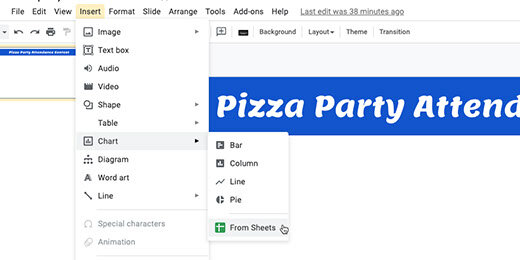
Find the Attendance Chart sheet. Click on the sheet icon and click the Select button.

Each chart in the sheet is detected and displayed. Click on the Kinder attendance chart.

Each chart is linked to the spreadsheet. This link updates the chart as the data in each sheet updates. We will see how this works later. Click the Import button.

Position the chart so it fills the slide. Don’t worry if the chart stretches.

Click the Insert slide selector.

The template has a master slide with the reformatted heading. Select this slide master.

Insert the next chart. Go to the menu and select Insert. Go to the chart option and select From Sheets. Select the attendance spreadsheet. Find the First-grade chart and insert it into the slide. Resize the chart to fit. Repeat this process with all the charts.

The data in my current chart for Kinder represents the first week’s attendance. This is true for all the other charts. This represents the selector choice I made a few steps ago.

Return to the Sheets tab. Use the date filter and select August 28, 2020.

The chart updates with the data from the dates.

Return to the Google Slides tab. The chart in the kinder chart has an update button; click the button.

The chart updates and matches the chart in the Sheet.

The chart on each slide needs to be updated. Go to the First-grade chart and click the update button.

Updating each chart on each slide is tedious. There is a faster way to update all the charts at once. Go to the menu and click Tools; select the Linked objects option.

A panel opens on the right. It lists objects with links to external sources. Each link has an update button.

We can click each update button but there is a faster way to update all the charts. There is a button at the bottom of the panel to update all the linked objects; click the button.

There is a way to automatically update all the charts. That requires the creation of a Google Script. That takes us beyond the objective of this lesson.
Publishing
Everything is ready for publication. Go to the menu and click File; select publish to the web.

The link configuration box has several auto-advance options. The default is three seconds. Use the selector to choose how long each slide will display before advancing to the next. I like to leave it at three-seconds unless there is a lot of information to present.
Select the option to start the slideshow as soon as the player loads. Select the option to restart the slideshow after the last slide. Click the Publish button.

Click the Ok button to confirm the publication.

A special publication link is created. Copy the link.

Create a new tab and paste the link. Press the Return key to view the published slide show. The presentation begins moving from slide to slide as soon as the page loads.

Adjust the timing
The three-second default might be too fast. To adjust the timing we need to return to the publication settings. Choose a different time interval.

The link updates with the new setting. Copy the link. Return to the tab with the slide. Replace the link with the updated version.

Another way to update the setting is to go directly to the link. The end of the link has a number. This number represents the number of seconds for each slide. The number represents milliseconds. 5000 or 5 milliseconds in my example. Set this value to any value you want. Here are some examples: 5500 is five-and-a-half seconds, 7000 is seven seconds, and 60000 is one minute.

Use this link to publish the live charts.
Stop publishing
It is a good idea to stop publishing live charts when they are no longer needed. Return to the Google Slides tab. Click the Published content & settings option. Click the Stop publishing button when you are done with the project.

Publishing Google Charts with Google Drawings
Welcome to the third lesson in a four-part lesson for publishing Google Charts. This lesson focuses on the publication of Google Charts with Google Drawings.
Google Drawings has features that make publishing charts easy. Google Drawings allows us to be creative. Charts are often part of infographics. We are using a basic infographic to publish the chart in this lesson.

Introduction
Welcome to the third lesson in a four-part lesson for publishing Google Charts. This lesson focuses on the publication of Google Charts with Google Drawings.
In a previous lesson, we learned how to publish charts on their own. We published a Google Sheet to simulate a dashboard. We used a Google Doc to publish the chart and include detailed information.
Google Drawings has features that make publishing charts easy. Google Drawings allows us to be creative. Charts are often part of infographics. We are using a basic infographic to publish the chart in this lesson.
Use the link below to see a preview of the final product.
Use the links below to get a copy of the Chart and Drawing working documents.
The Chart
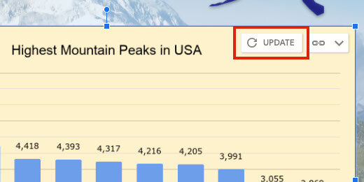
Take a look at the chart on the Google Sheet. The chart displays the top ten highest mountain peaks in the United States. The data for the chart comes from a Wikipedia article. The link to the articles is available in the Sheet. The data is in the Peaks sheet.
The Table uses a Query to filter for prominent peaks in the United States. The Google Sheet with the chart doesn’t need to be open. You can close it after reviewing the information.

The Drawing
The template has a background image of the Denali mountain. It has a title and text box with basic information about Denali. There is a place for the chart next to the text box.

Go to the menu and click Insert. Go to the Chart option and select From Sheets.

Look for the spreadsheet titled Highest Mountain Peaks. The preview shows the table and chart in the first sheet. Select the spreadsheet.

The import box displays the only chart in our spreadsheet.
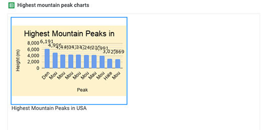
The chart is linked to the spreadsheet; this is important. Select the chart and click Import.

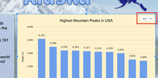
Resize the chart and place it next to the information box. The chart shows a link to the spreadsheet. We will come back to this later.
Click the Share button.

Click the option that reads Change to anyone with the link.

Click the Copy link button.

Open a new tab and paste the link into the address bar. The link ends with the word edit and some other information.

Replace edit and anything that comes after, with the word preview. Press the Return key to render the page.

Our drawing is nicely published for the world to view.

The data in the published drawing is live. Leave the tab open and return to the Drawing tab. Click the Done button to close the link box.

Click once on the chart. Click the Link button and select Open source.

The information in the table for the chart is from a Query. Click on the Heading titled Peak. Look at the query in the Formula bar.

Go into the Formula bar and change the Limit parameter from 10 to 5. The Limit parameter limits the number of results returned in the query. Press the Return key to update the query.

The table and chart update

Return to the Drawings tab. An update button appears next to the Link menu. Click the Update button.
Go to the published drawing tab. Refresh the page to show the changes.

Google Drawings is very useful for creating elaborate documents. An infographic is one document format that works well with charts and drawings.
The publish option
There is a publishing option for Drawings. This is similar to publish options in Sheets, Docs, and Slides. There is one important difference. The publish option does not provide a web version of the drawing. Let's take a look.
Click File and select Publish to the web.

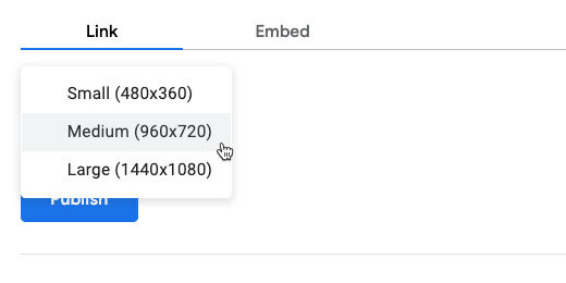
Publishing Google Drawings comes with an option to select the resolution of the published image. The medium resolution is recommended.
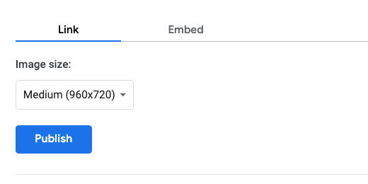
The other resolution options are small and large. Stick with medium and click the Publish button.
Confirm you want Google to publish the drawing.

A link is generated for the published document. Copy the link; create a new tab and paste the link.
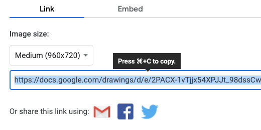
Press the Return key. You most likely won’t see the chart displayed on the page. The drawing is converted to a PNG image and downloaded to your computer.
This option doesn’t serve us here for what we want to do. It is useful for other purposes. It is a good way to distribute and share images. It is also a good way to embed images in other Google products.
Publishing Google Charts with Google Docs
Welcome to the second part of a four-part lesson on publishing Google Charts. This lesson focuses on the publication of charts using Google Docs.
In the previous lesson, we learned how to publish charts with Google Sheets. We published a Chart by itself. We also published charts and tables in a dashboard format.

Introduction
Welcome to the second part of a four-part lesson on publishing Google Charts. This lesson focuses on the publication of charts using Google Docs.
In the previous lesson, we learned how to publish charts with Google Sheets. We published a Chart by itself. We also published charts and tables in a dashboard format.
Publishing charts in Docs provides a variety of tools not available in Sheets; this is useful when we want students to include Charts in reports.
Use the link below to see a preview of the final document.
Use the links below to get a copy of the working document for this lesson.
The link below contains the Google Doc to be published.
The link below contains the Google Sheet with the chart to be published.
Google Sheets working document
The document has information about Denali and Mount Blackburn. I copied the information from Wikipedia. The links to the resources are available in the citations.
Insert the chart
Place the cursor above the heading for Mountain Peaks.

Go to the menu and click Insert. Go to the Chart option and select From Sheets.

Find the Highest mountain peak spreadsheet; click on it once. Click the Select button.

A chart selection box opens. We only have one chart. Click on the chart and then the Import button.

There are two ways of publishing this document. I prefer one over the other. I think you will see why one is better than the other. Click File in the menu and select Publish to the web.

Click the Publish button. Get the link and paste it into a new tab. The published document looks good; however, all our nice formatting is gone. Let's take a look at another option.

Leave the published document tab open. Return to the document and close the publication configuration box.
Click the Share button.

Click the option to change the link so anyone who has the link can view the document.

Click the copy link button.

Open a new tab and paste the link. Look for the word edit at the end of the shared link.

Replace edit and anything after with the word —preview. Press the Return key.
This published version retains all the formatting. I prefer this way of publishing the Google Document.

This version comes with drawbacks. A shared version is different from a published version. The link on a shared version can be modified to allow anyone to make a copy of the document. They can replace the word preview with the word —copy. This is how you have been getting the working documents for the lessons.
Update the chart
Updating the chart information is not automatic. Go to the spreadsheet. Click on the Heading for Peak. Go to the Formula bar and change the limit from 10 to 5.


Go to the working document. Not the one published with the preview link. Click once on the chart. There is an update button in the top right corner. Click the button to update the published chart.

Go to the published document tab. Refresh the document page.

Text in a Google Doc is different. The text in the document is automatically updated.
Publishing charts with Google Sheets
This is part of a four-part series on publishing Google Charts. Published charts are live. Any changes made to the working chart are reflected in the published chart. Updates are not automatic for all forms of published charts. Updates have to be manually pushed to the published version.

Introduction
This is part of a four-part series on publishing Google Charts. Published charts are live. Any changes made to the working chart are reflected in the published chart. Updates are not automatic for all forms of published charts. Updates have to be manually pushed to the published version.
Google Sheets is a useful tool for the development of a variety of charts. Once those charts are created it may be necessary to share them with others. There are a variety of reasons for sharing the information and a variety of ways to share it. I am going to focus on examples related to education.
The first example focuses on the publication of data for a geography assignment. Like all assignments, this assignment is connected to other subjects. It is part of an overall student product students.
The second example comes from something I was part of for one year. The administrator at the campus wanted to increase student attendance. She offered a pizza party for the class or classes with the highest attendance. The parties would be part of the traditional holiday parties for December.
Product preview
Use the links below to see a preview of the final products.
The highest mountain peaks in North America:
Holiday party attendance:
Working documents
Use the links below to get a copy of the working document. The document includes the charts. The charts are already formatted for publication.
Just the chart
The spreadsheet has a chart and table on the first sheet. The first sheet is titled USA. The second sheet is titled peaks. That sheet contains the raw data.

Click once on the chart. Look for the action menu.

Click the action menu and select Publish chart.

A publication configuration box opens.

Click the share option selector. Choose the chart itself. The chart is titled Highest Mountain Peaks in USA.

Leave the other option set at Interactive. Click the Publish button.

Google Drive prompts for confirmation. Click the OK button.

A special publication link is generated and selected. Copy the link.

Create a new tab and paste the link into the address bar. Press the Return key to load the published chart.
The chart appears on the far left side of the browser. Nothing but the formatted chart appears on the page. Use the link and share it with anyone who needs to see the chart. The chart does not need special permission. Anyone who has the link can see it.
Charts created within an organization have additional options to share with the world. Use those options to share the map with the world. Otherwise, the chart can only be viewed by members of the organization.

Roll the mouse over one of the columns in the chart. The name of the mountain and height appear. This is the extent of the interactivity.

Interactivity is nice; it isn’t needed in this chart. We can choose to publish the chart as a non-interactive image. Click in the address bar and move to the end of the link. The last word in the link is interactive.

Replace the word interactive with "image". Press the Return key.

The image appears at the center of the page. Roll your mouse over a column and nothing will happen. Change the link name back to interactive if you want to use the interactive version.

The chart data is live. The chart updates on its own when we update the information related to the chart. For example, the chart would update if we chose to chart only the top five highest peaks. All we do is update the chart on the sheet. The update on the published version takes care of itself. Let’s take a look at how this works. Leave the tab open and return to the spreadsheet tab.
Stop and Republish
The sheet still has the publication options dialogue open. Click the Published content & settings option.

This is where we stop publishing the chart. The chart will always be viewable by anyone with the link as long as the publish option is enabled.
There are other ways to stop the published chart. These are not the ideal way to stop publishing the chart but you need to be aware of them. Deleting the chart from the sheet will stop the publication. Deleting the spreadsheet or Sheet will also stop the publication. Anyone visiting the site with a missing chart link will see an error message.
The republish option is automatically enabled. I recommend unchecking the option before making changes. This gives you time to make sure the information is ready for publication.

Remove the check from the box and close the configuration box.

Go to the table and click the Peak heading.

Look at the Formula bar. The table is generated with a Query function. The function has a limit parameter. The limit is currently set to 10. Only the first 10 records are displayed.

Replace the 10 with 5 and press the Return key.

The chart on the sheet updates with the changes.

Click the chart action menu; select Publish chart.

Place a check back on the option to automatically republish changes. Close the configuration box.

Switch back to the published chart tab. The chart has been updated with the changes. Click the browser refresh button if the chart does not show the change.

Close the published chart tab. We don’t need it for the remaining lessons.
Dashboard option
Sharing charts as we did is easy but the view is kind of plain. There is another way to share the chart and other content on the sheet. This is often referred to as publishing a dashboard.
This is a dashboard of a kind. Real dashboards created with Google Data Studio have interactive components. They include selectors and ways to update the information in charts.
Go to the menu and click File; choose to Publish to the web.

This is the same configuration option we just used.

Click the selector and choose USA. This is the Sheet itself.

Click the Publish button. Confirm you want to publish the document.

Copy the publish link. This link is different from the chart link we created earlier.

Create a new tab and paste the link into the address bar. The sheet with the table and chart open on the page. The name of the spreadsheet and sheet appears in the information bar. The table is missing half the mountain peaks. We changed the Query limit in the previous lesson.

Updating the dashboard
Return to the spreadsheet tab. Close the configuration box. Click on the Peak heading; go to the formula bar. Change the Limit value from 5 to 10. Press the Return key to update the table and chart.

Go to the spreadsheet dashboard tab. Click the browser refresh button.

updated published version of chart
I like this method of publishing charts. It allows me to choose the position and background color of the chart. I can also include other elements like the table.
Attendance dashboard
In the attendance dashboard, I applied the same process. The dashboard has several charts with additional formatting. Use the link above to see the published version of this dashboard.
Google Sheets measures in time assignments
In this lesson, we are creating an assignment generator for time measurement. The assignment generator will generate assignments for students to calculate the number of minutes in a given number of seconds. It will also create assignments for students to calculate the number of hours given minutes and seconds.

Introduction
We teach a variety of measurement standards. These measurement standards include linear measurement units like feet, yards, centimeters, and meters. Time is also one of those measurement standards.
Measuring intervals of time is important in science. It is also important in coding. In this lesson, we will create a time assignment generator using Google Sheets. The generator will create assignments for students to solve for the number of minutes and seconds. The generator will also create assignments for calculating hours, minutes, and seconds.
Use the links below for a copy of the final product.
Calculating hours, minutes, and seconds preview
Calculating hours, minutes, and seconds copy
The template
I have formatted a sheet to get you started. Use the link below to get a copy of the starter template.
Time measurement generator template
We are using a function called RANDBETWEEN. This function selects a random number from a range of numbers we provide. The function needs the lowest and largest number in the range. The sheet I provided already has a lower and upper number in cells A3 and B3. The function will use these numbers.
The function retrieves the numbers from these cells to make it easier for us to update the range values at any time.
Go to cell C3 and type the function below.
=RANDBETWEEN($A$3,$B$3)

The cells are referenced using a dollar symbol before each letter and number. This converts the reference to an absolute cell reference. The function will look to the values in cells A3 and B3 only. This is important.
The function selects a number between 60 and 360. We are going to make a copy of this function to create 10 problems.
Click back on cell C3. Find the blue square in the lower right corner of the cell. This is the duplicate tool. Drag the blue square down to cell C12. Drag it down more cells if you want more assignment problems.

We have 10 problems with a random set of seconds.

Go to cell E3 and type the formula below.
=C3/60

The formula divides the value in cell C3 by 60. Not all the seconds in our problems are evenly divisible by 60. The formula in my example has 3 minutes and some seconds. The seconds are shown as decimal values.
To remove the seconds we need to round the division to the nearest whole number. Erase the formula and update it with the one below.
=ROUNDDOWN(C3/60,0)

We are using the ROUNDDOWN function to round the quotient to the nearest whole number. The function needs the number to round. This is provided by the division of the value in cell C3 by 60. It needs the place value for the rounding. The parameter of 0 is used to provide a whole number. We don’t need any decimals.
There are several rounding functions available in Google Sheets. I chose the ROUNDDOWN function because it will round down to the nearest whole number. Rounding up causes problems when the decimal value is .5 or above. This would give us too many inches in some instances.
Click back on cell E3. Drag the blue square down to row 12.
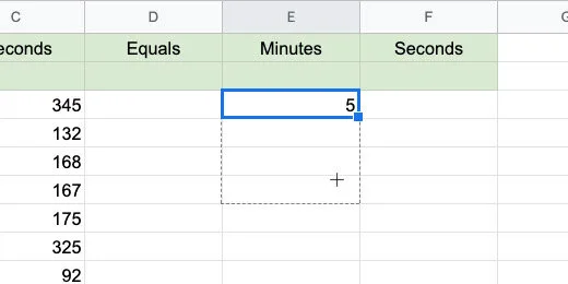
Go to cell F3. Type the function below.
=MOD(C3,60)
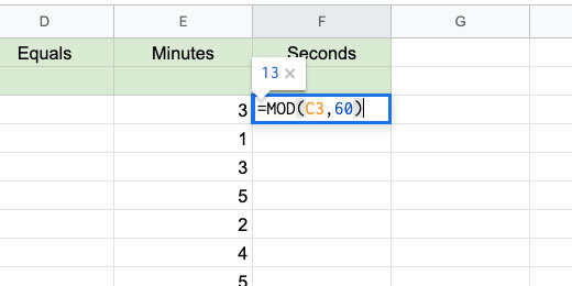
The Modulus function is used to pull out the remainder from a division. The function divides the contents in cell C3 by 60. Only the remainder is placed in the cell.
This came out perfect in my example. Look at the image below. We have 64 seconds which is 1 minute and 4 seconds.
Copy the formula down to row 12.

We have our first problems set. We need one more thing. We need an equal sign. We can't just type the equal sign. The equal sign is used to begin a function or formula in sheets.

Type the function below. Copy it down to row 12.
=CHAR(61)

The CHAR function is used to represent Unicode values. Every character used in a computer has a Unicode value. The Unicode value for the equal sign is 61.
I use the site below to reference basic math Unicode values.
http://xahlee.info/comp/unicode_math_operators.html
Go to this web site for a moment. Hover over one of the symbols to see the Unicode value for that symbol. The Unicode value is 61 for the equal sign. Return to the google sheet.

Change the upper value to generate more complicated assignments. I changed the value to 720.

Minutes to hours
Now that we have seconds to minutes, we will create assignments to convert minutes to hours. Go to the next sheet in the template.
In the template, I provided ranges for the minutes and seconds.
The values in cells E3 and F3 are not generated randomly yet. I placed these values here so we can see out how this works with something that makes sense.

We are working backward and beginning with something we know. Go to cell J3 and enter the function below.
=MOD(F3,60)

Remember, this function returns the remainder from the division of the value in cell F3 and 60 seconds. The value in cell F3 is 60 so the remainder is zero.

Go to cell I3 and enter the formula below.
=MOD(F3/60+E3,60)

In this cell, we need to do more than calculate the number of minutes. We need to add the number of minutes in cell E3 to add up the number of hours.
This is what the first part of the formula is doing. It is dividing the value in cell F3 by 60 seconds. The quotient of this division is added to the minutes in cell E3. This gives us the total number of minutes to calculate for hours. The sum of the hours is divided by 60 minutes.
We are using the MOD function to return the remainder of our division by 60. The MOD function is calculating the value from the division and the addition of seconds and minutes. It is then dividing that value by 60 and returning the remainder. The remainder is the number of minutes left over.
We have one minute leftover. This makes sense. The sum of 180 minutes and 60 seconds is 2 hours and 1 minute.

Go to cell H3 and enter the formula below.
=ROUNDDOWN((E3+I3)/60,0)

We are adding the number of minutes in cell E3 to the calculated minutes in cell I3. The sum is divided by 60 minutes. The calculation of E3 and I3 is in parenthesis. This instructs Google Sheets adds these numbers before dividing by 60. Google Sheets obeys the order of operations. Without the parenthesis, it would divide I3 by 60 before adding E3.
We are using the ROUNDDOWN function as we did with minutes in the previous part of the lesson. We don't want any decimal place values so the value is rounded to 0 or no decimal places.
The answer makes sense. The sum of 180 minutes plus 60 seconds is 3 hours and 1 minute.

Go to cell F3. Change the seconds from 60 to 61 seconds. The minutes are calculated and include a decimal value. This doesn’t work for us. We need to round the value to the nearest whole number.

Update cell I3 with the formula shown below.
=ROUNDDOWN(MOD(F3/60+E3,60),0)

We are embedding the MOD function inside the ROUNDDOWN function. The result of the MOD function is rounded down to the nearest whole number.

The answers make sense. Now we can generate random minutes and seconds. Go to cell E3 and enter the function below.
=RANDBETWEEN($A$3,$B$3)

Go to cell F3 and enter the function below.
=RANDBETWEEN($C$3,$D$3)

Duplicate the functions down each column. Use the blue square. Duplicate them down to row 12.

Google Docs assignment
We have our assignment generator. It’s a time to generate an assignment and publish it with Google Docs. I have a template for you to use. Use this template or create your own new Google Doc. Use the link below to get a copy.
The document includes a header with the title and instructions.

Keep the document open and return to the Google Sheet tab.
Select all the problems generated in the hours, minutes, and seconds sheet. Include the headers. Click Edit in the menu and select Copy.

Go to the Google document tab. Click Edit and select Paste. Select the option to paste unlinked.

Let’s make the problems presentable for students.

Select all the cells in the table.

Go to the menu and click Format. Go down to the Table option. Select Table properties.

Set the column width to 1.0

Set the table border to .5 points.

Set the table border color to a light gray.

Click the OK button to save the changes.
Don’t deselect the table yet. Go to the button bar and click the Center Text align button.

Change the font size to 12 points.

Student copy
This is your teacher's master.

Go to the menu and click File. Select Make a copy.

Update the document name. Set it to Hours Minutes and seconds student assignments. Click the OK button.
Select the answers for hours, minutes, and seconds. Press the Delete key to erase the values. Distribute this document to students.
Create math assignments with Google Sheets
This lesson covers the process for creating a Least Common Multiple(LCM) and Greatest Common Factor (GCF) assignment generator. The generator is created with Google Sheets. The content is sent to a Google Doc and distributed to students.

Generate math assignment for the Greatest Common Factor and Least Common Multiple.
Introduction
This is an assignment generator using Google Sheets. After learning multiplication and division. Before learning fractions. We cover the Greatest Common Factor and Least Common Multiple. These skills tie into multiplication and division. They are also the jumping-off point for fractions and reducing fractions.
When solving for the Greatest Common Factor we are looking for a number that divides evenly into two or more numbers. The Least Common Multiple is the smallest number this is evenly divisible by two or more numbers. For example, 16 is divisible by 4 and 8.
Below are links to the final product in a Google Doc.
Least common denominator assignment preview
Least common denominator assignment copy
The GCF generator
Go to Google Drive and create a new Google Sheet. Use GCF and LCM assignment generator for the document name.

Double click the sheet name. Change the name from sheet 1 to GCF.

We are using a function called RANDBETWEEN to generate the numbers for each problem set. We need to pass two values into the function. It needs a lower and upper number for the range. It chooses a number from within this range. The range we use can vary from assignment to assignment. This is especially true when differentiating assignments.
In programming, it is good practice to avoid hard coding variables into functions. When values are hardcoded we need to go into each function every time it is used and change the values. This gets tedious and is error-prone. We are setting up cells to act as the values that will be adjusted for all the instances of our RANDBETWEEN function.
Type these headings. Type Range Values in cell A1. Type Lower and Upper in cells A2 and B2. Type Number 1 and Number 2 in cells C2 and D2. Type GCF in cell E2.

Select cells A1 and B1. Go to the button bar and click the Merge cells button.

Highlight the cells A1 to E2. Go to the button bar and click the Center Align button.

Highlight cells A1 to B2. Click the cell background color selector in the button bar. Choose a light color. I chose a light blue.

Click on the C column heading.

Go to the button bar and click the Border selector. Choose the Left border. Don’t leave the selector yet.

Go to the Borderline thickness selector. Choose a thick border. Chose the third option.

Type 10 in cell A3 and 50 in cell B3. We will begin with these numbers for the range.

Go to cell C3 and type the function below.
=RANDBETWEEN($A$3,$B$3)
The function uses the values in cells A3 and B3 for the range. The dollar sign before each letter and number sets the cell reference to an absolute cell reference. This sets the function to use the values in these cells only.

Type the same function in cell D3.
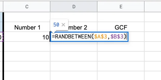
Go to cell E3 and type the function below.
=GCD(C3:D3)
The function uses the values in cells C3 and D3 to determine the GCF of both.

The generator selects two numbers. The numbers in my example are 49 and 21. The GCF for both numbers is 7.

Select the cells from C3 to E3.

There is a blue square in the lower right corner of cell E3. Click and drag this blue square down. Drag it down to row 12.

This copies the functions down 10 rows to give us ten problems. Drag the blue square down more rows if you want more problems.

The numbers are randomly selected for each problem. Some numbers have more GCF values of 1 than others. In the image below I have a nice distribution of numbers.

If you’re not happy with the numbers this is how to update the numbers. Click and drag the blue square on any GCF cell. You don’t have to update all the cells. One or two is enough to force the sheet to update. The sheet updates everything.

Go to the range parameters. Update them to increase or decrease the range of numbers.
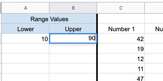
LCM generator
The Least Common Multiple Generator works on the same principle as the GCF. So, we have done most of the work for the LCM generator.
Click the actions triangle next to the sheet name.

Select the Duplicate option.
Double click the duplicate sheet name. Use LCM for the name.

Go to cell E2. Update the heading from GCF to LCM.

Double click on cell E3. Replace the GCD function with LCM. Press the Return key to update the function.
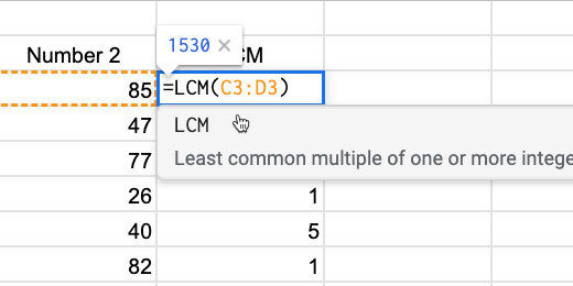
Go back to cell E3. Drag the blue square down to row 12 or the last row in your problems set. We only need to update the LCM column.

The LCM values are large. Reduce the LCM by reducing the range values.

I used a range of 1 to 10 for these LCM values.

We are done with the LCM generator.
Google doc assignment
Let’s put it all together into an assignment for students. Leave the sheets tab open. Go back to the Google Drive tab. Create a new Google Document. Use LCM assignment for the name.

Go to the menu and click Insert. Go to the Headers & footers section. Select Header.

Provide a title for the assignment. Include instructions. Press the Return key once to add some space after the instructions.
Return to the Google Sheet with the generator. Select the rows with numbers and solutions. Don’t include the headers. Copy the selection.

Return to the document. Click once on the body. Go to the menu and click Edit. Select Paste without formatting.

Select all the numbers on the page. Set the font size 14 points. Choose Double from the Line Spacing selector.

Click the numbered list selector. Choose the numbering style with parenthesis.

Move the First Line indent marker to 0.00.

Student copy
This is your teacher's master document.

We will highlight the answers. Select the first answer and change the color. I use the traditional red. Don’t deselect the number yet.

Double click the format paint tool.

Double click the next answer. The formatting tool remains loaded with the format tool. This is why we double-clicked the tool. Double click each of the answers. Click the format tool once to unload the formatting when you are done.

We need a copy of this document for student assignments. Click File in the menu and select Make a copy.

Set the name of the copy to LCM student assignment. Click the OK button.
Double click the first answer and press the delete key.

Repeat the process with each answer. Distribute this assignment to students.
Repeat the process with assignments for the greatest common factor. Generate numbers in the spreadsheet and create several assignments.
Halloween Infographic with Google Drawings
In this lesson, we are using Google Drawings to create a fun Halloween Infographic. You will learn how to import images into Drawings. You will learn how to layer images with transparency. You will learn how to create a working document for students with the necessary resources like images and fonts. Use the infographic for basic information on Halloween or use it for writing exercises. Writing exercises include poems, stories, and personal memories.

Introduction
Infographics are used in a wide range of topics. Infographics are a fun way for students to collect and present information. An infographic is filled with images and charts that provide an overview of a topic. Most infographics contain a minimum amount of text.
Infographics are designed to provide visual information. Visual information is processed faster than text. This is one reason infographics are so popular in media.
Creating them takes more work. This is one of the reasons I like this type of exercise.
Students need to be aware of their audience. They need to think about thinks like legibility and readability. They research the topic. They decide how they are going to present the information. Is it going to be formal, informal, or personal? They need to decide on the format. They outline the information and create mockups. Students need to highlight the main points of a topic. They need to learn how to convey the main idea with a few sentences.
The product
I like to create a working document for students. The working document contains some resources. These resources facilitate the speedy completion of the product. For example, students often spend too much time searching through fonts. The working document includes the fonts to be used in the project.
The first infographic projects are guided. On these projects, I include the graphics to be used. I do this to speed up the process and avoid distractions. Searching for images is fun but students wander off.
Use the link below to see a preview of the final product.
Use the link below to get a copy of the working document.
Get a copy of the working document
Drawing document
The working document has a few resources. On the left side of the canvas is the list of imported fonts. Google has a large repository of fonts available for Google documents. They are also available for use on your computer. The repository is found at https://fonts.google.com. The repository is also available within the Google Apps.
When you receive a Google document from any application —Google Docs, Sheets, Slides, or Drawings— it includes all the fonts used in the creation of that document.
The fonts for this lesson are in a text box where each line is formatted with a separate font. This attaches the fonts to the document and makes them available.
Below the font resources is a donut chart. The chart is one of the components I want students to include. The chart represents statistics on the number of people that wear a costume on Halloween. This information is available on ducksters.com —Halloween facts for kids.
https://www.ducksters.com/holidays/halloween.php

On the right side of the canvas are the graphics used in the product. They include a pumpkin scarecrow, scary pumpkin, and cute trick-or-treaters.

The background
I like to begin with a background. The background sets the tone of the project. It also sets the choice of colors. Click the Insert Image option in the button bar; select the Search web option.

Search for Halloween.
I chose the image with a haunted house and an orange moon in the background. Click on the image and click the Insert button. The button is at the bottom of the panel. You can also double click the image. That’s much easier.

Stretch the image so it fills the canvas. Don’t worry about deforming the image. Halloween images are scary and deformed.

Go to the shape selector tool. Select the rectangle shape tool.

Draw a rectangle anywhere over the image.
Use the background palette and set the color to dark orange 1.

Use the line color palette and choose the transparent option.

Go back to the color background tool; choose the custom option.

Move the transparency slider to the left. Not too much —about a fifth of the way.

The top of the custom toolbox has a Hex value for color and transparency. Enter this number if you want the same results I have. The Hex value is e69138c8. Click the OK button.
Move the box to the top left corner. Align the edges of the box to the edges of the canvas. Use the red alignment guides to help.
Stretch the box so it fills the image on the canvas.

The title
Go to the menu and click Insert. Choose the Word art option.

Type Halloween Facts in the Word art box. Press the Return key.

Keep the word art selected. Use the font menu to select one of the fonts provided with the document. Mine are all listed in the recent section. The fonts on your menu will be further down. I’m using the Creepster font.

Move the word art text box to the top center of the drawing canvas.

Use the background fill tool. Select a color for the title. I choose dark red 2.

The text has a thin black border that helps the red stand out. Click the line thickness tool and choose the 2-pixel option.
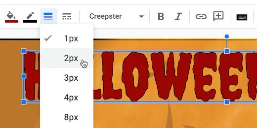
Click the Format options button.

Place a checkmark on Drop shadow. Close the format options panel.

Bullet points
The pumpkin images will serve as bullet points. The pumpkin images are available on the document but I want to show you how to search for and insert them. Click the Insert image selector. Choose Search the web.

Search for Halloween pumpkin clipart. The clipart option is important.

Click the preview image icon for the first pumpkin.

The clipart image appears in an overlay. The image is surrounded by tiny grey and white squares. These squares indicate that the background is transparent. That’s what we want. We don’t want to have to deal with some ugly background around the pumpkin.

Click the next button twice to get to the pumpkin image we need.
Click the Insert button.

Click the Format options button.
Open the Size & Rotation section. Place a checkmark on the Lock aspect ratio option.

Change the width to 1-inch. The height value changes to match the aspect ratio.

Place the pumpkin below the letter H for Halloween. Use the red alignment guides to position the image.

Go to the menu and click Edit. Select the Duplicate option.

Place the duplicate pumpkin below the first.

Repeat the process one more time and place the pumpkin below the second.

Hold the Shift key and click once on each pumpkin image. This selects all three images for the next step.
Use the border-color picker and set the border to transparent.

Go to the menu and click Arrange. Use the Align option and select Center. This aligns the images to the center.

Go back to the menu and select Arrange again. Go to the distribute option and select vertically.

Text boxes
Use the text box tool and place a text box next to the first pumpkin.

Click the Format options button. Go to the Size & Rotation section. Set the width to 6.3 and the height to 1 inch.

Click the background color tool; select the same orange we’ve been using.

Go back to the background color tool and choose Custom.
Move the transparency slider to the left. Move it so it’s just above the letter ‘o’ in OK. Click the OK button.

Place a checkmark on the drop shadow option. The option is in the Format options panel.

Go to the menu and click Edit; choose the duplicate option.
Use the vertical and horizontal options to align the duplicate with the previous text box.

Duplicate this text box and move it next to the last pumpkin image.

Remaining images
Get the donut chart and move it below the last text box.

When you let go of the chart it will look like it disappeared; it didn’t. Images are placed on invisible layers. The donut chart is in one of the first layers so it is below the background image. We need to bring the image to the top layer.

Click Arrange and move to the Order option; select bring to front.
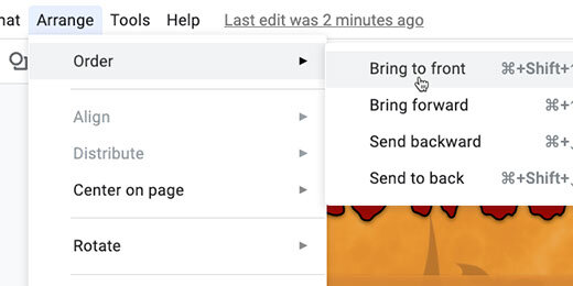
Bring the images I placed on the right side of the canvas and place them on either side of the donut chart. Use the Order tool to bring the images to the front. Resize the scarecrow image so it fits.
Select each image and add a drop shadow.

The infographic design is complete. Fill in the text boxes with three facts about Halloween.

Lesson ideas
Infographics are versatile. Instead of facts, we can use it for other Halloween topics. Here are some examples.
Halloween short stories. Students write three short Halloween stories.
Halloween memories: Students write three Halloween memories. They can also write one long memory —each box represents a paragraph.
Halloween family: Students write a short story about a member of their family during Halloween.
Halloween poems are another option.
Crossword puzzles with Google Sheets
In this lesson, we are creating a crossword puzzle assignment in Google Sheets. We will use scripts to help us fill in the vocabulary in a crossword-style format. We will use some conditional formatting to help students know where the words go in the crossword puzzle. We will use Notes to provide reference information and clues for the words.

Introduction
In previous lessons, we learned how to create Word Search and Word Jumble puzzles. The links to those lessons are available below.
Word search puzzles: https://digitalmaestro.org/articles/word-search-puzzles-with-google-docs
Word jumble puzzles: https://digitalmaestro.org/articles/word-jumbles-with-google-sheets-and-docs
My students enjoyed word searches and word jumbles. Crossword puzzles too. These are all fun activities that engage students with the vocabulary. I gave them these assignments for homework or as filler activities.
This lesson focuses on the creation of crossword puzzle exercises. We are using Google Sheets to create and distribute the crossword puzzle.
I will show you how to create a template so you can easily create more puzzles and distribute them quickly.
Use the link below to get a copy of the crossword puzzle template.
Template overview
I have done most of the work for you so we can focus on constructing the crossword puzzle.
The grid is where we construct the crossword puzzle.

The answers table is where students fill in the puzzle answers.

The clues table is for students that need help. The clues are optional. The clue words are here for reference while constructing the puzzle.

Code assistance
To construct the puzzle we need a formula with several parameters. The formula is available below. Let me explain what the formula does.
Three functions are part of the formula. I will begin with the inter most function and work outward.
The REGEXREPLACE function takes the word entered by students and adds a comma between each letter. This comma is used by the next function. The SPLIT function looks for the comma between each letter. It uses the comma to separate each letter and place it on a different cell.
The IFERROR function corrects a warning. The other functions report a warning when there is nothing to replace or split. The formula will have nothing to spit until students enter a word. The IFERROR function hides the error message.
The formula needs a word to split. The location of the word is referenced in a cell. The formula is looking in cell S4. It's right after the ampersand(&) in the formula. This cell reference is updated for each word.
I am NOT going to make you type this formula for each word in the puzzle. I have some helpful code to help with that process.
=iferror(SPLIT(REGEXREPLACE("" & S4,"(\w)", "$1,"), ","),"")
Helpful code
The template includes code to help construct the puzzle.
Go to the menu and click Tools. Select the Script editor option.

A tab opens to the right of the sheet. The tab contains code. I have developed this code to make the process easier. The code is not working now because it has been commented out. The two forward slashes(//) at the beginning of each line are comment characters. The slashes tell Google Apps Script not to run the code.
Comment code is used to provide information about code. The first lines of the code are comments from me about the code below.

We need to enable the code. Select the code from line 8 to line 25.
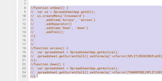
Go to the menu and click Edit. Select the Toggle comment option.

The code is uncommented. The code has words of different colors. This indicates that the editor recognizes the words as code.

Click the Save button.

We can’t run the code yet. We need to give the code permission to make changes to the spreadsheet.
Click the function selector. Choose the first function. This function loads a Crossword menu when the spreadsheet opens. I created this menu to make things easier.

Click the Run button.

An alert box opens. Click the Review permissions button.

You are prompted to select the Google account for the spreadsheet. Click on your account.
A message opens to warn us that the app isn’t verified. Verified apps are available through the Google Apps store. The script here isn’t verified through Google. This is why you are getting this message.
I go through the code in more detail at the bottom of the page.
I demonstrated the code and what it does. You can verify that it does what I outlined. As long as you are using the template from the link on my site. The code is not meant to cause any harm. The code is available at the bottom of this document. Please verify it before proceeding with the next step.
Click the Advanced link.

Click the link that reads "Go to puzzle(unsafe)".
An authorization page opens with information about the script access. The top portion identifies what the code might be able to do. The puzzle code will edit the contents of this spreadsheet only.
It will NOT edit, create, or delete any other spreadsheets on your Google Drive.
Click the Allow button.

The authorization page closes. You are returned to the Google Sheets crossword puzzle template. The Crossword menu option is added. It appears next to the Help menu option.

Click the Crossword menu. The menu has two options. They are Across and Down. Don’t select any of the menu options yet.

Type the word Saturn in the answers table. This will be number 1-across.

Click once on cell D4. It can be any cell you want. As long as there is enough room for the letters of the word to go across or down.

Go to the Crossword menu. Select the Across option.

Each function in the script needs to be verified before it is allowed to make changes to the current sheet once. You only need to verify each once. Click the continue button. Follow the same steps from earlier to authorize the script.

The script needed your authorization before it did anything on the sheet. The script doesn’t run the first time. It runs only after you provide authorization.
Go back to the Crossword menu and select Across.
The word Saturn appears in the grid. The letter S begins on the cell we selected. The rest of the letters appear to the right. One letter in each cell.

The code from the script appears in the Formula bar.

The cell reference in the formula is orange and points to cell S4. Cell S4 contains the word Saturn.
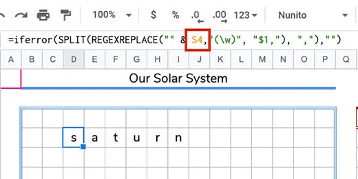
Type the word Venus in the table for 1 Down.
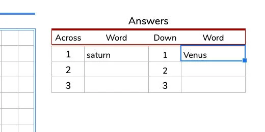
Go to cell E6. Click once a cell below the word Saturn. Go to the Crossword menu and select Down.

The first two are easy. I set them up to be easy. I set the cell reference for S4 and U4 by default. The rest aren’t much harder.
Type the word Jupiter going across for number 2.

Click on an empty cell in the grid. Make sure there is enough space for the word to fit within the grid going across.
Go to the Crossword menu and select Across. The word Saturn appears in the puzzle. The formula automatically points to cell S4.

Go to the Formula bar. Change the reference from S4 to S5. Press the Return key or click outside the Formula bar.

The word updates to match the word for 2 across.

One more together. Type Earth for 2 Down. Click on cell C5. Use the Crossword menu and select Down. Change the cell reference in the Formula bar. The cell reference is U5.

Adding more words is just this simple.
Review
Before we go on I would like to take a step back. I want to preview how the puzzle will eventually work. Erase the words in the Answers table.

The words in the puzzle grid are removed automatically.

Type the word Saturn in the Answer table for 1 Across. Press the Return key or click on another cell. The word Saturn appears in the puzzle grid.
Type Jupiter in 2 Across. Type the wordS for Down into the table. Those words appear in the puzzle too.
Fill out the puzzle with the rest of the words.
The Clues
Crossword puzzles need clues. They also need numbers. Click on the letter S for Saturn.
Go to the menu and click Insert.
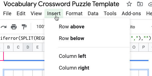
Select the Note option. The Note option has a Shortcut key option. The combination is Shift+F2. I recommend using this combination. It helps things go faster.

A note box opens next to the cell.

Type “1 Across: This planet has rings. It is the farthest planet that can be seen with the naked eye.”

Click on the cell for the letter E of Earth. Insert a note and type the information below.
2 Down: This is our home planet. The Big Blue marble.

Go to the letter V for Venus. Enter this information in a note.
1 Down: This is the second planet from the sun. It is the hottest planet in the solar system.
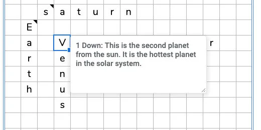
Use this note for Jupiter.
2 Across: This is the largest planet in the solar system. Come up with your own clues for the rest of the planets. I have my clues available below if you want to use them.
Preview so far
Erase the words in the table. Move your mouse over a cell with the black triangle.

Enter the word for each clue in the Answer Table.
Use the rest of the words. Place them in the answer box. I only formatted the first three rows. I didn’t want you to think the puzzle entries had to be uniform. There are more words across than down.
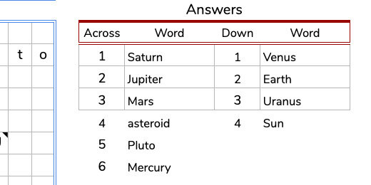
Select the numbers and words for across and down.
Click the Border format tool. Click the color picker and choose dark gray 1.

Click the all borders option.

Visuals
The puzzle by itself is plain. Regular crossword puzzles outline where the words go and how many letters are needed. That’s what we’ll do next.
Select the cells for the letters in the word Saturn.

Go to the menu and click Format. Select the Conditional formatting option.

The conditional formatting panel opens on the right. The formatting will be applied to the selected range. The formatting is applied if the cells are not empty. That is the condition that must be met. The selected cells are not empty. The cells for the word Saturn are green. That is the default cell fill condition.

The color format is set in the formatting style section.

Click the color background palette tool. Select the light green color. This is the color I prefer. Chose one that you want to use. Use light colors so the text is easy to read.
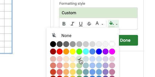
This isn’t the only range of cells we want to format. We want all the cells with words to change to green when students enter the answer. Click the range selection icon.

Click the Add another range button.

The range input box is ready for us to enter a range. We can enter the range manually or use the mouse to select the range. Using the mouse is much easier.

Select the cells in the word Earth.

The range information is added to the input field.
Click the Add another range button. Add another set of cells to the range. Repeat this process until all the words are selected. Click the OK button to finish selecting the ranges. The ranges are combined and listed in the range field.

The formatting is applied to the selected cells. This is a preview before we save the conditional formatting rule.

Click the Done button to save the conditional formatting rule.

We want to apply formatting to the cells for words that are empty. This shows where the words go, the orientation, and the number of spaces for the word.
There is another way to select the cells for conditional formatting. Begin by selecting one word.

The next step requires the use of a modifier key. Some people like to use modifier keys, others don't. Chrome and Windows users hold the Alt key down. Mac users hold the Command key down. Select the next range of cells while holding the modifier key.
I selected Saturn and Jupiter using the modifier key. Both sets of cells are selected. Keep holding the modifier key and select the other cells.
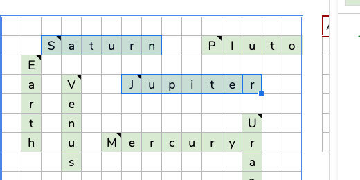
The selected cells appear in a darker shade of green. This is due to the combination of the blue selection color and the green cell color.

Go to the conditional formatting rules panel. Click the Add another rule button.

The selected cells are added to the range list. We need to change the condition for the rule.

Click the condition selector. Select the condition — for when the cell is empty.

Click the cell color palette tool. Choose a light yellow. Click the Done button.

We have two rules that apply to the same group of cells. One for when the cells are filled. One for when the cells are empty.

I like to include one more color condition option. Let’s look at an example. The answer for 2 down is Earth. What if a student answers Mars instead of Earth. A yellow cell points out that a letter is missing.

What if the student enters a longer word like Mercury. The letters extend outside the colored grid. The next conditional formatting will alert students to the mistake.
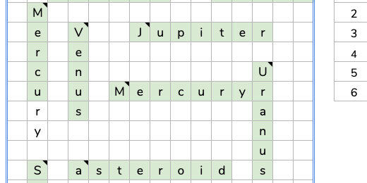
Select all the cells in the grid. Include the ones we already color-coded.

Add another rule. Set the conditional color to red. Leave the formatting rule set at “is not empty”. Click the Done button.
The letters in Mercury that extend beyond the cell range are highlighted with red.

Conditional formatting works in layers. The condition for green filled in cells is before the condition for red filled in cells. This is why the cells for the letters in the word are not red.
We are done with the conditional formatting panel. Go ahead and close it.
Student distribution
This is your teacher's master. We need a copy for the students. Click File in the menu and select Make a copy.

Use “Solar System Crossword Puzzle - Student” for the file name. Click the OK button.

Erase the answers in the answer table. Distribute the puzzle to students.
One more thing
I recommend adding instructions above the puzzle. A helpful reminder to students for where the answers are placed.

Puzzle script
The first five lines provide information about the code. The code uses functions to execute instructions. The first function is called onOpen. The instructions in the function attach the Crossword menu to the spreadsheet each time the spreadsheet opens. It also adds the Across and Down menu items.
Each menu item refers to the functions across and down. The first Across is the menu name. The across in lower case references the across function. The same is true for the down menu item.
The across function gets the current spreadsheet and the current cell. It sets the formula inside the cell. The formula is within the open and close parenthesis. The same instructions are used for the down function. The formula for the down function includes the transpose function. It changes the letters from going across to going down.
// The code below is used to enter the long formula into cells.// One formula is for words that go across.// The other formula is for words that go down.// The code creates a menu option.// The menu options include across and down.function onOpen() { var ui = SpreadsheetApp.getUi(); ui.createMenu('Crossword') .addItem('Across', 'across') .addSeparator() .addItem('Down', 'down') .addToUi();}function across() { var spreadsheet = SpreadsheetApp.getActive();spreadsheet.getCurrentCell().setFormula('=iferror(SPLIT(REGEXREPLACE("" & S4,"(\w)", "$1,"), ","),"")');};function down() { var spreadsheet = SpreadsheetApp.getActive(); spreadsheet.getCurrentCell().setFormula('=iferror(TRANSPOSE(SPLIT(REGEXREPLACE("" & U4,"(\w)", "$1,"), ",")),"")');}Elementary bar chart assignments with Google Sheets and Docs
In this lesson, we are creating an assignment generator for elementary age students. The generator uses emoji graphics to create a table of objects. Students use that table to create bar charts. Use the assignment generator to familiarize students with data and bar charts.

Introduction
Reading and interpreting information from graphs is an important skill. This skill is often required on standardized tests. Students have a better understanding of data when they learn to construct the graphs themselves. My students had an easier time interpreting information from graphs when they had first-hand experience creating their own.
This lesson is designed as an introduction to bar graphs. The assignments generated here are ideal for 2nd, 3rd, and 4th-grade students.
This assignment generator selects images and places them into a table. Students count the images and construct a bar chart. Students answer questions based on the graph they construct.
Use the links below to get a preview and copy of the final product.
We are using Google Sheets to generate the assignments. The assignments are copied to a Google Doc and distributed to students. Use the links below to get a copy of the Google Sheet starter template.
Google Sheet starter template copy
Use the link below to get a copy of the Google Doc assignment template.
Google Doc assignment template copy
Graphic data
We need something for students to count. Pictures of objects is a good place to begin. The spreadsheet template has two sheets. The first sheet is titled Graph. The second sheet is titled Lists. Go over to the Lists sheet.

The Lists sheet has titles for birds, mammals, and bugs. Below each title is a series of numbers. Next to each number is the name of an animal.
We are using something called Unicodes. If you have seen some of my other lessons you have probably used Unicodes in math assignment generators. Unicodes represent a variety of characters.
Some Unicode characters include emojis. Yes, emojis. Don't worry, they aren't all smilies and strange shapes. Many of them are useful for our purpose. The number, Unicode, next to the animal name is used to display the emoji.

Go to cell E2 and type the function below.
=CHAR(C2)
The CHAR function reads a Unicode value and interprets it into the symbol it represents. Instead of typing the number 129413, we refer to the number in cell C2. The image of an eagle is appearing in the preview. Press the Return key to complete and the function.

Click back onto cell E2. Look for a blue square in the lower right corner of the cell. Click and drag that square down to match the row with the word rooster.
The blue square copies or duplicates the contents of the original selected cell or cells.

These are the images generated by each Unicode value.

Generate previews of the mammals and bugs in the same way. Use CHAR(F2) for mammals and CHAR(I2) for bugs. Type CHAR(F2) in cell G2. Type CHAR(I2) in cell K2.

These lists are the basis for the bar chart tables. Google sheets will select the animals from the list and randomly arrange them on a table.
The process for doing this is a little awkward so I want to demo the basics before we create the final table.
Go to cell A2 and type the function below.
=indirect(“D2”)
This function gets the contents or reference from the selected cell. That cell is D2 in this example.
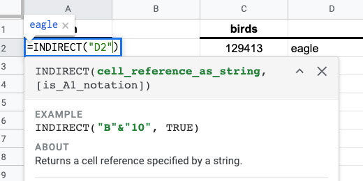
The content of the cell is the word eagle.

Double click on cell A2. Update the function with the information below.
=INDIRECT(“D2:D6”)

This time all the values from the range are placed into cell A2 and fill the cells down the column as needed.

We are using the range of values in each category to generate the table. Typing the range like this is inconvenient. I want to use something easier and more intuitive. We are going to use something called Named Ranges. This calls a range of values with a keyword.
Select the Unicode values for birds.

Go to the menu and click Data. Select the Named ranges option.

Use the panel on the right to provide a name for the selected range. Use birds for the name and click Done.

Go back to cell A2 and double click the cell. Update the function using the information below.
=INDIRECT(“birds”)

The Unicode for birds appears down the column.
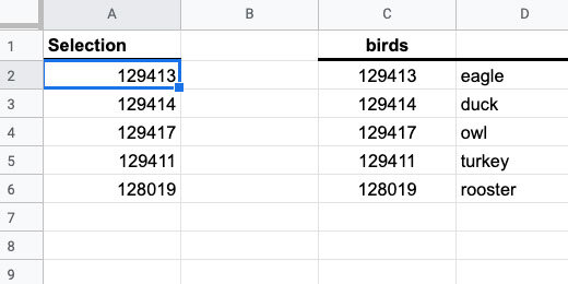
Select the Unicode values for mammals.

The Named Ranges panel is still open. Click the Add a range button.

Use mammals for the range name. The range names are the same as the headings. They need to be identical for this process to work. This is done on purpose. Make sure to use the exact name and spelling. Click the Done button.

Highlight the Unicode values for bugs and create a named range. Use bugs for the name.

Return to cell A2. Replace the range name with B1. Don’t place B1 within quotation marks this time.

Nothing appears in cell A2 because there is nothing in cell B1.

Type bugs in cell B1. Press the Return key. The Unicode values for bugs appear under the Selection heading. The Indirect function uses the range name bugs to populate the cells.

Change bugs to mammals.
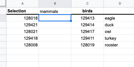
Any other name or value entered into cell B1 gives an error in cell A2. This is part of the reason the names in named ranges is important.

Erase any value you entered into cell B1.
Category selector
Switch to the Graph sheet.

Go to cell A2. Go to the menu and click Data. Choose Data validation.

Click the List range icon selector.

A select range dialogue box opens. Ignore this box for now.

Click the Lists sheet.

Select the cells from C1 to I1. The information in the data range field appears as Lists!C1:I1. Click the OK button.

Click the option to reject other input. Click the Save button.

Go back to the Graph sheet. Cell A2 has a drop-down selector.

The selector uses the headings we selected in the Lists sheet. The headings are the same names used in the Named ranges.

Select the column headers B and C. Hold the Shift key while clicking on each column header.

Click one of the Header action triangle.

Select the option to resize columns B-C.

Set the column size to 35. Click the OK button.

Go to the Lists sheet. Select cell A2. Update the function information with the information below.
=INDIRECT(‘Graph’!A2)
We are pointing the INDIRECT function to cell A2 in the Graph sheet. Indirect will look at the value in the cell and pull the values from the selected Named range.

You might get an Error message like my example. That’s OK.

Return to the Graph sheet and select one of the category options.

Return to the Lists sheet. The Unicode for the selected category is listed.

Return to the Graph sheet. Select cell D4. Enter the function below.
=CHAR(‘Lists’!A2)
This uses the value in the Lists sheet and cell A2. Press the Return key.
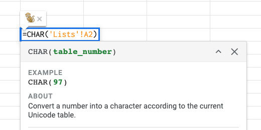
Use the category selector and choose a different category.

In my example, I chose bugs. A butterfly appears in the cell.
The first Unicode value appears in the cell for each category. We want a random image to appear each time. To get the random image we need to use a formula that is a little complex. Replace the function in cell D4 with the formula below.
=CHAR(INDEX(Lists!$A$2:$A$6,RANDBETWEEN(1,5)
The CHAR function has two embedded functions. The INDEX function returns the contents of a cell as a list. The cell is selected by the RANDBETWEEN function. It selects a cell between 1 and 5. The selected cells are numbered by the INDEX function. It chooses a cell between A2 and A6. A2 is the first cell, A3 the second, and A6 the 5th. These cells are in the Lists sheet.
Make sure you include the dollar symbols in the cell reference. This sets the cell reference to an absolute cell reference. This is important for the next steps.

Bugs is my chosen category. An ant appears in cell D4.
Choose a different category. A random image from that category is placed in cell D4.

Click on cell D4. Click and drag the blue square down five rows to row 8.

Keep the rows selected and drag the blue square to column H.
We have a table with 5 rows and 5 columns. Each cell in the table has a random image from the category. Choose a different category and the images will update.

Formatting the tables
The hard part is over. Now we begin the process of formatting the table for the assignment. We are going to change the row height to resize the emojis. Click the row header for row 4. Hold the Shift key and click the header for row 8.

Right-click one of the row headers. Select the option to Resize rows 4-8.

Set the row height to 45 pixels. Click the OK button.

Use the font size selector to set the font to 24 points. The images are characters represented by a Unicode. Unicode characters are formatted like letters and numbers.

Use the text-alignment selector to center the cell contents.

Use the vertical-alignment selector to align the contents in the middle of the cells.

The emojis are easier to see now.

Deselect the rows and select the cells with the emojis only.

Click the border formatting tool. Set the border color to a medium gray.

Choose the all-borders option.

Select the row-headers for rows 10 to 20. We are skipping row 9.

Right-click one of the row headers. Select the option to resize rows 10-20. Set the size to 35 pixels.

Select the cells from D10 to H21. The cells in row 21 will hold the titles for each bar in the chart.

Use the border configuration selector to set the same gray border around each cell. This table is used by students to create a bar-chart.
Use the cells in column C to number each row. Begin with row 20 and number 1. Number each row up until you reach 10 in row 11.

Select the cells with the numbers. Use the text-alignment option to center the text. Use the vertical-alignment option to set the alignment to the middle.
Select the cells from D10 to H10.
Click the merge cells button.

The bar chart generator and template is complete. We are ready to send this to a Google Doc for distribution to students.
More emojis
Before we do that, let's learn how to add more emoji characters. I used the quackit.com website to get the Unicode. I like this site because it includes a visual of each Unicode emoji. Use the link below to get to the animal emoji page.
The page has a table with columns for the emoji and a name for the emoji.

Other columns include the hexadecimal and decimal codes. Google Sheets uses the decimal code.

Only the numbers are used. The other characters are used with HTML code on web pages.

Use the Emoji characters menu to select different emoji categories.

There are hundreds of emoji characters and codes. I collected most of these characters for you on the sheet. Return to the Google Sheet. Click the All Sheet selector. Select the emojis sheet.

The sheet has 521 emoji characters and codes.

New categories
Let’s add another set of images. Select five characters and codes. Include the code, emoji, and name column. Copy the selection.

Go to the Lists sheet. Click on cell L2 and paste.

Type the word marine for the header. We are using one name header. This is necessary because Named ranges cannot have spaces in the name. I chose marine but you can choose amphibian.
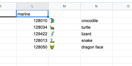
Select the codes in column L.
Go to the menu and select Data. Select the Named ranges option. Set the name of the range to marine. Click the Done button.
Important note. Range names cannot have spaces. This is why I chose one word for the range name and category. The category and range name have to be identical! I know that I am repeating but this is important.

Go to the Graph sheet. The marine category is not part of the selector. We need to add it.
Select cell A2.
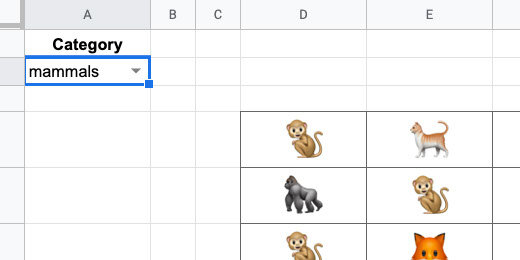
Go to the menu and click Data. Select the Data validation option. Click the sheet selector in the validation configuration box.

The selection for the category names begins on cell C1 and extends to cell I1. We need to extend the range to cell L1.
We don’t want to keep updating the range every time a new category is added. We want the name added automatically. To do this we instruct the range to begin on cell C1 and look at every cell to the right of it. Replace the letter I with Z. Z is the last column in the sheet. The updated range looks like the range shown below. Click the OK button.
Lists!C1:Z1

Leave all the other options the same. Click the Save button.
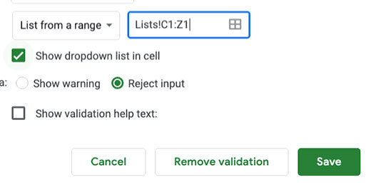
Click the category selector and choose marine.
Update emoji information
I see a dragon on my table. We can fix this with ease.

Return to the emoji sheet. Select a marine animal code. Copy the information.

Paste the information over the dragon information in the Lists sheet.

Return to the Graph sheet. The dragon is replaced by the whale emoji.

Make your lists
You don't have to go with the categories or lists as they are on the sheet. Create your own by copying and pasting different codes. I created a food category with a mix of food from different categories.

The category appears automatically in the category selector.

Now I have images for a food graph.

Replace categories
You don’t need to use the categories I created. Replace these categories with your own. In this example, I replaced the bugs category with fruit.

Update the range name before using the category. Go to the menu and select the Named ranges option. Click the pencil icon next to the old category. In this example, that is bugs.
Update the name and click the Done button.
Google docs assignment
I created a template for you to use with the generator. Use this or your own. I have placed the link below for your convenience.
The template includes header information. The header includes the assignment title and brief instructions. The template is set up to use the legal document page format. This provides more room for questions and student responses.

Return to the Google Sheets tab. Click view and select Gridlines. This hides the Gridlines on the sheet.

Select the images and bar chart tables. Make sure to include the column with the numbers. Copy the selection.

Return to the Google Docs tab. Paste the selection. Select Paste unlined when prompted.

We need some final adjustments.

Students use the top row for the chart title. You can include this before distribution.

Use the bottom cells for the item titles. You can include them but I prefer students to add this information themselves.

How it works
Students count the number of matching items. The table has 2 burgers. Students select cells 1 and 2 in the burgers column.

Click the cell background fill tool. Select a color. You may allow students to select their colors or you might want to designate the colors they need to use. Students like to choose their colors but they often spend too much time doing this step.

The cells are filled with the selected color.
Repeat the process for the other items.

Chart questions
It is a good idea to include questions related to the chart. This is what students will typically do when they see charts on standardized tests.

Student version
This chart is your teacher's master with the answer key. Make a copy for student distribution. Go to the menu and click File. Select the option to make a copy.

Rename the copy for students.

Select the bar chart cells. Set the background color. Use transparent or white. Distribute this copy for the assignment.
Fraction assignment generator for reducing fractions
In this lesson, we are creating a fraction assignment generator. This generator creates an assignment generator for reducing fractions. This assignment generator is an extension of the least common multiple and greatest common factor generator.

Reducing fractions
Reducing fractions is important. This is a natural progression from Least Common Multiples and Greatest Common Factors. This generator focuses on creating assignments for students to practice reducing fractions.
Use the links below to see a preview of the final product and get a copy.
Reducing fractions assignment preview
Reducing fractions assignment copy
I have a spreadsheet template to get us started. It is formatted with the headings and columns we need. Use the link below to get a copy.
Reducing fractions spreadsheet lesson template
The template
The left side of the generator has place holders for the numerator and denominator variables. We will call on these variable numbers using a function. There is a smaller table with a multiplier. This multiplier helps create the fractions that need to be reduced.
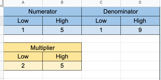
The right side of the template is where the generator is created.

Numerators and denominators
Open the Google Sheet and click on cell F2. Type the function below into the cell and press the Return key.
The RANDBETWEEN function selects a random number between a lower and an upper number. These numbers are usually entered directly into the function. Our function gets the values from the cell variables in A3 and B3. We will update these numbers later and the function will select a number from the new values.
=RANDBETWEEN($A$3,$B$3)
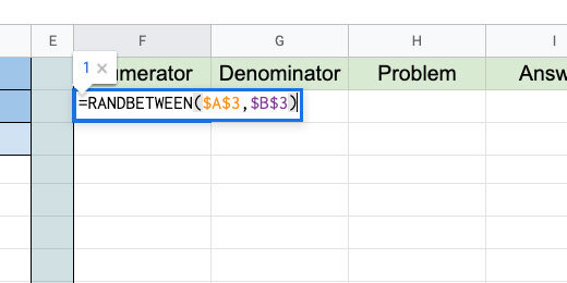
The cell has a random number chosen from the range 1 to 5. Click back on cell F2. Look for the blue square in the lower right corner. Click and drag that square down to row 11.
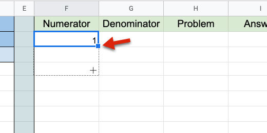
The function is copied down the column to row 11.

Go to cell G2 and type the function below.
=RANDBETWEEN($C$3,$D$3)

Press the Return key to save the function. Double click the blue square. The blue square uses the values in the column on the left as a guide. Each value on the cell to the left is used as a reference. The copy process stops when it doesn't encounter values in the left cell.
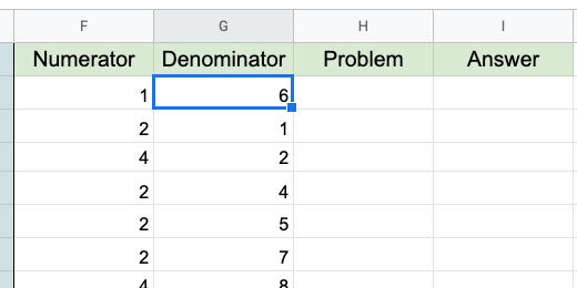
Go to cell H2. This is where we will create the template to be used in assignments. Type the formula below.
=F2&”/“&G2&” = “

The formula is doing several things. The numbers in cells F2 and G2 are being referenced. The ampersand is used to connect cells and text. They are Concatenating the number in cell F2 with a forward slash and the number in cell G2. This creates a fraction.
We need to use the ampersands because the forward-slash by itself would be used to perform the operation. You will see this in the next step.
Double click the blue square to copy the formula down the column.
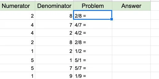
Go to cell I2 and type the formula below.
=F2/G2

Copy the formula down the column. We didn’t use the concatenation and quotation marks here. The forward slash divides the numerator by the denominator.
The answers are calculated as decimals. We need to get answers in fraction form. Select all the answers in the column.

Go to the menu and click Format. Go to the More formats option. Select Custom number format.

Click inside the Custom format box. Type the format below.
_# ??/??

Click the Apply button.
We have a variety of answers. Some of the answers are improper fractions.

Go to the numerator and denominator configuration section. Set the range of the numerators from 1 to 5. Set the range of the denominators from 6 to 9. This forces all our fractions to be proper fractions.
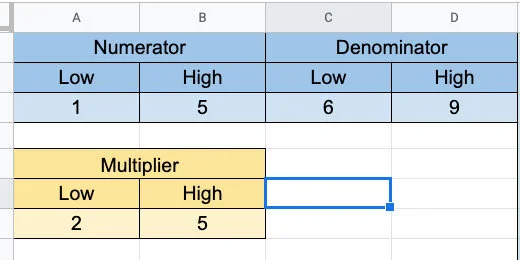
We want sets of problems where students reduce fractions. To create these fractions we increase the values for the numerator and denominator. Change the values in the denominator. Try 5 for the lower and 9 for the upper. Change the values in the denominator. Try 10 for the lower and 20 for the upper.

This doesn’t give us too many fractions that need to be reduced.
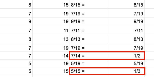
We need a multiplier for the numerator and denominator.
Click on cell F2 then go to the Formula bar. It’s easier to edit a long formula using the formula bar.
Update the formula so it looks like the one below.
=RANDBETWEEN($A$3,$B$3)*RANDBETWEEN($A$7,$B$7)
This function multiplies a random number into the random number generated for the numerator. The values for the random number come from the multiplier table. The table has a lower value of 2 and an upper value of 5.

Update the cells down the column with this change. We can’t double click the blue square to copy the update down the column. We need to drag the blue square down toward the last cell.
Double click on cell G2. Update the formula with the one below. It performs the same function for the denominator.
=RANDBETWEEN($C$3,$D$3)*RANDBETWEEN($A$7,$B$7)

Copy the updated formula to the cells down the column. Drag the blue square down to the last cell.
Change the numerator and denominator range values. Set them to something lower. I went back to 2 and 5 for the numerator. I used 6 and 9 for the denominator.
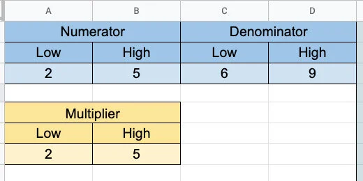
We have fractions for students to reduce.

Select the cells with the answers. Use the alignment selector to align the answers to the left.

Select the cells with the problems. Use the alignment selector to align the problems to the right.

Google doc assignment
I have a Google Doc assignment template for you. Use the link below to get a copy. Use this template or create your own Google Doc for the assignment.
Google Doc reducing fractions template
Open the template or create a new Google Doc and return to the reducing fractions generator. Select the cells with the problems and answers. Don’t select the headings. Copy the contents to memory.

Switch to the Google Docs tab. Click Edit and select Paste. Select the option to Paste unlinked.

Right-click on the top-left cell. Select — Insert column left.

Drag the left column border to the center of the first column.

Select the second and third columns.

Right-click one of the selected columns. Choose the option to distribute columns.

Number the problems from 1 to 10 down the first column. I recommend using a closing parenthesis after the number. This helps avoid confusion with the numbering and the problems.

Select the border between the problems and answers. Nudge the border to the left.

Select all the cells in the table. Set the font size to 14 points. Use the border-color tool to select a very light color. The table border should not be a distraction.

Student copy
This is your teacher's master. Make a copy for student distribution. Go to the menu and click File. Select the option to make a copy.

Rename the copy as a student assignment.

Select the column with the answers. Press the Delete key to erase the answers. Distribute this copy to students.

Basic math problem generator with Google Sheets
In this lesson, we are creating a math assignment generator. We are using Google Sheets to generate math problems. The math problems include basics like addition, subtraction, division, and multiplication. The problems are copied to a Google Doc and formatted for distribution to students.

Introduction
Practice assignments are important when learning a concept. Practicing problems helps students hone their skills and understanding. There was a time when worksheets were used to drill students on skills. This eventually was overdone because teachers used them for everything. Worksheets were termed drill and kill.
Practice assignments apply skills repeatedly. It is similar to developing muscle memory. In this case, they are developing mental or skills memory. Skills memory is important for standardized assessments.
Students quickly forget skills and concepts if they are glanced over without enforcement. For example, if we cover fractions at the beginning of the year and never return to them, students forget. Skills should be revisited regularly in a variety of contexts.
Repeated assignments help teachers evaluate the formation and retention of skills.
In this lesson, we will create a spreadsheet in Google Sheets to generate math practice assignments. The template is built around the basics. Those basics include addition, subtraction, multiplication, and division.
The generated assignments are transferred to a Google Sheet for distribution to students.
If you like this lesson please consider purchasing a PDF version. The purchase lets me know you like the lesson and it supports my efforts.
Purchase a printable PDF version of this lesson ($5.00)
Links to the finished products are available below.
Preview and copy of the finished product(addition)
Preview and copy of the finished product(subtraction)
Preview and copy of the finished product(multiplication)
Preview and copy of the finished product(division)
Google Sheet Generator
Go to your Google Drive and create a folder to store the generator. Here is an example of what I do. I create an assignment folder. The assignment folder has a math folder. In that folder, I have my generator. This folder has folders for the eventual products created with the generator.
Create a spreadsheet. Set the name of the Sheet to Basic Math Generator.
The generator uses a function called RANDBETWEEN. This function selects a random number from a provided range. The range has a lower number and an upper number.
Type the title Addend 1 in cell A1. Type the title Addend 2 in cell C1. Type the titles High and Low in cells A2 and B2. Type the same titles in cells C2 and D2. Type the number 5 in cell A3 and the number 1 in cell B3. Type the same numbers in cells C3 and D3. We will begin with these numbers for our range.
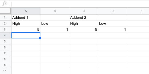
Select cells A1 and B1.

Go to the button bar and click the merge button.

Repeat the process to merge cells C1 and D1.

Select the cells between A1 and D3.
Go to the button bar and click the alignment selector. Choose the center align option.

Change the font size to 12. Click the background selector tool. Select a light color.
Select cells A3 to D3. Change the background color. Use a color that compliments the first. I have chosen a light blue and orange. This makes the generator useful and pleasant to use.
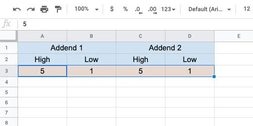
Click the letter E for column E.

Click the border selector. Choose the left border option. Don’t move away from the selector yet.

Click the border thickness option. Choose the third option.

Type the titles Problem #, Addend 1, Addend 2, Problem and Sum in cells E1, F1, G1, H1, and I1. Set the font size to 12. Change the background of the cells. Use a light color. I choose a light green.

Type the numbers 1 through 20 down column E. Begin in cell E2.
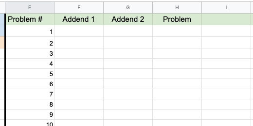
Go to cell F2 and type the function below. The function selects a random number between the numbers in cells A3 and B3. The lowest number must be first. This is why the first cell reference points to B3. The dollar symbols set the cell reference to an absolute cell reference. Press the Return key to set the function.
=RANDBETWEEN($B$3,$A$3)
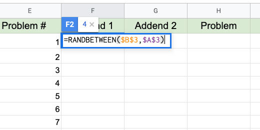
The number generated in my example appears in cell F2. Go back to cell F2. Look for the blue square in the lower right corner. Double click this square.

This copies the function down the column. This option works because there is content in the left column. It will copy the function as long as it encounters content in the left column. The copy process ends at number 20.

Go to cell G2. Type the function below into the cell.
=RANDBETWEEN($D$3,$C$3)
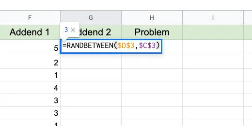
Double click the blue square to copy this function down the column.
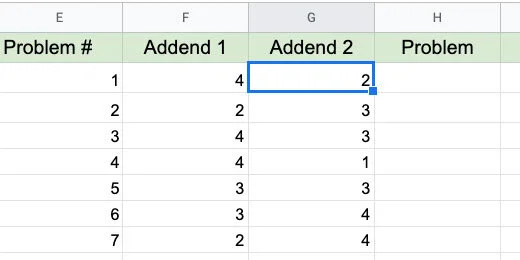
Go to cell H2 and type the formula below.
=F2&” + “&G2&” = “
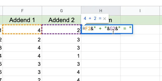
I refer to formula and function. A function has one purpose. A formula is a combination of functions and operations.
F2 references the number in that cell. The ampersand is used to join, concatenate, two functions, or formula. We can't use the add symbol by itself. It would just add the contents of the cells together. The quotation marks set the add symbol as text. There is space between the add symbol to make the problem easier to read. The Add symbol and space is concatenated with the number in cell G2. The equal sign with spaces is concatenated with G2.
Double click the blue square to copy the formula down the column.

Change the high and low numbers to adjust the difficulty of the problems. Use single or double digits. There is no limit. Use numbers of any size.

Go to cell I2 and enter the formula below. Double click the blue square.
=F2+G2

This is the basic addition problem generator. The rest of the generators are based on this one.
Subtraction
Double click the Sheet 1 name. Change the name to Addition.

Click the actions triangle next to the sheet name.
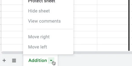
Select the Duplicate option.

Change the name of the duplicate sheet. Use Subtraction for the new name.
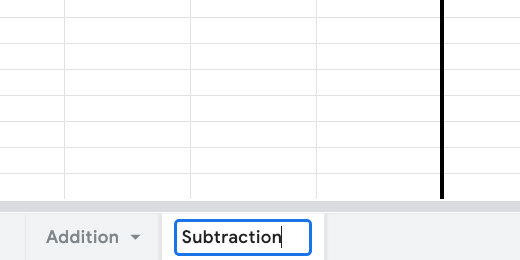
Change the names of the columns for the number ranges. The column names are Minuend and Subtrahend.
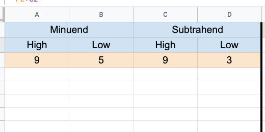
Update the heading in the generator section. Replace Sum with Difference.

Double click on H2. This places the cell in edit mode.

Replace the addition symbol with the subtraction symbol. Press the Return key to update the formula.
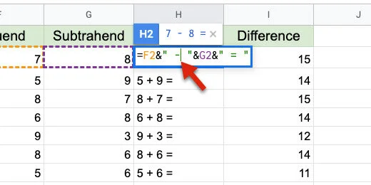
Click back onto cell H2. Drag the blue square down the column to update the rest of the cells. We can't double click the blue square this time.
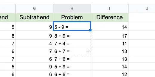
Double click on cell I2. Change the addition to subtraction.

Drag the blue square down the column to update the rest of the cells.

Some of the answers are negative numbers.

To prevent negative numbers we need to change the range values. The range of values for the subtrahend must be smaller than those of the minuend.

Multiplication
Make a duplicate of the subtraction sheet. Change the name of the duplicate to Multiplication.

Change the titles for the ranges. Use Multiplier and Multiplicand. You can also use Factor 1 and Factor 2.
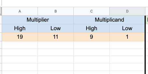
Update the titles in the generator section. Replace Difference with Product.

Double click cell H2. Replace the subtraction symbol with a letter x. Update the cells down the column.
Double click cell I2. Change the subtraction operator with an asterisk. An asterisk is used to multiply values. Update the cells down the column.
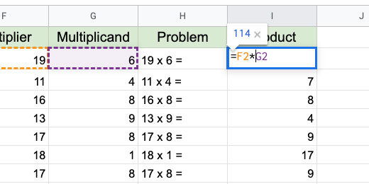
That's all there is to the multiplication generator.
Sometimes we need to transition from the letter x for multiplication to the Dot symbol. This is how to use the dot symbol for multiplication.
Double click H2. Replace the addition symbol and the quotation marks with CHAR(8901). Update the cells down the column.
=F2&" "&CHAR(8901)&" "&G2&" = "
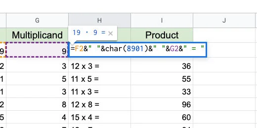
CHAR is a function. It uses Unicode values to generate almost any symbol. Every symbol available to computers is represented with a Unicode value. The value for the Dot multiplication operator is 8901. The quotation marks between the ampersand are used to add space.
The link below has a nice page with a visual reference for several math Unicode values.
http://xahlee.info/comp/unicode_math_operators.html
The dot symbol is in the Operators section. The value appears when we hover the mouse arrow over a symbol.

Division
Make a copy of the multiplication sheet. Change the name to Division. Update the titles for the ranges. The titles are Dividend and Divisor.

Update the titles on the Generator. Replace Product with Quotient.

Double click on cell H2. Update the formula with the formula below.
=F2&" "&char(247)&" "&G2&" = "
This is the same format used to replace the x with the Dot symbol for multiplication. If you used the dot symbol all you need to do is replace the code with 247. Update the cells below.
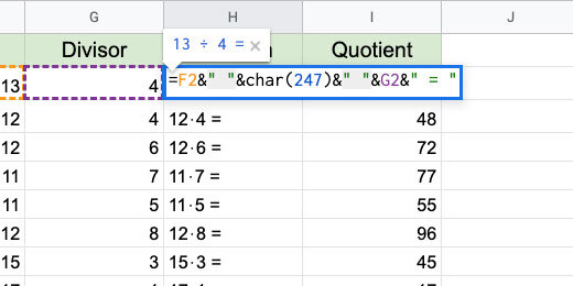
Double click on cell I2. Replace the asterisk with the forward slash. Update the cells down the row.

Most of the answers are in decimal format. Decimals are the remainder of the division problem. Remainders are often represented as fractions.

Fractions
Click on cell J1. Type the title Fraction. Update the cell background color.

Click in cell J2. Type =I2. This copies the contents of cell I2 into cell J2. Copy the formula to the cells down the column. Hint: double click the blue square.

Select all the cells below the Fraction title.

Click Format and go to the Number option.

Go to the bottom of the Number format options. Select Custom number format from the More formats option.

Type # ??/?? in the custom format bar. This builds a number format where a whole number replaces the # symbol. Decimal values are converted to fractions and formatted with ??/??. Each question mark represents a number. Click the Apply button.

The answers are represented as fractions.

Remainders
Before students use fractions, they use remainders. Click on cell K1. Type Remainder for the title. Change the cell background color. Update the font size and center the title.

Type the formula below into cell K2. Copy the formula to the cells down the column.
=ROUNDDOWN(J2,0)&" R "&MOD(F2,G2)

The ROUNDDOWN function rounds the decimal value. It gets the value in cell J2. The 0 is used for not decimal place value. We concatenate the letter R for the remainder within quotation marks. The MOD function is short for Modulus. Modulus determines the remainder in a division. To determine the remainder it needs to perform the division. It divides F2 by G2.

No Remainder
Most fractions have remainders. When students first learn division we avoid remainders. Division is usually taught along with multiplication. The relation of both operations is demonstrated with the back and forth of both operations.
Make a Duplicate of the Division sheet. Rename the sheet to Division No Remainders.
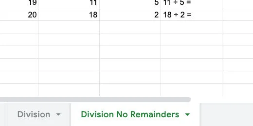
Double click cell F2. Add G2* after the equal sign. This multiplies the random number by the divisor. No remainders. Update the formulas down the column.

There isn’t a need for the fraction or remainder column. Select both columns.

Click the action triangle on one of the headers.

Select, Delete columns J-k.
The basic generators are complete. Let’s use them to create assignments.
Google Docs
Leave the generator sheet open. Go to Google Drive and create a new Google Document. Name the document Division with remainders 01.

Go to the menu and select Insert. Go to Headers & footers. Select Header.

Type the title "Division with Remainders 01". Provide instructions below the title. Use the Title paragraph style for the title. Set the instructions font size to 14 points. Press the return key twice to add some space. Click on the body of the document to close the Header section.

Return to the math generator sheet. Select the regular Division sheet. Select the first ten problems.

These are old problems. We can generate new problems on the sheet at any time. New problems are generated in several ways. They are generated when we open the spreadsheet when we refresh the page, and every minute through the settings.
There is an option I prefer. Click on the first cell for the first problem. Click and drag the blue square down to the number of problems you want to regenerate.

This regenerates all the problems and selects the problems we want for the assignment.

The answers are two columns over. To select the cells we need to use a modifier key. Windows and Chromebook users hold the Alt key. Mac users hold the Command key. Select the matching answers in the Remainder column.
Go to the menu. Click Edit and select Copy.

Go to the Google Document tab. Click Edit and select Paste without formatting.

Highlight the problems.

Change the font size to 18 points.

Click the line spacing selector and choose Double.

Click the Numbered Bullet list option with parenthesis.

Move the First line indent bar to the left. Stop when the indent is a 0.0.

Deselect the problems.

This is your teacher's master. We need a copy for the students. Go to the menu and click File. Select the option to make a copy.

Remove the "Copy of" from the beginning of the name. Add "for students" at the end of the document name. Click the OK button.

Delete the answers from the student version.

Repeat this process with any number of math assignments from the problem generator.
Google Forms for vocabulary assignments
Vocabulary is such an important part of the development of language. It is important for the development of comprehension in reading. It facilitates language development. Increases communication skills. Facilitates the communication of ideas. Increases writing skills. This lesson demonstrates how to create assignments and assessments for vocabulary.

Introduction
Vocabulary is such an important part of the development of language. It is important for the development of comprehension in reading. It facilitates language development. Increases communication skills. Facilitates the communication of ideas. Increases writing skills. I have a couple of links below with information on the importance of vocabulary development.
https://www.scholastic.com/teachers/articles/teaching-content/understanding-vocabulary/
https://infercabulary.com/top-5-reasons-why-vocabulary-matters/
Spelling and using vocabulary in context is important. This lesson focuses on the use of Google Forms to create spelling assignments or assessments. The lesson leverages the quiz option to check the assignment for us.
Log into Google Drive and create a new Google Form. You can also go to https://forms.google.com to create the form. Name the form Mammals Vocabulary Quiz.

Click the Settings icon.

Remove the option to collect an email address. Enable the option to limit the response. This requires that students be logged into their account.

Go to the presentation section. Select the options to show the progress bar and to shuffle the question order.
Go to the quiz section. Enable the option to make this a quiz. Click the Save button.

Click the actions menu.

Select the Preferences option.

Check the option to make all questions required. Enable the default quiz point value. I have each word in the quiz worth ten points. Choose your own point value. Click the Save button.

There are several ways to format questions. We will look at some of the options. Use more than one question format to keep things interesting.
The first question describes a mammal. This mammal has black and white stripes.

Click the question type selector. Choose a Short answer.

Click the Answer key link.

Click in the correct answer field.

Type the word zebra. Select the option to mark all other answers as incorrect. Google Forms uses these options to automatically grade the assignment. Click the Done button.

Make sure the required option is turned on for the question. Click the Add section button.

Set the name of the section to Mammals vocabulary quiz.

Click the Add question button.

Click the Insert image button next to the question field.

Go to the Google image search section.

Search for a squirrel. Select the image of a squirrel. Click the Insert button.

Type a question for the image. What is the name of this mammal?

Use Short answer for the question type.

Click the Answer key link. Type squirrel for the correct answer. Select the option to mark all other answers incorrect.
There is an option to provide feedback. This feedback appears at the end when the student sees the scored assignment. This feedback is useful to reinforce their correct answer. It is also useful for students that don't answer correctly.

Go to the section module. Click the action menu. Select Duplicate section.

Click on the white space next to the image. This displays the action menu for the image.

Click the action menu. Select the option to change the image.

Go to the Google search section. Search for an elephant. Select an image and inert it.
Click the Answer key link.
Set the correct answer to elephant. Click the Done button.
Click the action menu for the section. Select the Duplicate option.
Scroll to the duplicate section and question. Click the action menu for the image. Select the option to remove the image.

Remove the question. Use a fill in the blank sentence. Use a sentence that allows students to use context clues. "The (blank) uses its long neck to reach leaves in tall trees". Change the correct answer from elephant to giraffe.

These are the three types of question prompts. I prefer to use images for vocabulary. Complete the form to create a quiz with ten questions.
Click the Preview button.

The first question appears below the name of the quiz. A progress bar appears below the question. The progress bar appears because we used sections between each question. Type the answer and click the next button.

The next question shows the image and provides space for students to enter the answer. The progress bar updates and shows we are on question 2 of 10.

Complete the quiz to make sure everything works correctly. Students can view their score at the end of the quiz. Immediate feedback is important. Research shows that immediate and meaningful feedback is important.
https://www.edutopia.org/blog/tips-providing-students-meaningful-feedback-marianne-stenger

Their score is displayed at the top of the page. This score as shown separately for each student.

Correct responses are highlighted in green.

Wrong answers show the wrong answer and the correct answer.

You might want to take the quiz again to test any changes. You need to remove the option in settings to limit the responses to 1. Don't forget to set it back when you are ready to release the quiz to students.
Geometry assignment document
In this lesson, you will create an assignment document for geometry assignments. The assignment document uses the geometry images created in other lessons. The images are free and available from my Teacher Pay Teacher storefront.

Introduction
In previous lessons, we learned to create a variety of geometric shapes and angles. In this lesson, we are going to bring them all together to provide assignments for students. The links to the shape and angle lessons are available below. A preview of the final product is also available.
Basic Geometric Shapes with Google Drawings
Preview and copy of the final product.
Area and perimeter
Open Google Drive and create a folder for the geometry assignments. Create a Google Document. Set the name of the document to Geometry Assignment Template. Go to the menu and click File. Select the Page Setup option.

Set the page size to Legal. Change all the margins to .5 inches. Click the Ok button. The legal size page format provides more space for the shapes. We can also use the A4 format.

Go to the menu again and click Insert. Go to the Headers & footers option. Select Header.
Set a title for the assignments. Provide instructions for students. I used the Title paragraph style for the assignment title. I have a coding scheme that helps me keep track of my assignments. Assignments begin with the Letter A. The letter is followed by the number of the assignment. I use Q for quizzes and T for tests. I use this information in my grade book.
This is a placeholder title. Replace it with each new assignment.
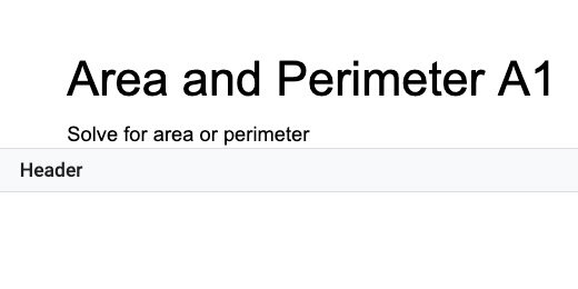
Click once in the document body. Press the Return key once. Click Insert and go to the Table option. Create a table with four columns and two rows.

The first column is used to number the problems. Type the number 1 and a closing parenthesis. Move the table column table border on the right. Move it close to the number but don't crowd it. The column needs to be wide enough to accommodate two-digit numbers.

We are going to adjust the column for the shapes. Go to the ruler. Find the column marker. It is next to the right indent marker.

Move the column marker to 2.5 inches.

Select the last two columns in the first row.

Click Format and go to the Table option. Select the option to distribute the columns.

Select the two rows in the second column.

Use Format to get to the Table option. Choose Merge cells.

Select the last two columns in the first row and merge them. This is the basic format for our geometry assignment template.

Go to the menu and click Format. Go to the table option. Select table properties.

Change the table border width to .5 points. Change the minimum row height to 2.

Click the border color selector. Select dark gray 1. Click the OK button to save the changes.

This is our basic template.

Select all the cells in the table. Click Edit and select Copy.

Click once below the table. Paste the contents.

Paste the table three more times. The fifth table is added to a second page. Keep pasting the table until there are 10. Change the numbers in each table to match the table count.

We have three pages with templates for geometry problems. The instructions from the heading are very close to the first table on each page. Double click inside the Header. Go to the end of the instructions and press the Return key once.

Using the template
The basic template is ready. I’ve shown how to do the next step in a previous lesson. The link to the lesson is available below.
Create a Template folder in the Bookmarks bar for the next step.
Go to the Chrome browser address bar.
Erase Edit# and replace it with template/preview.

Go to the beginning of the document link. Click the Lock icon and drag it to the address bar.

Drop the icon over the Template folder. Make sure to wait for the folder to highlight before releasing it.

Click the folder and select the geometry assignment template.

Click the Use Template button.
The assignment
Change the name of the document. This document's name is Geometry Perimeter A1.

Double click inside the Header. Update the title to match. Update the instructions.
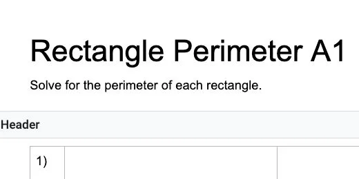
Click inside the second column for the first problem.
Click Insert and go to the Drawing option. Select From Drive.

Google Drive filters for all Google Drawings. Use the search box to search for the rectangle shape. Select the rectangle drawing and click the Select button.

Select the option to insert the Drawing unlinked.

The shape fills the available space between the column borders.

Define the problem in the main space to the right of the shape. Use the cells below the main space to mark the location for student answers.

Line segments are identified with a bar or Overline above the letters. Let’s update the instructions to include the Overline.
Erase the letters AB.

Click Insert and select Equation.

Type a backslash followed by the word overline and add a space. Type the letters AB. Like this, \overline and add a space. The word overline disappears so we can type the letters.
The letters AB have the overline in place to represent a line segment. Repeat the process with the other line segment.

Repeat the process to add more problems.

Solving ten area and perimeter problems might seem easy. I like to use an exercise like this to review other concepts. The measurements are given in different units of measure like inches, feet, or yards. The values include whole numbers, fractions, and decimals. I like to include ratios and percentages whenever possible. Look at the sample for an example.
Teacher master
This is the student version for the assignment. We need a version for ourselves. This version contains the answer key. We need to make a copy of this document. Go to the menu and click File. Select the option to make a copy.

Erase Copy of from the name. Add Teacher Answer Key to the end. Select the assignment folder for the document. It’s a good idea to keep them both in the same folder.

Go through each problem and provide the answers. Set them apart with different font colors.

Make a cone shape with Google Drawings
Geometry isn't only about 2D shapes and angles. It includes 3D shapes. Representing 3D shapes on 2D surfaces like screens and paper is difficult. We can use orthographic projection to represent 3D objects in 2D space. There are different methods for representing 3D objects.

Introduction
Geometry isn't only about 2D shapes and angles. It includes 3D shapes. Representing 3D shapes on 2D surfaces like screens and paper is difficult. We can use orthographic projection to represent 3D objects in 2D space. There are different methods for representing 3D objects.
One method used in technical drawings is isometric projection. Another familiar perspective is a Cabinet graphical projection. Cubes are often represented using this projection. Artists often use perspective projections. This is common with buildings and landscapes. There is a family of graphical projections. The images below represent some of these projection groups.
Use the links below to get a copy of this final product or to see a preview.
See a preview of the final product
Cone
Google Drawings has plenty of shapes to help with geometry. It has a couple of 3D shapes. It does not have spheres or cones. In this lesson, we are creating a cone shape.
Create a Google Drawing document. Click File in the menu and go to the page setup option. Set the width and height to 10 inches. Rename the drawing cone.
Select the triangle tool from the shapes selector.
Drag out a basic triangle.
Click the Format options button in the button bar. Select the size & rotation section in the format options panel.

Set the width to 6-inches and the height to 7-inches.

Drag the shape to the center of the canvas. Use the alignment guides.

Change the fill color. Choose white.

Change the line thickness to 3 pixels.

Select the oval tool. Create a small oval next to the triangle.

Move the oval to the bottom of the triangle. Use the alignment guides to center the oval.

Stretch the left side of the oval. Align it to the left angle of the triangle.
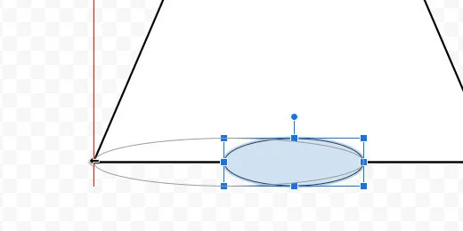
Stretch the right side of the oval. Align it to the right angle of the triangle.
Change the oval fill color to white.
Change the border color to a dark gray.
Change the line thickness to 3 pixels.
Set the line style to dashed.
Select the triangle. Click Arrange and go to the Order option. Select the option to bring it to the front.

Each shape is placed on a layer. The triangle was the first shape so it was placed on the first layer. Each new layer is placed above the first. The oval was placed on the second layer. The operation we just performed brought the triangle layer to the top. Part of the oval has disappeared below the triangle.
Select the line tool and create a small vertical line next to the triangle. Use the Shift key to create a straight vertical line.

Set the line thickness to 4 pixels. Choose dotted for the line style. Select orange for the line color. Move the line to the top of the triangle. Use the alignment guides to center the top of the line to the top of the triangle.

Drag the line’s bottom to the bottom of the triangle. Use the purple anchor point to attach the line to the triangle.
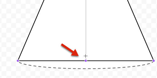
Click on the triangle. Go to Arrange and then to the Order option. Select Send to back.
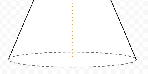
Create a horizontal line. Place it next to the triangle. Change the line thickness to 3 pixels. Change the line color to blue. Change the line style to dashed. Move the line to the bottom of the cone. Align the left side to the orange line. Align the line itself to the center of the oval. Use the alignment guides.

Connect the right side of the line to the edge of the oval on the right.

The blue line represents the radius of the base.
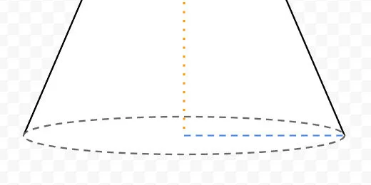
Select the arc tool from the tools selector.

Draw a small arc next to the triangle. Use the Shift key to keep the arc symmetrical.

Drag one of the arc anchor points to form a circle. Don’t complete the circle. Leave a small gap.
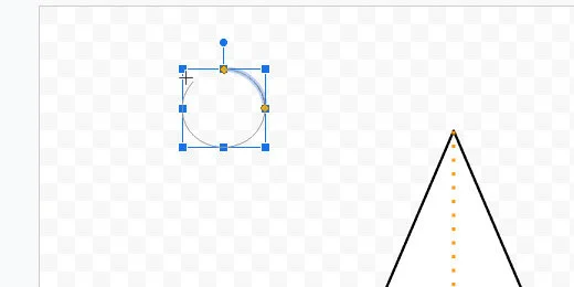
Drag the arc to the bottom of the cone. Align it to the center of the oval.

Stretch the left side of the arc to the left edge of the oval.

Stretch the other end of the arc to the right side of the oval.
We need to align the arc to the oval. The arc will be directly over the oval. Hold the Option key and drag the bottom resize hand toward the oval border. The option key keeps it centered while it is resized.

Drag the left arc anchor point to the left. Place the yellow anchor as close as you can to the edge of the oval and the angle of the triangle.

Repeat the process for the other arc anchor point.
Change the arch line thickness to 3 pixels. Set the line style to solid. This completes the illustration.

Make a sphere with Google Drawings
Geometry isn't only about 2D shapes and angles. It includes 3D shapes. Representing 3D shapes on 2D surfaces like screens and paper is difficult. We can use orthographic projection to represent 3D objects in 2D space. There are different methods for representing 3D objects.

Introduction
Geometry isn't only about 2D shapes and angles. It includes 3D shapes. Representing 3D shapes on 2D surfaces like screens and paper is difficult. We can use orthographic projection to represent 3D objects in 2D space. There are different methods for representing 3D objects.
One method used in technical drawings is isometric projection. Another familiar perspective is a Cabinet graphical projection. Cubes are often represented using this projection. Artists often use perspective projections. This is common with buildings and landscapes. There is a family of graphical projections. The images below represent some of these projection groups.
Use the links below to get a copy of this final product or to see a preview.
See a preview of the final product
Sphere
Google Drawings has some 3D shapes. These shapes include the cylinder and cube. It does not have a sphere or a cone. We will create a sphere.
Create a folder to store the geometric shapes. I have my 3D shapes folder within a geometry folder. That folder is within an assignment folder. Go into that folder to create the sphere.
Go to your Google Drive and open the folder where the Sphere will be saved. Create a new drawing document. Set the document name to Sphere. Click File and go to the page setup option.

Select the custom option from the page setup selector. Set the width and height to 10-inches. Click the apply button.

Click the shapes selector. Choose the oval tool.

Drag out a circle shape. Press the Shift key on your keyboard to constrain the shape to a circle. The circle doesn’t have to be large.

Go to the button bar and click Format options. Click the Position section. Set the X and Y position values to 1-inch.

Select the size & position section. Set the width and height values to 8-inches.

Use the shape color fill tool and choose the Transparent option.
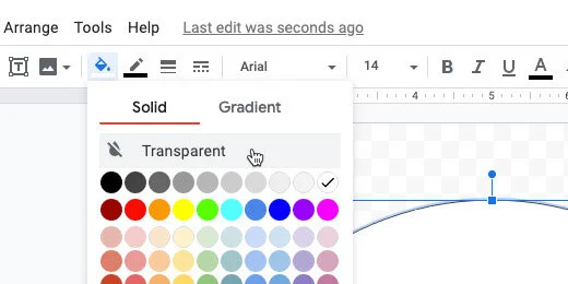
Select the arc tool from the shapes selector.
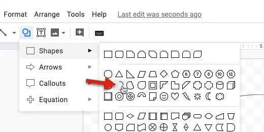
Draw a small arc shape outside the circle area. Press the Shift key to create a symmetrical arc.

Use one of the yellow anchor points to trace a circle. Don’t complete the circle. Leave a small gap.

Move the arc shape to the top center of the circle. Use the alignment guides to help align the shape.

Drag the bottom resize handle down.

Release the shape when it touches the opposite end of the circle.

One of the yellow anchor dots should be somewhere within the circle. Click and drag the yellow dot down to the bottom of the circle.

The yellow dot should be touching the bottom of the circle.

The other yellow dot should be touching the top of the circle.

Open the size & rotation option. Set the width of the arc to 3-inches. Make sure the height is set to 8-inches.

Changing the size moves the arc slightly off-center. Drag the arc toward the center of the circle. Use the alignment guides.

Change the arc line color to a light gray.

Change the line thickness to 4 pixels.
Set the line style to dashed.
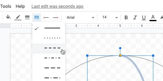
Click Edit and select Duplicate.

Click Arrange and go to the Rotate option. Select Flip horizontally.

Drag the duplicate shape and center it within the circle.

Change the line style. Use the dotted line style.
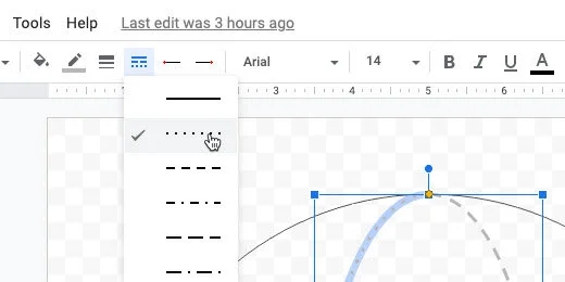
The next step is optional. Try it out so see if is something you want for your sphere.
Select the circle.

Click the color fill selector. Switch to the gradient section.
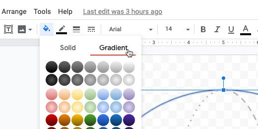
Choose a gradient from the fourth row.

You don’t have to give the sphere a gradient color. I think it adds some depth. The next step creates the diameter and radius lines.
Select the line tool. Draw a horizontal line outside the circle. Hold the Shift key to keep the line horizontal.

Change the line thickness to 3 pixels. Change the line style to dashed. Press the ESC key to deselect the line.
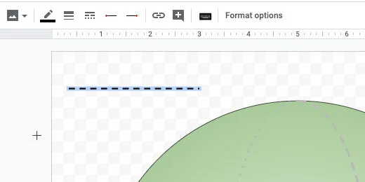
Move the line to the center of the circle. Use the alignment guides.

Drag the right anchor to the edge of the circle. Connect it to the anchor that appears at the edge. Repeat the process for the other end of the line.

We are going to duplicate this line. Click Edit and select Duplicate. Drag the right endpoint up. Connect it to one of the connectors on the circle above the diameter line.

Drag the other end of the line. Connect it to the center connector on the diameter line.

Click the Textbook button. Click outside the sphere. Type the capital letter D in the box. Resize the textbook. Place the letter where the radius line meets the diameter line.
Create another text box. Type a lower case letter r. Resize the box and position it next to the radius line.
