
Technology lessons for educational technology integration in the classroom. Content for teachers and students.
Fundraising goal thermometer graphic with Google Sheets
Fundraiser thermometer graphic with Google Sheets. We are using Google Sheets to create our fundraiser thermometer. The sheet will display daily updated totals on the web. The thermometer will be dynamic with changing colors and updated information.

Fundraisers are part of many organizations. In education, we have fundraisers for a variety of needs. A class or a select group of students is usually charged with updating the goal chart with the latest totals. This chart is often placed in a prominent location.
There are several online services and apps built to help track and display a fundraiser thermometer. Many of these services are free and offer basic services.
We are using Google Sheets to create our fundraiser thermometer. The sheet will display daily updated totals on the web. The thermometer will be dynamic with changing colors and updated information.
Use the links below to see a preview of the final chart and to get a link to the working document.
Fundraiser thermometer preview
Fundraiser thermometer chart
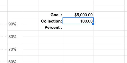
Open the Google Sheet working document. The top of the spreadsheet has a title or the goal for the fundraiser. There is a box with information about the fundraiser on the left. The fundraiser goal for this example is $5,000.
The chart will use percentages to represent our progress. The percentage is based on the total collected and the goal. Place $100.00 in the collection cell.
Click the currency button to convert the collection into dollars—use the currency for your part of the world.

Select the cell to the right of the percent label; enter the formula below.
=K10/K9
This formula divides the collected amount by the goal amount; it calculates the percentage. Leave the calculated percent as a decimal; we will format the percentage later.

Some of the cells in the template are merged to provide formatting. Select the merged cells G27-28. They are at the bottom of the chart.
These grouped cells will display the current percentage as it relates to the colored section of the thermometer.

Type the expression below into the merged cells.
=IF(K11\<=0.1,K11,””)
The expression uses the IF function. The function evaluates if something is True. The function needs three parameters. Each parameter is separated by a comma. The first parameter evaluates if something is True. The second parameter applies a value to the cell if the evaluation is True. The third parameter applies a value if the evaluation is False. The function reads like this—If…Then…Else.
This is what it evaluates; if the value in cell K11 is less than or equal to 0.1, 10-percent, it will display the contents of cell K11. If the value is not greater than or equal to 0.1, it will display nothing; designated by the empty quotes.

Press the Return key. The decimal value appears in the cell.

Go to the button bar; click the Percent format button.

Click the decrease decimal place value twice to eliminate the decimals.

The amount collected stands at 2-percent.

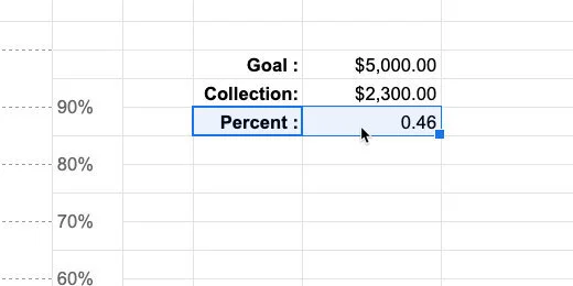
Go to the collection cell; enter $600.00. The percentage collected is now 0.12.

The percentage disappears in the cell. This is what we want to happen. We don’t need to display the percentage for this part of the chart once the value is greater than 10-percent.

Select the cells above—G25-26. Enter the expression below.
=IF(AND($K$11\>0.1,$K$11\<=.2),$K$11,””)
This expression includes the AND function. The function evaluates two expressions to determine if they are both True. Each expression is separated by a comma.
The cell references include dollar symbols before the letter and number. The dollar symbols are used to lock the cell reference. This is called an absolute cell reference. It is a good idea to lock the cell reference if we plan to copy a formula or expression. We will copy this expression to the cells above later.
This is how the expression reads. If the value in cell K11 is greater than 0.1 AND less-than-or-equal-to .2; apply the value in cell K11; else leave the cell blank.

We have now collected 12-percent. Click the decrease decimal button twice to remove the place values.

We are going to use this expression up to the 90-percent indicator. This will save lots of typing and possible errors. Make sure the cell is selected. Copy the cell contents. Go to the grouped cells above and paste.

Double-click the cell to enter edit mode.

Change the value 0.1 to 0.2; change the value 0.2 to 0.3. Press the Return key. Update the amount collected to $1,200.00. We have now collected 24-percent.

Copy and paste the expression in this cell onto the cell above. Change the value 0.2 to 0.3; change the value 0.3 to 0.4.

Change the collected value to $1,600.00.

Repeat this process for the rest of the cells up to 90-percent.

The final chart indicator has a slight modification to the expression. Enter the expression below.
=IF(K11\>0.9,K11,””)
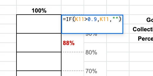
Change the amount collected to $4,600.00. Reduce the decimal place values.

Color indicators
Return to the bottom of the chart. Select cells F27-28.

Go to the menu and click Format. Choose Conditional formatting from the list of options.

The conditional formatting panel shows the selected cells that will be formatted.

Cells are formatted with background colors or type styles based on rules. The default rule applies the default style—green. The selected cell is empty so no color is applied.

We want the first grouped cells to change color if the amount collected is greater than zero percent.
Click the formatting rules selector; select the Greater than rule.

We need to provide a value for the rule to use for comparison; enter the number zero.

Nothing is happening. This is because the formatting rule looks for the value to be in the selected cells. The cells in the chart are not going to have a percentage. The percentage is in cell K11. It is also in the adjacent cell we formatted earlier.
We need to refer to the value in cell K11 for the formatting to work. We need to use a separate rule.
Click the rule selector and choose Custom formula.

Erase the zero and enter the expression below.
=K11\>0

The cell's background color is formatted with the default green.

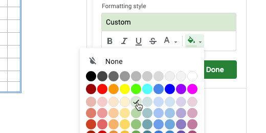
Click the cell background color selector.

Select dark red 1 or any color you want.

Click the Done button.

Select the cells above the formatted cells.

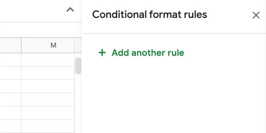
Go to the conditional format rules panel; click the Add another rule button.
Select the Custom formula rule. Enter the expression shown below into the formula box.
=K11\>0.1

Change the cell background color to dark red 1; click the Done button.

The first and second groups cells are now formatted.

Select the grouped cells above. Add another formatting rule. Choose the custom formula rule. Enter =K11\>0.2 in the formula box. Change the background color and click Done. Repeat this process for the remainder of the cells.

Close the conditional formatting rule panel.

Change the amount collected to different values to see how the chart updates.

We don’t need to show the percentage value below the amount collected cell. That is already shown on the chart. Select the percent label and the value.
Click the Text color button and choose white.

The percentage is still there—because we need it—but not visible.

Final touches
We need one more item to make the thermometer chart complete. The chart needs to resemble a thermometer.
Go to the menu and click Insert; select Drawing.

Click the shapes selector and select the Chord tool.

Click once in the center of the canvas.

The chord has yellow handles to change the width and angle of the chord. Click and drag the top handle to the left. Release the handle when it is opposite from the top left resize handle.

Move the right chord handle so it is opposite the left chord handle. The chord should be horizontal.
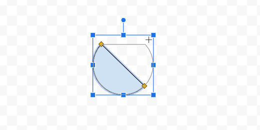
Select dark red 1 from the color fill tool.

Click the Save and Close button.

The drawing is placed somewhere in the spreadsheet.

Move the shape to the bottom of the chart.

Use the resize handles to reshape the drawing. Reshape it until it resembles the bottom of a thermometer.

Publish the chart
Click View and select the Gridlines option. This hides the sheet gridlines.

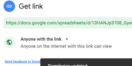
Click the Share button.

Click the link that reads Change to anyone with the link.

Make sure the link is available to anyone on the Internet. Click the copy link button.
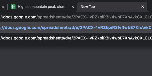
Open a new browser tab; paste the link into the tab. Don’t press the Return key yet.

Edit the end of the link. Find the word edit at the end of the link.

Replace the word edit and everything after it with the word preview. Press the Return key to load the sheet.

Use this link to share with anyone interested in your fundraising efforts.

The drawing has a box around it. This appears to be an issue with published drawings in Google Sheets.
Return to the tab with the working Sheet; update the collection amount.

Return to the published sheet to view the updated chart.
Histogram charts with Google Sheets
Create histograms with Google Sheets. Histograms are used in statistics. They are used to show the frequency of a set of continuous data. Numerical data can be discrete or continuous. Discrete data is counted. Continuous data is measured. Examples of discrete data include the number of students in a class or the number of faces on a die. Continuous data can take any value. Examples of continuous data include a person’s height or weight.

Introduction
Histograms are used in statistics. They are used to show the frequency of a set of continuous data. Numerical data can be discrete or continuous. Discrete data is counted. Continuous data is measured. Examples of discrete data include the number of students in a class or the number of faces on a die. Continuous data can take any value. Examples of continuous data include a person’s height or weight.
The data used in the lesson is from a paper airplane contest. I love paper airplane contents; they involve all sorts of learning opportunities. The contest has one variable—a basic airplane design. The goal is to fly the farthest distance from a starting line.
The distances in this scenario are rounded to the nearest foot. Any plane landing 6-inches or above the nearest foot is rounded up. For example, a plane landing at 10-feet 7-inches is rounded to 11 feet. A plane landing 10-feet 5-inches is rounded to 10 feet.
Resources
Use the links below to get a copy of the working document and previews of the final product.
Airplane contest histogram preview
Airplane contest working document
Pre-requisite
To understand the concepts in the rest of this lesson, we need to understand how to prepare the data for a histogram. The sheet in the working document has a list of students and their attempts. The measurements are not in any order.

The data has a range. The range is the difference between the smallest and largest measurement. The smallest distance is 10-feet; the largest is 30-feet. We subtract these distances to get a range of 20-feet. This information is used to determine the range for each bar in the histogram. The range is the number of measurements held in each bin.
The bars in a histogram are called bins or buckets. The terms are descriptive of what they do. They are bins or buckets that hold content.
We are creating a histogram with five buckets. Five buckets tend to be the typical histogram format. It works well for our information because there isn't much of it.
Take the range and divide it by the number of buckets we want—(30-10)/5. This results in a range width for each bucket of 5. We want five buckets and it so happens that the range of each bucket is also 5.
This is how we construct the bucket ranges and frequencies. We begin with the smallest value; that value is 10. *We don’t want our buckets to begin with the value they are recording; you will see why this is important later.* To make sure this doesn’t happen we subtract .5 from the smallest value and add .5 to the largest value.
Bucket table
We make a table with a range of information. Look at the image below. The smallest value is 10 and we subtract .5 to get 9.5 for the starting value. We calculated each bucket range to be 5; we add 5 to 9.5 and get 14.5. The next range begins at 14.5 and we add 5. The next range is from 14.5 to 19.5.
We repeat this process until we have five buckets.

The information that goes into these buckets is the frequencies or the number of times a value falls within each bucket. In other words; how many times does a distance fall within the values of one of these ranges.
The table below shows that 7 distances fall between 9.5 and 14.5. Five distances fall between 14.5 and 19.5. We continue counting until all the distances are accounted for in each bin.

The histogram we will create needs to represent the information shown in the table.
Google Sheet histogram
We need the raw values for each distance. Histograms are created with one column of data.

Select the values; you can include the names. The names won’t part of the histogram chart.

Click the insert chart button.

Google thinks I want to create a line chart.

Click the chart selector; scroll to the bottom of the options; select the histogram chart.

The histogram looks very good. It creates a good basic chart. The titles come from the titles above the chart data. We will adjust these later.

The Chart editor panel opens on the right. The panel has several sections. Click the Histogram section. The histogram options are basic. The number of buckets is selected for us. The chart shows the data is divided into five buckets or bins. Place a checkmark on the Show item dividers. This helps count the items in each bin. This will help us throughout the lesson.

The bucket selector has options for 1, 2, 5, 10, 25, and 50. These are the common bucket options.

Open the Horizontal axis section. The minimum and maximum values are set from the data. The range of values falls onto the data points. This is not standard. This results in errors like the one in this chart. Let's take a look.
We have buckets with values from 10 to 15, 15 to 20, 20 to 25, 25 to 30, and 30 to 35. The bucket for the range of 30 to 35 shows two values. These are the values from the two 30-foot measurements. Our data doesn't have any values above 30. This is misleading information. The issue with ranges will pop up again later.
Let’s update the range.

Update the minimum and maximum values. Use 10 for the minimum value and 30 for the max.

The chart updates the bucket values. We still have the five buckets. The distribution of data has changed. The counts for each bucket are 7, 4,6,4, and 7. These don't match the ones from the table we created in the Sheet.

The bucket ranges are still misleading. Let's take a look at the count for the bucket that ranges from 22 to 26. The data shows the count of 4 is, that's correct, however, look a the count for the fifth bucket. It shows a count of 7, but 9 values technically meet this criterion.
This is the problem; we don’t know where to place the count for the 26-foot measurement. Does it fall under the fourth or fifth bin? This is why bin ranges should not fall onto values.
It is customary to set the minimum value to a percentage of the lowest and highest number; this is typically .5.
Use 9.5 for the min value and 30.5 for the max.

The ranges in the chart change and so do the counts in the bins. The counts are 7, 4, 8, 2, and 9. The lower and upper ranges are set to the values we placed. The range for each bin is adjusted for us. The counts are set to 4.2; not the 5 we calculated. This causes problems with the counts again.

The count in each bin isn’t exactly correct here. The measurements are in whole numbers. A bin of 4.2 forces us to split the difference when counting the distances and placing them into each bin.
Go to the histogram section; use 5 for the bucket size.

The bucket ranges update. The bucket counts update: 7, 5, 9, 7, and 2.

Use the chart title section to change the main title. Set the title to Paper Airplane Flight Contest.

Select the Vertical axis title option. Set the title to Distance in feet. We don’t need to change the horizontal axis title.

This is an excellent example for students. It demonstrates that they need to understand the manual process. The histogram would have been created with errors if they did not understand what needed to be done and what it needed to look like ahead of time.
Publishing charts with Google Sheets
This is part of a four-part series on publishing Google Charts. Published charts are live. Any changes made to the working chart are reflected in the published chart. Updates are not automatic for all forms of published charts. Updates have to be manually pushed to the published version.

Introduction
This is part of a four-part series on publishing Google Charts. Published charts are live. Any changes made to the working chart are reflected in the published chart. Updates are not automatic for all forms of published charts. Updates have to be manually pushed to the published version.
Google Sheets is a useful tool for the development of a variety of charts. Once those charts are created it may be necessary to share them with others. There are a variety of reasons for sharing the information and a variety of ways to share it. I am going to focus on examples related to education.
The first example focuses on the publication of data for a geography assignment. Like all assignments, this assignment is connected to other subjects. It is part of an overall student product students.
The second example comes from something I was part of for one year. The administrator at the campus wanted to increase student attendance. She offered a pizza party for the class or classes with the highest attendance. The parties would be part of the traditional holiday parties for December.
Product preview
Use the links below to see a preview of the final products.
The highest mountain peaks in North America:
Holiday party attendance:
Working documents
Use the links below to get a copy of the working document. The document includes the charts. The charts are already formatted for publication.
Just the chart
The spreadsheet has a chart and table on the first sheet. The first sheet is titled USA. The second sheet is titled peaks. That sheet contains the raw data.

Click once on the chart. Look for the action menu.

Click the action menu and select Publish chart.

A publication configuration box opens.

Click the share option selector. Choose the chart itself. The chart is titled Highest Mountain Peaks in USA.

Leave the other option set at Interactive. Click the Publish button.

Google Drive prompts for confirmation. Click the OK button.

A special publication link is generated and selected. Copy the link.

Create a new tab and paste the link into the address bar. Press the Return key to load the published chart.
The chart appears on the far left side of the browser. Nothing but the formatted chart appears on the page. Use the link and share it with anyone who needs to see the chart. The chart does not need special permission. Anyone who has the link can see it.
Charts created within an organization have additional options to share with the world. Use those options to share the map with the world. Otherwise, the chart can only be viewed by members of the organization.

Roll the mouse over one of the columns in the chart. The name of the mountain and height appear. This is the extent of the interactivity.

Interactivity is nice; it isn’t needed in this chart. We can choose to publish the chart as a non-interactive image. Click in the address bar and move to the end of the link. The last word in the link is interactive.

Replace the word interactive with "image". Press the Return key.

The image appears at the center of the page. Roll your mouse over a column and nothing will happen. Change the link name back to interactive if you want to use the interactive version.

The chart data is live. The chart updates on its own when we update the information related to the chart. For example, the chart would update if we chose to chart only the top five highest peaks. All we do is update the chart on the sheet. The update on the published version takes care of itself. Let’s take a look at how this works. Leave the tab open and return to the spreadsheet tab.
Stop and Republish
The sheet still has the publication options dialogue open. Click the Published content & settings option.

This is where we stop publishing the chart. The chart will always be viewable by anyone with the link as long as the publish option is enabled.
There are other ways to stop the published chart. These are not the ideal way to stop publishing the chart but you need to be aware of them. Deleting the chart from the sheet will stop the publication. Deleting the spreadsheet or Sheet will also stop the publication. Anyone visiting the site with a missing chart link will see an error message.
The republish option is automatically enabled. I recommend unchecking the option before making changes. This gives you time to make sure the information is ready for publication.

Remove the check from the box and close the configuration box.

Go to the table and click the Peak heading.

Look at the Formula bar. The table is generated with a Query function. The function has a limit parameter. The limit is currently set to 10. Only the first 10 records are displayed.

Replace the 10 with 5 and press the Return key.

The chart on the sheet updates with the changes.

Click the chart action menu; select Publish chart.

Place a check back on the option to automatically republish changes. Close the configuration box.

Switch back to the published chart tab. The chart has been updated with the changes. Click the browser refresh button if the chart does not show the change.

Close the published chart tab. We don’t need it for the remaining lessons.
Dashboard option
Sharing charts as we did is easy but the view is kind of plain. There is another way to share the chart and other content on the sheet. This is often referred to as publishing a dashboard.
This is a dashboard of a kind. Real dashboards created with Google Data Studio have interactive components. They include selectors and ways to update the information in charts.
Go to the menu and click File; choose to Publish to the web.

This is the same configuration option we just used.

Click the selector and choose USA. This is the Sheet itself.

Click the Publish button. Confirm you want to publish the document.

Copy the publish link. This link is different from the chart link we created earlier.

Create a new tab and paste the link into the address bar. The sheet with the table and chart open on the page. The name of the spreadsheet and sheet appears in the information bar. The table is missing half the mountain peaks. We changed the Query limit in the previous lesson.

Updating the dashboard
Return to the spreadsheet tab. Close the configuration box. Click on the Peak heading; go to the formula bar. Change the Limit value from 5 to 10. Press the Return key to update the table and chart.

Go to the spreadsheet dashboard tab. Click the browser refresh button.

updated published version of chart
I like this method of publishing charts. It allows me to choose the position and background color of the chart. I can also include other elements like the table.
Attendance dashboard
In the attendance dashboard, I applied the same process. The dashboard has several charts with additional formatting. Use the link above to see the published version of this dashboard.
Google Sheets measures in time assignments
In this lesson, we are creating an assignment generator for time measurement. The assignment generator will generate assignments for students to calculate the number of minutes in a given number of seconds. It will also create assignments for students to calculate the number of hours given minutes and seconds.

Introduction
We teach a variety of measurement standards. These measurement standards include linear measurement units like feet, yards, centimeters, and meters. Time is also one of those measurement standards.
Measuring intervals of time is important in science. It is also important in coding. In this lesson, we will create a time assignment generator using Google Sheets. The generator will create assignments for students to solve for the number of minutes and seconds. The generator will also create assignments for calculating hours, minutes, and seconds.
Use the links below for a copy of the final product.
Calculating hours, minutes, and seconds preview
Calculating hours, minutes, and seconds copy
The template
I have formatted a sheet to get you started. Use the link below to get a copy of the starter template.
Time measurement generator template
We are using a function called RANDBETWEEN. This function selects a random number from a range of numbers we provide. The function needs the lowest and largest number in the range. The sheet I provided already has a lower and upper number in cells A3 and B3. The function will use these numbers.
The function retrieves the numbers from these cells to make it easier for us to update the range values at any time.
Go to cell C3 and type the function below.
=RANDBETWEEN($A$3,$B$3)

The cells are referenced using a dollar symbol before each letter and number. This converts the reference to an absolute cell reference. The function will look to the values in cells A3 and B3 only. This is important.
The function selects a number between 60 and 360. We are going to make a copy of this function to create 10 problems.
Click back on cell C3. Find the blue square in the lower right corner of the cell. This is the duplicate tool. Drag the blue square down to cell C12. Drag it down more cells if you want more assignment problems.

We have 10 problems with a random set of seconds.

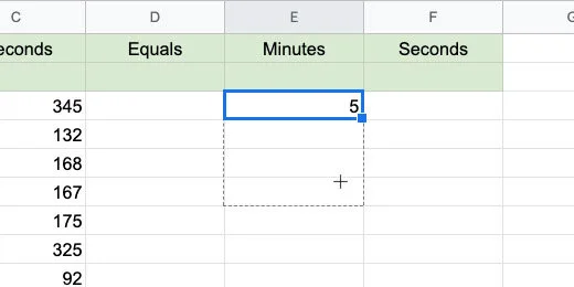
Go to cell E3 and type the formula below.
=C3/60

The formula divides the value in cell C3 by 60. Not all the seconds in our problems are evenly divisible by 60. The formula in my example has 3 minutes and some seconds. The seconds are shown as decimal values.
To remove the seconds we need to round the division to the nearest whole number. Erase the formula and update it with the one below.
=ROUNDDOWN(C3/60,0)

We are using the ROUNDDOWN function to round the quotient to the nearest whole number. The function needs the number to round. This is provided by the division of the value in cell C3 by 60. It needs the place value for the rounding. The parameter of 0 is used to provide a whole number. We don’t need any decimals.
There are several rounding functions available in Google Sheets. I chose the ROUNDDOWN function because it will round down to the nearest whole number. Rounding up causes problems when the decimal value is .5 or above. This would give us too many inches in some instances.
Click back on cell E3. Drag the blue square down to row 12.
Go to cell F3. Type the function below.
=MOD(C3,60)
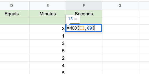
The Modulus function is used to pull out the remainder from a division. The function divides the contents in cell C3 by 60. Only the remainder is placed in the cell.
This came out perfect in my example. Look at the image below. We have 64 seconds which is 1 minute and 4 seconds.
Copy the formula down to row 12.

We have our first problems set. We need one more thing. We need an equal sign. We can't just type the equal sign. The equal sign is used to begin a function or formula in sheets.

Type the function below. Copy it down to row 12.
=CHAR(61)

The CHAR function is used to represent Unicode values. Every character used in a computer has a Unicode value. The Unicode value for the equal sign is 61.
I use the site below to reference basic math Unicode values.
http://xahlee.info/comp/unicode_math_operators.html
Go to this web site for a moment. Hover over one of the symbols to see the Unicode value for that symbol. The Unicode value is 61 for the equal sign. Return to the google sheet.

Change the upper value to generate more complicated assignments. I changed the value to 720.

Minutes to hours
Now that we have seconds to minutes, we will create assignments to convert minutes to hours. Go to the next sheet in the template.
In the template, I provided ranges for the minutes and seconds.
The values in cells E3 and F3 are not generated randomly yet. I placed these values here so we can see out how this works with something that makes sense.

We are working backward and beginning with something we know. Go to cell J3 and enter the function below.
=MOD(F3,60)

Remember, this function returns the remainder from the division of the value in cell F3 and 60 seconds. The value in cell F3 is 60 so the remainder is zero.

Go to cell I3 and enter the formula below.
=MOD(F3/60+E3,60)

In this cell, we need to do more than calculate the number of minutes. We need to add the number of minutes in cell E3 to add up the number of hours.
This is what the first part of the formula is doing. It is dividing the value in cell F3 by 60 seconds. The quotient of this division is added to the minutes in cell E3. This gives us the total number of minutes to calculate for hours. The sum of the hours is divided by 60 minutes.
We are using the MOD function to return the remainder of our division by 60. The MOD function is calculating the value from the division and the addition of seconds and minutes. It is then dividing that value by 60 and returning the remainder. The remainder is the number of minutes left over.
We have one minute leftover. This makes sense. The sum of 180 minutes and 60 seconds is 2 hours and 1 minute.

Go to cell H3 and enter the formula below.
=ROUNDDOWN((E3+I3)/60,0)

We are adding the number of minutes in cell E3 to the calculated minutes in cell I3. The sum is divided by 60 minutes. The calculation of E3 and I3 is in parenthesis. This instructs Google Sheets adds these numbers before dividing by 60. Google Sheets obeys the order of operations. Without the parenthesis, it would divide I3 by 60 before adding E3.
We are using the ROUNDDOWN function as we did with minutes in the previous part of the lesson. We don't want any decimal place values so the value is rounded to 0 or no decimal places.
The answer makes sense. The sum of 180 minutes plus 60 seconds is 3 hours and 1 minute.

Go to cell F3. Change the seconds from 60 to 61 seconds. The minutes are calculated and include a decimal value. This doesn’t work for us. We need to round the value to the nearest whole number.

Update cell I3 with the formula shown below.
=ROUNDDOWN(MOD(F3/60+E3,60),0)

We are embedding the MOD function inside the ROUNDDOWN function. The result of the MOD function is rounded down to the nearest whole number.

The answers make sense. Now we can generate random minutes and seconds. Go to cell E3 and enter the function below.
=RANDBETWEEN($A$3,$B$3)

Go to cell F3 and enter the function below.
=RANDBETWEEN($C$3,$D$3)

Duplicate the functions down each column. Use the blue square. Duplicate them down to row 12.

Google Docs assignment
We have our assignment generator. It’s a time to generate an assignment and publish it with Google Docs. I have a template for you to use. Use this template or create your own new Google Doc. Use the link below to get a copy.
The document includes a header with the title and instructions.

Keep the document open and return to the Google Sheet tab.
Select all the problems generated in the hours, minutes, and seconds sheet. Include the headers. Click Edit in the menu and select Copy.

Go to the Google document tab. Click Edit and select Paste. Select the option to paste unlinked.

Let’s make the problems presentable for students.

Select all the cells in the table.

Go to the menu and click Format. Go down to the Table option. Select Table properties.

Set the column width to 1.0

Set the table border to .5 points.

Set the table border color to a light gray.

Click the OK button to save the changes.
Don’t deselect the table yet. Go to the button bar and click the Center Text align button.

Change the font size to 12 points.

Student copy
This is your teacher's master.

Go to the menu and click File. Select Make a copy.

Update the document name. Set it to Hours Minutes and seconds student assignments. Click the OK button.
Select the answers for hours, minutes, and seconds. Press the Delete key to erase the values. Distribute this document to students.
Create math assignments with Google Sheets
This lesson covers the process for creating a Least Common Multiple(LCM) and Greatest Common Factor (GCF) assignment generator. The generator is created with Google Sheets. The content is sent to a Google Doc and distributed to students.

Generate math assignment for the Greatest Common Factor and Least Common Multiple.
Introduction
This is an assignment generator using Google Sheets. After learning multiplication and division. Before learning fractions. We cover the Greatest Common Factor and Least Common Multiple. These skills tie into multiplication and division. They are also the jumping-off point for fractions and reducing fractions.
When solving for the Greatest Common Factor we are looking for a number that divides evenly into two or more numbers. The Least Common Multiple is the smallest number this is evenly divisible by two or more numbers. For example, 16 is divisible by 4 and 8.
Below are links to the final product in a Google Doc.
Least common denominator assignment preview
Least common denominator assignment copy
The GCF generator
Go to Google Drive and create a new Google Sheet. Use GCF and LCM assignment generator for the document name.

Double click the sheet name. Change the name from sheet 1 to GCF.

We are using a function called RANDBETWEEN to generate the numbers for each problem set. We need to pass two values into the function. It needs a lower and upper number for the range. It chooses a number from within this range. The range we use can vary from assignment to assignment. This is especially true when differentiating assignments.
In programming, it is good practice to avoid hard coding variables into functions. When values are hardcoded we need to go into each function every time it is used and change the values. This gets tedious and is error-prone. We are setting up cells to act as the values that will be adjusted for all the instances of our RANDBETWEEN function.
Type these headings. Type Range Values in cell A1. Type Lower and Upper in cells A2 and B2. Type Number 1 and Number 2 in cells C2 and D2. Type GCF in cell E2.

Select cells A1 and B1. Go to the button bar and click the Merge cells button.

Highlight the cells A1 to E2. Go to the button bar and click the Center Align button.

Highlight cells A1 to B2. Click the cell background color selector in the button bar. Choose a light color. I chose a light blue.

Click on the C column heading.

Go to the button bar and click the Border selector. Choose the Left border. Don’t leave the selector yet.

Go to the Borderline thickness selector. Choose a thick border. Chose the third option.

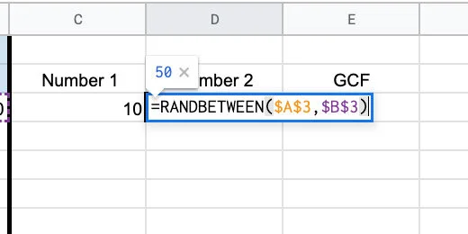
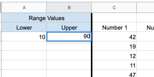
Type 10 in cell A3 and 50 in cell B3. We will begin with these numbers for the range.

Go to cell C3 and type the function below.
=RANDBETWEEN($A$3,$B$3)
The function uses the values in cells A3 and B3 for the range. The dollar sign before each letter and number sets the cell reference to an absolute cell reference. This sets the function to use the values in these cells only.

Type the same function in cell D3.
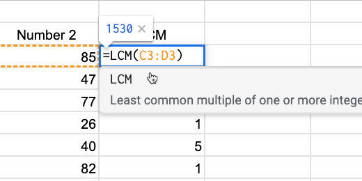
Go to cell E3 and type the function below.
=GCD(C3:D3)
The function uses the values in cells C3 and D3 to determine the GCF of both.

The generator selects two numbers. The numbers in my example are 49 and 21. The GCF for both numbers is 7.

Select the cells from C3 to E3.

There is a blue square in the lower right corner of cell E3. Click and drag this blue square down. Drag it down to row 12.

This copies the functions down 10 rows to give us ten problems. Drag the blue square down more rows if you want more problems.

The numbers are randomly selected for each problem. Some numbers have more GCF values of 1 than others. In the image below I have a nice distribution of numbers.

If you’re not happy with the numbers this is how to update the numbers. Click and drag the blue square on any GCF cell. You don’t have to update all the cells. One or two is enough to force the sheet to update. The sheet updates everything.

Go to the range parameters. Update them to increase or decrease the range of numbers.
LCM generator
The Least Common Multiple Generator works on the same principle as the GCF. So, we have done most of the work for the LCM generator.
Click the actions triangle next to the sheet name.

Select the Duplicate option.
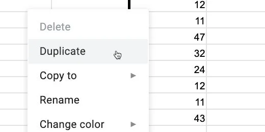
Double click the duplicate sheet name. Use LCM for the name.

Go to cell E2. Update the heading from GCF to LCM.

Double click on cell E3. Replace the GCD function with LCM. Press the Return key to update the function.
Go back to cell E3. Drag the blue square down to row 12 or the last row in your problems set. We only need to update the LCM column.

The LCM values are large. Reduce the LCM by reducing the range values.

I used a range of 1 to 10 for these LCM values.

We are done with the LCM generator.
Google doc assignment
Let’s put it all together into an assignment for students. Leave the sheets tab open. Go back to the Google Drive tab. Create a new Google Document. Use LCM assignment for the name.

Go to the menu and click Insert. Go to the Headers & footers section. Select Header.

Provide a title for the assignment. Include instructions. Press the Return key once to add some space after the instructions.
Return to the Google Sheet with the generator. Select the rows with numbers and solutions. Don’t include the headers. Copy the selection.

Return to the document. Click once on the body. Go to the menu and click Edit. Select Paste without formatting.

Select all the numbers on the page. Set the font size 14 points. Choose Double from the Line Spacing selector.

Click the numbered list selector. Choose the numbering style with parenthesis.

Move the First Line indent marker to 0.00.

Student copy
This is your teacher's master document.

We will highlight the answers. Select the first answer and change the color. I use the traditional red. Don’t deselect the number yet.

Double click the format paint tool.

Double click the next answer. The formatting tool remains loaded with the format tool. This is why we double-clicked the tool. Double click each of the answers. Click the format tool once to unload the formatting when you are done.

We need a copy of this document for student assignments. Click File in the menu and select Make a copy.

Set the name of the copy to LCM student assignment. Click the OK button.
Double click the first answer and press the delete key.

Repeat the process with each answer. Distribute this assignment to students.
Repeat the process with assignments for the greatest common factor. Generate numbers in the spreadsheet and create several assignments.
Crossword puzzles with Google Sheets
In this lesson, we are creating a crossword puzzle assignment in Google Sheets. We will use scripts to help us fill in the vocabulary in a crossword-style format. We will use some conditional formatting to help students know where the words go in the crossword puzzle. We will use Notes to provide reference information and clues for the words.

Introduction
In previous lessons, we learned how to create Word Search and Word Jumble puzzles. The links to those lessons are available below.
Word search puzzles: https://digitalmaestro.org/articles/word-search-puzzles-with-google-docs
Word jumble puzzles: https://digitalmaestro.org/articles/word-jumbles-with-google-sheets-and-docs
My students enjoyed word searches and word jumbles. Crossword puzzles too. These are all fun activities that engage students with the vocabulary. I gave them these assignments for homework or as filler activities.
This lesson focuses on the creation of crossword puzzle exercises. We are using Google Sheets to create and distribute the crossword puzzle.
I will show you how to create a template so you can easily create more puzzles and distribute them quickly.
Use the link below to get a copy of the crossword puzzle template.
Template overview
I have done most of the work for you so we can focus on constructing the crossword puzzle.
The grid is where we construct the crossword puzzle.

The answers table is where students fill in the puzzle answers.

The clues table is for students that need help. The clues are optional. The clue words are here for reference while constructing the puzzle.

Code assistance
To construct the puzzle we need a formula with several parameters. The formula is available below. Let me explain what the formula does.
Three functions are part of the formula. I will begin with the inter most function and work outward.
The REGEXREPLACE function takes the word entered by students and adds a comma between each letter. This comma is used by the next function. The SPLIT function looks for the comma between each letter. It uses the comma to separate each letter and place it on a different cell.
The IFERROR function corrects a warning. The other functions report a warning when there is nothing to replace or split. The formula will have nothing to spit until students enter a word. The IFERROR function hides the error message.
The formula needs a word to split. The location of the word is referenced in a cell. The formula is looking in cell S4. It's right after the ampersand(&) in the formula. This cell reference is updated for each word.
I am NOT going to make you type this formula for each word in the puzzle. I have some helpful code to help with that process.
=iferror(SPLIT(REGEXREPLACE("" & S4,"(\w)", "$1,"), ","),"")
Helpful code
The template includes code to help construct the puzzle.
Go to the menu and click Tools. Select the Script editor option.

A tab opens to the right of the sheet. The tab contains code. I have developed this code to make the process easier. The code is not working now because it has been commented out. The two forward slashes(//) at the beginning of each line are comment characters. The slashes tell Google Apps Script not to run the code.
Comment code is used to provide information about code. The first lines of the code are comments from me about the code below.

We need to enable the code. Select the code from line 8 to line 25.
Go to the menu and click Edit. Select the Toggle comment option.

The code is uncommented. The code has words of different colors. This indicates that the editor recognizes the words as code.

Click the Save button.

We can’t run the code yet. We need to give the code permission to make changes to the spreadsheet.
Click the function selector. Choose the first function. This function loads a Crossword menu when the spreadsheet opens. I created this menu to make things easier.

Click the Run button.

An alert box opens. Click the Review permissions button.

You are prompted to select the Google account for the spreadsheet. Click on your account.
A message opens to warn us that the app isn’t verified. Verified apps are available through the Google Apps store. The script here isn’t verified through Google. This is why you are getting this message.
I go through the code in more detail at the bottom of the page.
I demonstrated the code and what it does. You can verify that it does what I outlined. As long as you are using the template from the link on my site. The code is not meant to cause any harm. The code is available at the bottom of this document. Please verify it before proceeding with the next step.
Click the Advanced link.

Click the link that reads "Go to puzzle(unsafe)".
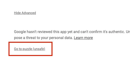
An authorization page opens with information about the script access. The top portion identifies what the code might be able to do. The puzzle code will edit the contents of this spreadsheet only.
It will NOT edit, create, or delete any other spreadsheets on your Google Drive.
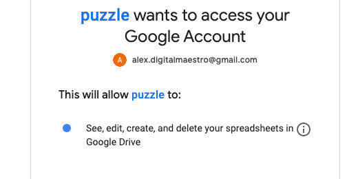
Click the Allow button.

The authorization page closes. You are returned to the Google Sheets crossword puzzle template. The Crossword menu option is added. It appears next to the Help menu option.

Click the Crossword menu. The menu has two options. They are Across and Down. Don’t select any of the menu options yet.

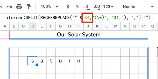
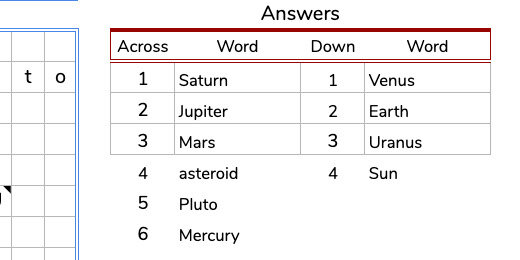
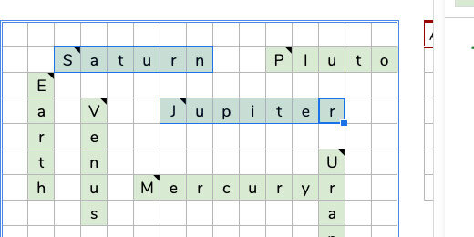
Type the word Saturn in the answers table. This will be number 1-across.

Click once on cell D4. It can be any cell you want. As long as there is enough room for the letters of the word to go across or down.

Go to the Crossword menu. Select the Across option.

Each function in the script needs to be verified before it is allowed to make changes to the current sheet once. You only need to verify each once. Click the continue button. Follow the same steps from earlier to authorize the script.

The script needed your authorization before it did anything on the sheet. The script doesn’t run the first time. It runs only after you provide authorization.
Go back to the Crossword menu and select Across.
The word Saturn appears in the grid. The letter S begins on the cell we selected. The rest of the letters appear to the right. One letter in each cell.

The code from the script appears in the Formula bar.

The cell reference in the formula is orange and points to cell S4. Cell S4 contains the word Saturn.
Type the word Venus in the table for 1 Down.
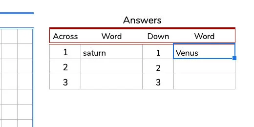
Go to cell E6. Click once a cell below the word Saturn. Go to the Crossword menu and select Down.

The first two are easy. I set them up to be easy. I set the cell reference for S4 and U4 by default. The rest aren’t much harder.
Type the word Jupiter going across for number 2.

Click on an empty cell in the grid. Make sure there is enough space for the word to fit within the grid going across.
Go to the Crossword menu and select Across. The word Saturn appears in the puzzle. The formula automatically points to cell S4.

Go to the Formula bar. Change the reference from S4 to S5. Press the Return key or click outside the Formula bar.

The word updates to match the word for 2 across.

One more together. Type Earth for 2 Down. Click on cell C5. Use the Crossword menu and select Down. Change the cell reference in the Formula bar. The cell reference is U5.

Adding more words is just this simple.
Review
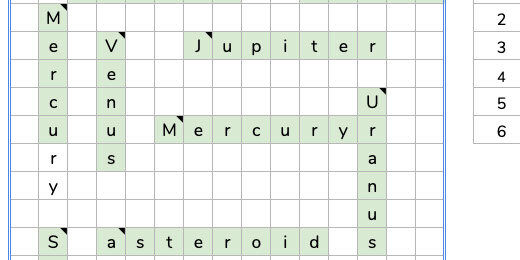
Before we go on I would like to take a step back. I want to preview how the puzzle will eventually work. Erase the words in the Answers table.

The words in the puzzle grid are removed automatically.

Type the word Saturn in the Answer table for 1 Across. Press the Return key or click on another cell. The word Saturn appears in the puzzle grid.
Type Jupiter in 2 Across. Type the wordS for Down into the table. Those words appear in the puzzle too.
Fill out the puzzle with the rest of the words.
The Clues
Crossword puzzles need clues. They also need numbers. Click on the letter S for Saturn.
Go to the menu and click Insert.
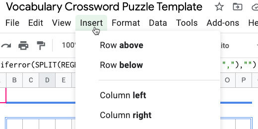
Select the Note option. The Note option has a Shortcut key option. The combination is Shift+F2. I recommend using this combination. It helps things go faster.

A note box opens next to the cell.

Type “1 Across: This planet has rings. It is the farthest planet that can be seen with the naked eye.”

Click on the cell for the letter E of Earth. Insert a note and type the information below.
2 Down: This is our home planet. The Big Blue marble.

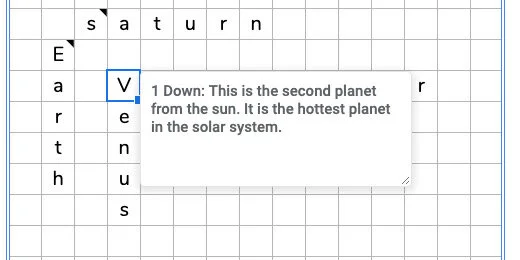
Go to the letter V for Venus. Enter this information in a note.
1 Down: This is the second planet from the sun. It is the hottest planet in the solar system.
Use this note for Jupiter.
2 Across: This is the largest planet in the solar system. Come up with your own clues for the rest of the planets. I have my clues available below if you want to use them.
Preview so far
Erase the words in the table. Move your mouse over a cell with the black triangle.

Enter the word for each clue in the Answer Table.
Use the rest of the words. Place them in the answer box. I only formatted the first three rows. I didn’t want you to think the puzzle entries had to be uniform. There are more words across than down.
Select the numbers and words for across and down.
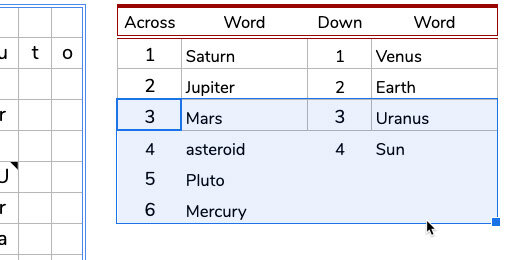
Click the Border format tool. Click the color picker and choose dark gray 1.

Click the all borders option.

Visuals
The puzzle by itself is plain. Regular crossword puzzles outline where the words go and how many letters are needed. That’s what we’ll do next.
Select the cells for the letters in the word Saturn.

Go to the menu and click Format. Select the Conditional formatting option.

The conditional formatting panel opens on the right. The formatting will be applied to the selected range. The formatting is applied if the cells are not empty. That is the condition that must be met. The selected cells are not empty. The cells for the word Saturn are green. That is the default cell fill condition.

The color format is set in the formatting style section.

Click the color background palette tool. Select the light green color. This is the color I prefer. Chose one that you want to use. Use light colors so the text is easy to read.
This isn’t the only range of cells we want to format. We want all the cells with words to change to green when students enter the answer. Click the range selection icon.

Click the Add another range button.

The range input box is ready for us to enter a range. We can enter the range manually or use the mouse to select the range. Using the mouse is much easier.

Select the cells in the word Earth.

The range information is added to the input field.
Click the Add another range button. Add another set of cells to the range. Repeat this process until all the words are selected. Click the OK button to finish selecting the ranges. The ranges are combined and listed in the range field.

The formatting is applied to the selected cells. This is a preview before we save the conditional formatting rule.

Click the Done button to save the conditional formatting rule.

We want to apply formatting to the cells for words that are empty. This shows where the words go, the orientation, and the number of spaces for the word.
There is another way to select the cells for conditional formatting. Begin by selecting one word.

The next step requires the use of a modifier key. Some people like to use modifier keys, others don't. Chrome and Windows users hold the Alt key down. Mac users hold the Command key down. Select the next range of cells while holding the modifier key.
I selected Saturn and Jupiter using the modifier key. Both sets of cells are selected. Keep holding the modifier key and select the other cells.
The selected cells appear in a darker shade of green. This is due to the combination of the blue selection color and the green cell color.

Go to the conditional formatting rules panel. Click the Add another rule button.

The selected cells are added to the range list. We need to change the condition for the rule.

Click the condition selector. Select the condition — for when the cell is empty.

Click the cell color palette tool. Choose a light yellow. Click the Done button.

We have two rules that apply to the same group of cells. One for when the cells are filled. One for when the cells are empty.

I like to include one more color condition option. Let’s look at an example. The answer for 2 down is Earth. What if a student answers Mars instead of Earth. A yellow cell points out that a letter is missing.

What if the student enters a longer word like Mercury. The letters extend outside the colored grid. The next conditional formatting will alert students to the mistake.
Select all the cells in the grid. Include the ones we already color-coded.

Add another rule. Set the conditional color to red. Leave the formatting rule set at “is not empty”. Click the Done button.
The letters in Mercury that extend beyond the cell range are highlighted with red.

Conditional formatting works in layers. The condition for green filled in cells is before the condition for red filled in cells. This is why the cells for the letters in the word are not red.
We are done with the conditional formatting panel. Go ahead and close it.
Student distribution
This is your teacher's master. We need a copy for the students. Click File in the menu and select Make a copy.

Use “Solar System Crossword Puzzle - Student” for the file name. Click the OK button.

Erase the answers in the answer table. Distribute the puzzle to students.
One more thing
I recommend adding instructions above the puzzle. A helpful reminder to students for where the answers are placed.

Puzzle script
The first five lines provide information about the code. The code uses functions to execute instructions. The first function is called onOpen. The instructions in the function attach the Crossword menu to the spreadsheet each time the spreadsheet opens. It also adds the Across and Down menu items.
Each menu item refers to the functions across and down. The first Across is the menu name. The across in lower case references the across function. The same is true for the down menu item.
The across function gets the current spreadsheet and the current cell. It sets the formula inside the cell. The formula is within the open and close parenthesis. The same instructions are used for the down function. The formula for the down function includes the transpose function. It changes the letters from going across to going down.
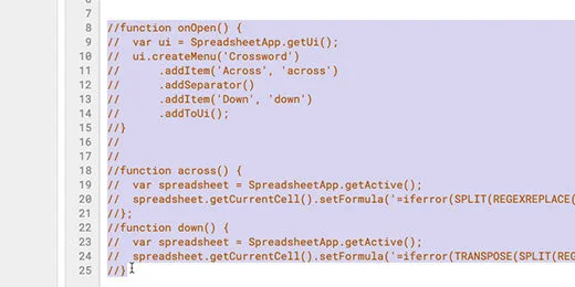
// The code below is used to enter the long formula into cells.// One formula is for words that go across.// The other formula is for words that go down.// The code creates a menu option.// The menu options include across and down.function onOpen() { var ui = SpreadsheetApp.getUi(); ui.createMenu('Crossword') .addItem('Across', 'across') .addSeparator() .addItem('Down', 'down') .addToUi();}function across() { var spreadsheet = SpreadsheetApp.getActive();spreadsheet.getCurrentCell().setFormula('=iferror(SPLIT(REGEXREPLACE("" & S4,"(\w)", "$1,"), ","),"")');};function down() { var spreadsheet = SpreadsheetApp.getActive(); spreadsheet.getCurrentCell().setFormula('=iferror(TRANSPOSE(SPLIT(REGEXREPLACE("" & U4,"(\w)", "$1,"), ",")),"")');}Elementary bar chart assignments with Google Sheets and Docs
In this lesson, we are creating an assignment generator for elementary age students. The generator uses emoji graphics to create a table of objects. Students use that table to create bar charts. Use the assignment generator to familiarize students with data and bar charts.

Introduction
Reading and interpreting information from graphs is an important skill. This skill is often required on standardized tests. Students have a better understanding of data when they learn to construct the graphs themselves. My students had an easier time interpreting information from graphs when they had first-hand experience creating their own.
This lesson is designed as an introduction to bar graphs. The assignments generated here are ideal for 2nd, 3rd, and 4th-grade students.
This assignment generator selects images and places them into a table. Students count the images and construct a bar chart. Students answer questions based on the graph they construct.
Use the links below to get a preview and copy of the final product.
We are using Google Sheets to generate the assignments. The assignments are copied to a Google Doc and distributed to students. Use the links below to get a copy of the Google Sheet starter template.
Google Sheet starter template copy
Use the link below to get a copy of the Google Doc assignment template.
Google Doc assignment template copy
Graphic data
We need something for students to count. Pictures of objects is a good place to begin. The spreadsheet template has two sheets. The first sheet is titled Graph. The second sheet is titled Lists. Go over to the Lists sheet.

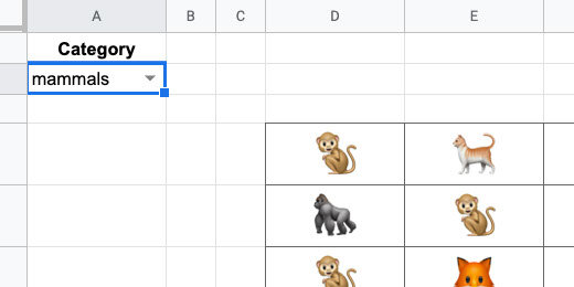
The Lists sheet has titles for birds, mammals, and bugs. Below each title is a series of numbers. Next to each number is the name of an animal.
We are using something called Unicodes. If you have seen some of my other lessons you have probably used Unicodes in math assignment generators. Unicodes represent a variety of characters.
Some Unicode characters include emojis. Yes, emojis. Don't worry, they aren't all smilies and strange shapes. Many of them are useful for our purpose. The number, Unicode, next to the animal name is used to display the emoji.

Go to cell E2 and type the function below.
=CHAR(C2)
The CHAR function reads a Unicode value and interprets it into the symbol it represents. Instead of typing the number 129413, we refer to the number in cell C2. The image of an eagle is appearing in the preview. Press the Return key to complete and the function.

Click back onto cell E2. Look for a blue square in the lower right corner of the cell. Click and drag that square down to match the row with the word rooster.
The blue square copies or duplicates the contents of the original selected cell or cells.

These are the images generated by each Unicode value.

Generate previews of the mammals and bugs in the same way. Use CHAR(F2) for mammals and CHAR(I2) for bugs. Type CHAR(F2) in cell G2. Type CHAR(I2) in cell K2.

These lists are the basis for the bar chart tables. Google sheets will select the animals from the list and randomly arrange them on a table.
The process for doing this is a little awkward so I want to demo the basics before we create the final table.
Go to cell A2 and type the function below.
=indirect(“D2”)
This function gets the contents or reference from the selected cell. That cell is D2 in this example.
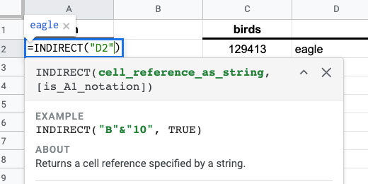
The content of the cell is the word eagle.

Double click on cell A2. Update the function with the information below.
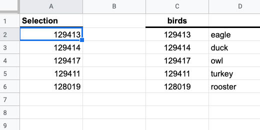
=INDIRECT(“D2:D6”)

This time all the values from the range are placed into cell A2 and fill the cells down the column as needed.

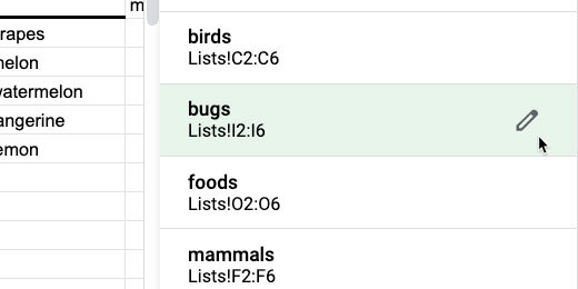
We are using the range of values in each category to generate the table. Typing the range like this is inconvenient. I want to use something easier and more intuitive. We are going to use something called Named Ranges. This calls a range of values with a keyword.
Select the Unicode values for birds.

Go to the menu and click Data. Select the Named ranges option.

Use the panel on the right to provide a name for the selected range. Use birds for the name and click Done.

Go back to cell A2 and double click the cell. Update the function using the information below.
=INDIRECT(“birds”)

The Unicode for birds appears down the column.
Select the Unicode values for mammals.

The Named Ranges panel is still open. Click the Add a range button.

Use mammals for the range name. The range names are the same as the headings. They need to be identical for this process to work. This is done on purpose. Make sure to use the exact name and spelling. Click the Done button.

Highlight the Unicode values for bugs and create a named range. Use bugs for the name.

Return to cell A2. Replace the range name with B1. Don’t place B1 within quotation marks this time.

Nothing appears in cell A2 because there is nothing in cell B1.

Type bugs in cell B1. Press the Return key. The Unicode values for bugs appear under the Selection heading. The Indirect function uses the range name bugs to populate the cells.

Change bugs to mammals.
Any other name or value entered into cell B1 gives an error in cell A2. This is part of the reason the names in named ranges is important.

Erase any value you entered into cell B1.
Category selector
Switch to the Graph sheet.

Go to cell A2. Go to the menu and click Data. Choose Data validation.

Click the List range icon selector.

A select range dialogue box opens. Ignore this box for now.

Click the Lists sheet.

Select the cells from C1 to I1. The information in the data range field appears as Lists!C1:I1. Click the OK button.

Click the option to reject other input. Click the Save button.

Go back to the Graph sheet. Cell A2 has a drop-down selector.

The selector uses the headings we selected in the Lists sheet. The headings are the same names used in the Named ranges.

Select the column headers B and C. Hold the Shift key while clicking on each column header.

Click one of the Header action triangle.

Select the option to resize columns B-C.

Set the column size to 35. Click the OK button.

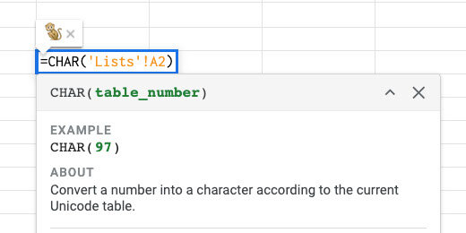
Go to the Lists sheet. Select cell A2. Update the function information with the information below.
=INDIRECT(‘Graph’!A2)
We are pointing the INDIRECT function to cell A2 in the Graph sheet. Indirect will look at the value in the cell and pull the values from the selected Named range.

You might get an Error message like my example. That’s OK.

Return to the Graph sheet and select one of the category options.

Return to the Lists sheet. The Unicode for the selected category is listed.

Return to the Graph sheet. Select cell D4. Enter the function below.
=CHAR(‘Lists’!A2)
This uses the value in the Lists sheet and cell A2. Press the Return key.
Use the category selector and choose a different category.

In my example, I chose bugs. A butterfly appears in the cell.
The first Unicode value appears in the cell for each category. We want a random image to appear each time. To get the random image we need to use a formula that is a little complex. Replace the function in cell D4 with the formula below.
=CHAR(INDEX(Lists!$A$2:$A$6,RANDBETWEEN(1,5)
The CHAR function has two embedded functions. The INDEX function returns the contents of a cell as a list. The cell is selected by the RANDBETWEEN function. It selects a cell between 1 and 5. The selected cells are numbered by the INDEX function. It chooses a cell between A2 and A6. A2 is the first cell, A3 the second, and A6 the 5th. These cells are in the Lists sheet.
Make sure you include the dollar symbols in the cell reference. This sets the cell reference to an absolute cell reference. This is important for the next steps.

Bugs is my chosen category. An ant appears in cell D4.
Choose a different category. A random image from that category is placed in cell D4.

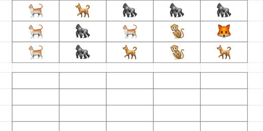
Click on cell D4. Click and drag the blue square down five rows to row 8.

Keep the rows selected and drag the blue square to column H.
We have a table with 5 rows and 5 columns. Each cell in the table has a random image from the category. Choose a different category and the images will update.

Formatting the tables
The hard part is over. Now we begin the process of formatting the table for the assignment. We are going to change the row height to resize the emojis. Click the row header for row 4. Hold the Shift key and click the header for row 8.

Right-click one of the row headers. Select the option to Resize rows 4-8.

Set the row height to 45 pixels. Click the OK button.

Use the font size selector to set the font to 24 points. The images are characters represented by a Unicode. Unicode characters are formatted like letters and numbers.

Use the text-alignment selector to center the cell contents.

Use the vertical-alignment selector to align the contents in the middle of the cells.

The emojis are easier to see now.

Deselect the rows and select the cells with the emojis only.

Click the border formatting tool. Set the border color to a medium gray.

Choose the all-borders option.

Select the row-headers for rows 10 to 20. We are skipping row 9.

Right-click one of the row headers. Select the option to resize rows 10-20. Set the size to 35 pixels.

Select the cells from D10 to H21. The cells in row 21 will hold the titles for each bar in the chart.

Use the border configuration selector to set the same gray border around each cell. This table is used by students to create a bar-chart.
Use the cells in column C to number each row. Begin with row 20 and number 1. Number each row up until you reach 10 in row 11.

Select the cells with the numbers. Use the text-alignment option to center the text. Use the vertical-alignment option to set the alignment to the middle.
Select the cells from D10 to H10.
Click the merge cells button.

The bar chart generator and template is complete. We are ready to send this to a Google Doc for distribution to students.
More emojis
Before we do that, let's learn how to add more emoji characters. I used the quackit.com website to get the Unicode. I like this site because it includes a visual of each Unicode emoji. Use the link below to get to the animal emoji page.
The page has a table with columns for the emoji and a name for the emoji.

Other columns include the hexadecimal and decimal codes. Google Sheets uses the decimal code.

Only the numbers are used. The other characters are used with HTML code on web pages.

Use the Emoji characters menu to select different emoji categories.

There are hundreds of emoji characters and codes. I collected most of these characters for you on the sheet. Return to the Google Sheet. Click the All Sheet selector. Select the emojis sheet.

The sheet has 521 emoji characters and codes.

New categories
Let’s add another set of images. Select five characters and codes. Include the code, emoji, and name column. Copy the selection.

Go to the Lists sheet. Click on cell L2 and paste.

Type the word marine for the header. We are using one name header. This is necessary because Named ranges cannot have spaces in the name. I chose marine but you can choose amphibian.
Select the codes in column L.
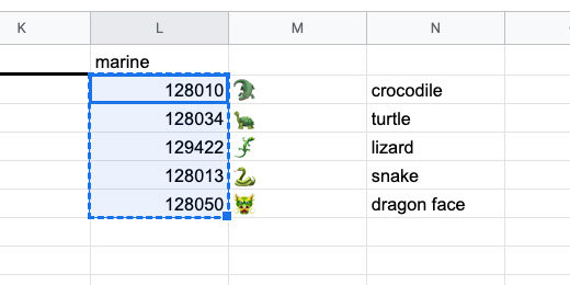
Go to the menu and select Data. Select the Named ranges option. Set the name of the range to marine. Click the Done button.
Important note. Range names cannot have spaces. This is why I chose one word for the range name and category. The category and range name have to be identical! I know that I am repeating but this is important.

Go to the Graph sheet. The marine category is not part of the selector. We need to add it.
Select cell A2.
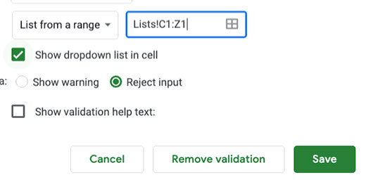
Go to the menu and click Data. Select the Data validation option. Click the sheet selector in the validation configuration box.

The selection for the category names begins on cell C1 and extends to cell I1. We need to extend the range to cell L1.
We don’t want to keep updating the range every time a new category is added. We want the name added automatically. To do this we instruct the range to begin on cell C1 and look at every cell to the right of it. Replace the letter I with Z. Z is the last column in the sheet. The updated range looks like the range shown below. Click the OK button.
Lists!C1:Z1

Leave all the other options the same. Click the Save button.
Click the category selector and choose marine.
Update emoji information
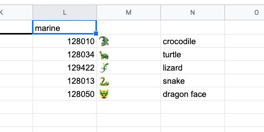
I see a dragon on my table. We can fix this with ease.

Return to the emoji sheet. Select a marine animal code. Copy the information.

Paste the information over the dragon information in the Lists sheet.

Return to the Graph sheet. The dragon is replaced by the whale emoji.

Make your lists
You don't have to go with the categories or lists as they are on the sheet. Create your own by copying and pasting different codes. I created a food category with a mix of food from different categories.

The category appears automatically in the category selector.

Now I have images for a food graph.

Replace categories
You don’t need to use the categories I created. Replace these categories with your own. In this example, I replaced the bugs category with fruit.

Update the range name before using the category. Go to the menu and select the Named ranges option. Click the pencil icon next to the old category. In this example, that is bugs.
Update the name and click the Done button.
Google docs assignment
I created a template for you to use with the generator. Use this or your own. I have placed the link below for your convenience.
The template includes header information. The header includes the assignment title and brief instructions. The template is set up to use the legal document page format. This provides more room for questions and student responses.

Return to the Google Sheets tab. Click view and select Gridlines. This hides the Gridlines on the sheet.

Select the images and bar chart tables. Make sure to include the column with the numbers. Copy the selection.

Return to the Google Docs tab. Paste the selection. Select Paste unlined when prompted.

We need some final adjustments.

Students use the top row for the chart title. You can include this before distribution.

Use the bottom cells for the item titles. You can include them but I prefer students to add this information themselves.

How it works
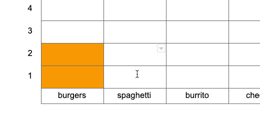
Students count the number of matching items. The table has 2 burgers. Students select cells 1 and 2 in the burgers column.

Click the cell background fill tool. Select a color. You may allow students to select their colors or you might want to designate the colors they need to use. Students like to choose their colors but they often spend too much time doing this step.

The cells are filled with the selected color.
Repeat the process for the other items.

Chart questions
It is a good idea to include questions related to the chart. This is what students will typically do when they see charts on standardized tests.

Student version
This chart is your teacher's master with the answer key. Make a copy for student distribution. Go to the menu and click File. Select the option to make a copy.

Rename the copy for students.

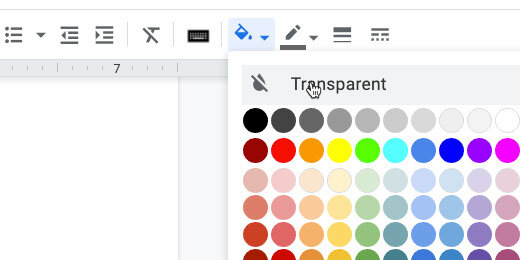
Select the bar chart cells. Set the background color. Use transparent or white. Distribute this copy for the assignment.
Fraction assignment generator for reducing fractions
In this lesson, we are creating a fraction assignment generator. This generator creates an assignment generator for reducing fractions. This assignment generator is an extension of the least common multiple and greatest common factor generator.

Reducing fractions
Reducing fractions is important. This is a natural progression from Least Common Multiples and Greatest Common Factors. This generator focuses on creating assignments for students to practice reducing fractions.
Use the links below to see a preview of the final product and get a copy.
Reducing fractions assignment preview
Reducing fractions assignment copy
I have a spreadsheet template to get us started. It is formatted with the headings and columns we need. Use the link below to get a copy.
Reducing fractions spreadsheet lesson template
The template
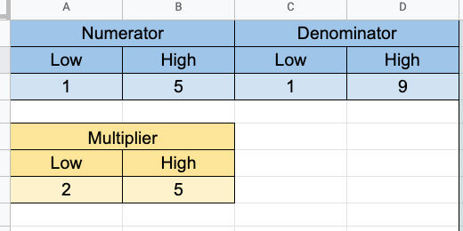
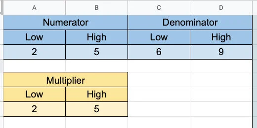
The left side of the generator has place holders for the numerator and denominator variables. We will call on these variable numbers using a function. There is a smaller table with a multiplier. This multiplier helps create the fractions that need to be reduced.
The right side of the template is where the generator is created.

Numerators and denominators
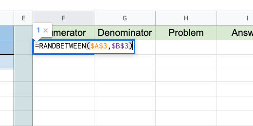
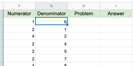
Open the Google Sheet and click on cell F2. Type the function below into the cell and press the Return key.
The RANDBETWEEN function selects a random number between a lower and an upper number. These numbers are usually entered directly into the function. Our function gets the values from the cell variables in A3 and B3. We will update these numbers later and the function will select a number from the new values.
=RANDBETWEEN($A$3,$B$3)
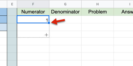
The cell has a random number chosen from the range 1 to 5. Click back on cell F2. Look for the blue square in the lower right corner. Click and drag that square down to row 11.
The function is copied down the column to row 11.

Go to cell G2 and type the function below.
=RANDBETWEEN($C$3,$D$3)

Press the Return key to save the function. Double click the blue square. The blue square uses the values in the column on the left as a guide. Each value on the cell to the left is used as a reference. The copy process stops when it doesn't encounter values in the left cell.
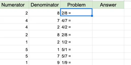
Go to cell H2. This is where we will create the template to be used in assignments. Type the formula below.
=F2&”/“&G2&” = “

The formula is doing several things. The numbers in cells F2 and G2 are being referenced. The ampersand is used to connect cells and text. They are Concatenating the number in cell F2 with a forward slash and the number in cell G2. This creates a fraction.
We need to use the ampersands because the forward-slash by itself would be used to perform the operation. You will see this in the next step.
Double click the blue square to copy the formula down the column.
Go to cell I2 and type the formula below.
=F2/G2

Copy the formula down the column. We didn’t use the concatenation and quotation marks here. The forward slash divides the numerator by the denominator.
The answers are calculated as decimals. We need to get answers in fraction form. Select all the answers in the column.

Go to the menu and click Format. Go to the More formats option. Select Custom number format.

Click inside the Custom format box. Type the format below.
_# ??/??

Click the Apply button.
We have a variety of answers. Some of the answers are improper fractions.

Go to the numerator and denominator configuration section. Set the range of the numerators from 1 to 5. Set the range of the denominators from 6 to 9. This forces all our fractions to be proper fractions.
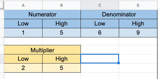
We want sets of problems where students reduce fractions. To create these fractions we increase the values for the numerator and denominator. Change the values in the denominator. Try 5 for the lower and 9 for the upper. Change the values in the denominator. Try 10 for the lower and 20 for the upper.

This doesn’t give us too many fractions that need to be reduced.
We need a multiplier for the numerator and denominator.
Click on cell F2 then go to the Formula bar. It’s easier to edit a long formula using the formula bar.
Update the formula so it looks like the one below.
=RANDBETWEEN($A$3,$B$3)*RANDBETWEEN($A$7,$B$7)
This function multiplies a random number into the random number generated for the numerator. The values for the random number come from the multiplier table. The table has a lower value of 2 and an upper value of 5.

Update the cells down the column with this change. We can’t double click the blue square to copy the update down the column. We need to drag the blue square down toward the last cell.
Double click on cell G2. Update the formula with the one below. It performs the same function for the denominator.
=RANDBETWEEN($C$3,$D$3)*RANDBETWEEN($A$7,$B$7)

Copy the updated formula to the cells down the column. Drag the blue square down to the last cell.
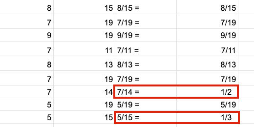
Change the numerator and denominator range values. Set them to something lower. I went back to 2 and 5 for the numerator. I used 6 and 9 for the denominator.
We have fractions for students to reduce.

Select the cells with the answers. Use the alignment selector to align the answers to the left.

Select the cells with the problems. Use the alignment selector to align the problems to the right.

Google doc assignment
I have a Google Doc assignment template for you. Use the link below to get a copy. Use this template or create your own Google Doc for the assignment.
Google Doc reducing fractions template
Open the template or create a new Google Doc and return to the reducing fractions generator. Select the cells with the problems and answers. Don’t select the headings. Copy the contents to memory.

Switch to the Google Docs tab. Click Edit and select Paste. Select the option to Paste unlinked.

Right-click on the top-left cell. Select — Insert column left.

Drag the left column border to the center of the first column.

Select the second and third columns.

Right-click one of the selected columns. Choose the option to distribute columns.

Number the problems from 1 to 10 down the first column. I recommend using a closing parenthesis after the number. This helps avoid confusion with the numbering and the problems.

Select the border between the problems and answers. Nudge the border to the left.

Select all the cells in the table. Set the font size to 14 points. Use the border-color tool to select a very light color. The table border should not be a distraction.

Student copy
This is your teacher's master. Make a copy for student distribution. Go to the menu and click File. Select the option to make a copy.

Rename the copy as a student assignment.

Select the column with the answers. Press the Delete key to erase the answers. Distribute this copy to students.

Basic math problem generator with Google Sheets
In this lesson, we are creating a math assignment generator. We are using Google Sheets to generate math problems. The math problems include basics like addition, subtraction, division, and multiplication. The problems are copied to a Google Doc and formatted for distribution to students.

Introduction
Practice assignments are important when learning a concept. Practicing problems helps students hone their skills and understanding. There was a time when worksheets were used to drill students on skills. This eventually was overdone because teachers used them for everything. Worksheets were termed drill and kill.
Practice assignments apply skills repeatedly. It is similar to developing muscle memory. In this case, they are developing mental or skills memory. Skills memory is important for standardized assessments.
Students quickly forget skills and concepts if they are glanced over without enforcement. For example, if we cover fractions at the beginning of the year and never return to them, students forget. Skills should be revisited regularly in a variety of contexts.
Repeated assignments help teachers evaluate the formation and retention of skills.
In this lesson, we will create a spreadsheet in Google Sheets to generate math practice assignments. The template is built around the basics. Those basics include addition, subtraction, multiplication, and division.
The generated assignments are transferred to a Google Sheet for distribution to students.
If you like this lesson please consider purchasing a PDF version. The purchase lets me know you like the lesson and it supports my efforts.
Purchase a printable PDF version of this lesson ($5.00)
Links to the finished products are available below.
Preview and copy of the finished product(addition)
Preview and copy of the finished product(subtraction)
Preview and copy of the finished product(multiplication)
Preview and copy of the finished product(division)
Google Sheet Generator
Go to your Google Drive and create a folder to store the generator. Here is an example of what I do. I create an assignment folder. The assignment folder has a math folder. In that folder, I have my generator. This folder has folders for the eventual products created with the generator.
Create a spreadsheet. Set the name of the Sheet to Basic Math Generator.
The generator uses a function called RANDBETWEEN. This function selects a random number from a provided range. The range has a lower number and an upper number.
Type the title Addend 1 in cell A1. Type the title Addend 2 in cell C1. Type the titles High and Low in cells A2 and B2. Type the same titles in cells C2 and D2. Type the number 5 in cell A3 and the number 1 in cell B3. Type the same numbers in cells C3 and D3. We will begin with these numbers for our range.
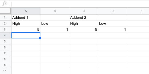
Select cells A1 and B1.

Go to the button bar and click the merge button.

Repeat the process to merge cells C1 and D1.

Select the cells between A1 and D3.
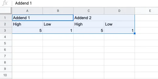
Go to the button bar and click the alignment selector. Choose the center align option.

Change the font size to 12. Click the background selector tool. Select a light color.
Select cells A3 to D3. Change the background color. Use a color that compliments the first. I have chosen a light blue and orange. This makes the generator useful and pleasant to use.
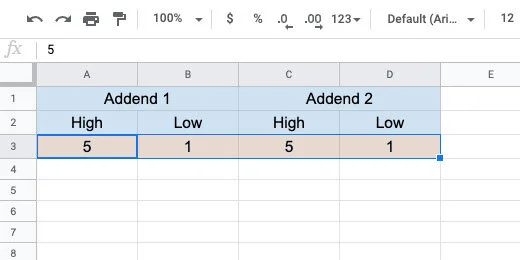
Click the letter E for column E.

Click the border selector. Choose the left border option. Don’t move away from the selector yet.

Click the border thickness option. Choose the third option.

Type the titles Problem #, Addend 1, Addend 2, Problem and Sum in cells E1, F1, G1, H1, and I1. Set the font size to 12. Change the background of the cells. Use a light color. I choose a light green.

Type the numbers 1 through 20 down column E. Begin in cell E2.
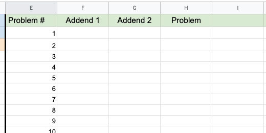
Go to cell F2 and type the function below. The function selects a random number between the numbers in cells A3 and B3. The lowest number must be first. This is why the first cell reference points to B3. The dollar symbols set the cell reference to an absolute cell reference. Press the Return key to set the function.
=RANDBETWEEN($B$3,$A$3)
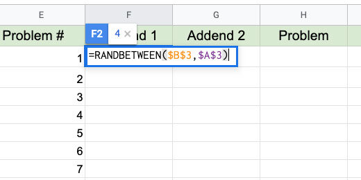
The number generated in my example appears in cell F2. Go back to cell F2. Look for the blue square in the lower right corner. Double click this square.

This copies the function down the column. This option works because there is content in the left column. It will copy the function as long as it encounters content in the left column. The copy process ends at number 20.

Go to cell G2. Type the function below into the cell.
=RANDBETWEEN($D$3,$C$3)
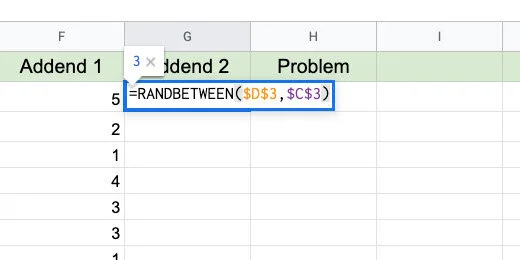
Double click the blue square to copy this function down the column.
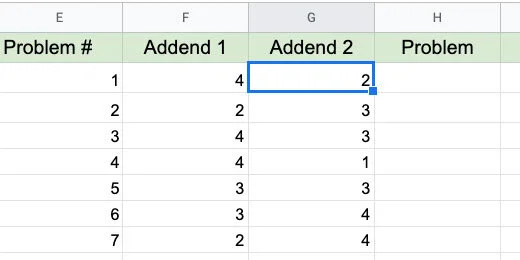
Go to cell H2 and type the formula below.
=F2&” + “&G2&” = “
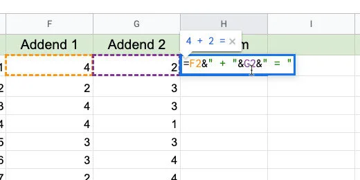
I refer to formula and function. A function has one purpose. A formula is a combination of functions and operations.
F2 references the number in that cell. The ampersand is used to join, concatenate, two functions, or formula. We can't use the add symbol by itself. It would just add the contents of the cells together. The quotation marks set the add symbol as text. There is space between the add symbol to make the problem easier to read. The Add symbol and space is concatenated with the number in cell G2. The equal sign with spaces is concatenated with G2.
Double click the blue square to copy the formula down the column.

Change the high and low numbers to adjust the difficulty of the problems. Use single or double digits. There is no limit. Use numbers of any size.

Go to cell I2 and enter the formula below. Double click the blue square.
=F2+G2

This is the basic addition problem generator. The rest of the generators are based on this one.
Subtraction
Double click the Sheet 1 name. Change the name to Addition.

Click the actions triangle next to the sheet name.
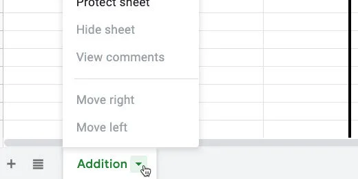
Select the Duplicate option.

Change the name of the duplicate sheet. Use Subtraction for the new name.
Change the names of the columns for the number ranges. The column names are Minuend and Subtrahend.
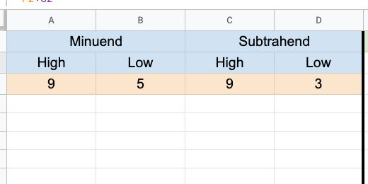
Update the heading in the generator section. Replace Sum with Difference.

Double click on H2. This places the cell in edit mode.

Replace the addition symbol with the subtraction symbol. Press the Return key to update the formula.
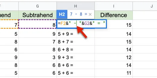
Click back onto cell H2. Drag the blue square down the column to update the rest of the cells. We can't double click the blue square this time.
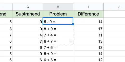
Double click on cell I2. Change the addition to subtraction.

Drag the blue square down the column to update the rest of the cells.

Some of the answers are negative numbers.

To prevent negative numbers we need to change the range values. The range of values for the subtrahend must be smaller than those of the minuend.

Multiplication
Make a duplicate of the subtraction sheet. Change the name of the duplicate to Multiplication.

Change the titles for the ranges. Use Multiplier and Multiplicand. You can also use Factor 1 and Factor 2.
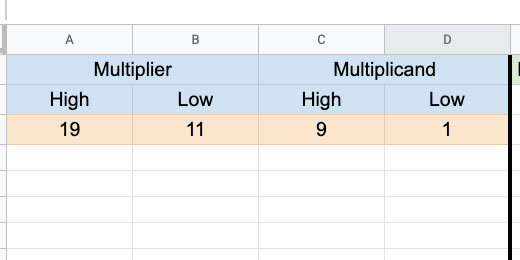
Update the titles in the generator section. Replace Difference with Product.

Double click cell H2. Replace the subtraction symbol with a letter x. Update the cells down the column.
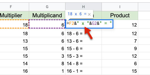
Double click cell I2. Change the subtraction operator with an asterisk. An asterisk is used to multiply values. Update the cells down the column.
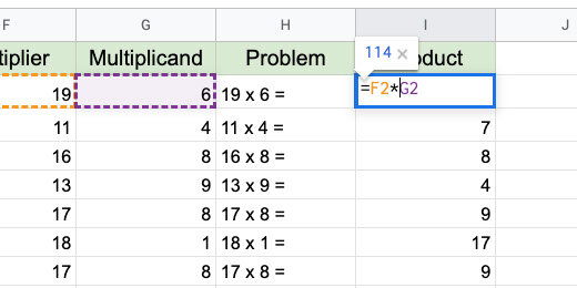
That's all there is to the multiplication generator.
Sometimes we need to transition from the letter x for multiplication to the Dot symbol. This is how to use the dot symbol for multiplication.
Double click H2. Replace the addition symbol and the quotation marks with CHAR(8901). Update the cells down the column.
=F2&" "&CHAR(8901)&" "&G2&" = "
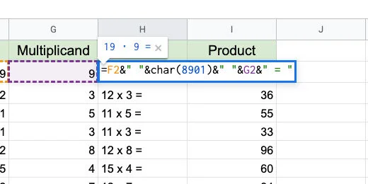
CHAR is a function. It uses Unicode values to generate almost any symbol. Every symbol available to computers is represented with a Unicode value. The value for the Dot multiplication operator is 8901. The quotation marks between the ampersand are used to add space.
The link below has a nice page with a visual reference for several math Unicode values.
http://xahlee.info/comp/unicode_math_operators.html
The dot symbol is in the Operators section. The value appears when we hover the mouse arrow over a symbol.

Division
Make a copy of the multiplication sheet. Change the name to Division. Update the titles for the ranges. The titles are Dividend and Divisor.

Update the titles on the Generator. Replace Product with Quotient.

Double click on cell H2. Update the formula with the formula below.
=F2&" "&char(247)&" "&G2&" = "
This is the same format used to replace the x with the Dot symbol for multiplication. If you used the dot symbol all you need to do is replace the code with 247. Update the cells below.
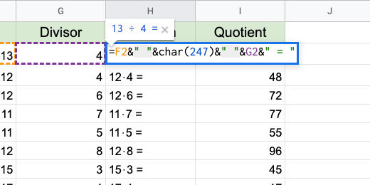
Double click on cell I2. Replace the asterisk with the forward slash. Update the cells down the row.

Most of the answers are in decimal format. Decimals are the remainder of the division problem. Remainders are often represented as fractions.

Fractions
Click on cell J1. Type the title Fraction. Update the cell background color.

Click in cell J2. Type =I2. This copies the contents of cell I2 into cell J2. Copy the formula to the cells down the column. Hint: double click the blue square.

Select all the cells below the Fraction title.

Click Format and go to the Number option.

Go to the bottom of the Number format options. Select Custom number format from the More formats option.

Type # ??/?? in the custom format bar. This builds a number format where a whole number replaces the # symbol. Decimal values are converted to fractions and formatted with ??/??. Each question mark represents a number. Click the Apply button.

The answers are represented as fractions.

Remainders
Before students use fractions, they use remainders. Click on cell K1. Type Remainder for the title. Change the cell background color. Update the font size and center the title.

Type the formula below into cell K2. Copy the formula to the cells down the column.
=ROUNDDOWN(J2,0)&" R "&MOD(F2,G2)

The ROUNDDOWN function rounds the decimal value. It gets the value in cell J2. The 0 is used for not decimal place value. We concatenate the letter R for the remainder within quotation marks. The MOD function is short for Modulus. Modulus determines the remainder in a division. To determine the remainder it needs to perform the division. It divides F2 by G2.

No Remainder
Most fractions have remainders. When students first learn division we avoid remainders. Division is usually taught along with multiplication. The relation of both operations is demonstrated with the back and forth of both operations.
Make a Duplicate of the Division sheet. Rename the sheet to Division No Remainders.
Double click cell F2. Add G2* after the equal sign. This multiplies the random number by the divisor. No remainders. Update the formulas down the column.

There isn’t a need for the fraction or remainder column. Select both columns.

Click the action triangle on one of the headers.

Select, Delete columns J-k.
The basic generators are complete. Let’s use them to create assignments.
Google Docs
Leave the generator sheet open. Go to Google Drive and create a new Google Document. Name the document Division with remainders 01.

Go to the menu and select Insert. Go to Headers & footers. Select Header.

Type the title "Division with Remainders 01". Provide instructions below the title. Use the Title paragraph style for the title. Set the instructions font size to 14 points. Press the return key twice to add some space. Click on the body of the document to close the Header section.

Return to the math generator sheet. Select the regular Division sheet. Select the first ten problems.

These are old problems. We can generate new problems on the sheet at any time. New problems are generated in several ways. They are generated when we open the spreadsheet when we refresh the page, and every minute through the settings.
There is an option I prefer. Click on the first cell for the first problem. Click and drag the blue square down to the number of problems you want to regenerate.

This regenerates all the problems and selects the problems we want for the assignment.

The answers are two columns over. To select the cells we need to use a modifier key. Windows and Chromebook users hold the Alt key. Mac users hold the Command key. Select the matching answers in the Remainder column.
Go to the menu. Click Edit and select Copy.

Go to the Google Document tab. Click Edit and select Paste without formatting.

Highlight the problems.

Change the font size to 18 points.

Click the line spacing selector and choose Double.

Click the Numbered Bullet list option with parenthesis.

Move the First line indent bar to the left. Stop when the indent is a 0.0.

Deselect the problems.

This is your teacher's master. We need a copy for the students. Go to the menu and click File. Select the option to make a copy.

Remove the "Copy of" from the beginning of the name. Add "for students" at the end of the document name. Click the OK button.

Delete the answers from the student version.

Repeat this process with any number of math assignments from the problem generator.
Word Jumbles with Google Sheets and Docs
This lesson teaches you how to create word jumble exercises. Word jumbles are fun activities for students. They are useful for decoding and spelling. Use word jumbles with context clues in sentences. Use them with the word definition for review. Use word jumbles with Cloze sentences. This lesson builds on the skill learned in the Word Search lesson.

Introduction
Vocabulary is such an important part of the development of language. It is important for the development of comprehension in reading. It facilitates language development. Increases communication skills. Facilitates the communication of ideas. Increases writing skills. I have a couple of links below with information on the importance of vocabulary development.
https://www.scholastic.com/teachers/articles/teaching-content/understanding-vocabulary/
https://infercabulary.com/top-5-reasons-why-vocabulary-matters/
Learning vocabulary doesn't have to be the tedious process of memorizing the spelling and definition of words. Vocabulary games like crosswords, word searches, and word jumbles provide fun ways for students to apply vocabulary skills. With these tools, students are not asked to memorize. They are applying the use of vocabulary in fun ways.
I created a set of instructions for using Google Sheets and Docs to create word search puzzles. The link is available below.
https://digitalmaestro.org/articles/word-search-puzzles-with-google-docs
In this lesson, I want to show you how to create word jumble puzzles. This lesson builds on the skills from the word search lesson. I will review the basics here for you.
A link to the final product is available below.
Click the Use Template button to get a copy.Google Docs word jumble preview and copy
This lesson is available in a printable PDF version.
Preparation
Use the link above to get a copy of the vocabulary Sheet. The sheet has three columns of vocabulary words. Teachers like to present the vocabulary in one of two ways. Some teachers like to use the words will all uppercase letters. Other teachers prefer all lowercase letters. This first step demonstrates how to covert the case of your words using Google Sheets functions.
The Google Sheet has a list of vocabulary words. This word search reviews mammals covered in the lesson. In the sheet, I have the same list repeated three times. One column has the names with the first letter capitalized. The second has the letter in all upper case. The last has them all in lower case.
You can format the word search using all uppercase or all lowercase letters. The choice is yours. I want to show you how to format the words without having to retype them.
Google Sheets has plenty of useful formatting tools. I begin with Sheets when I have to deal with complex products.
Lowercase
Each word begins with a capital letter in the first column. I want all the letters to be lowercase.
Click on cell B2 and type =LOWER(A1). Press the Return key to apply the formula. This converts all the letters in the word to lower case.
Select cell B1 again. Click the blue square in the lower right corner and drag it down.
This copies the formula down the column. Stop when you reach the end of the word list.

All the letters in each word are now lowercase.
Uppercase
The next column has words that are all lowercase.

Click in cell E1 and type =UPPER(D1). Press the Return key.

Return to cell E1. Click the blue square and drag it down the column.
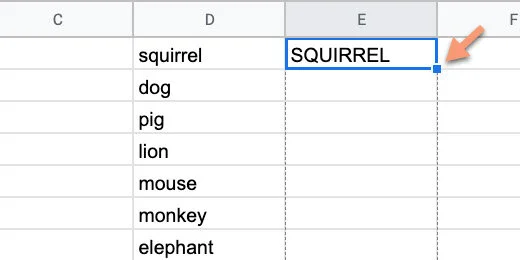
The letters in each word are transformed to uppercase.

Proper Case
Converting letters to upper or lower case it not all we can do. There is a function for converting the first letter in each word to upper case. It also changes the letters after the first letter to lowercase.
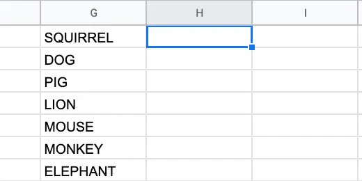
Click in cell H1 and type =PROPER(G1). Copy the function down the column.
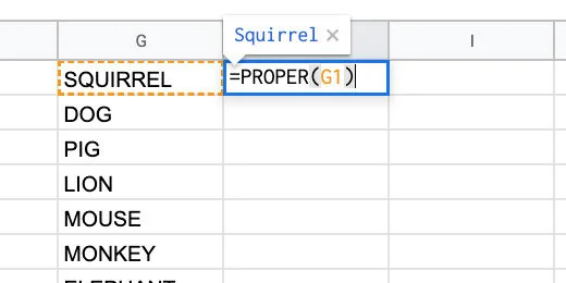
Selecting an option
We have three options for the word search lettering. We only need one. The other options need to be removed. I am using the uppercase option.
This is how to remove the unwanted word list. Click on the column header with the word list to be removed.
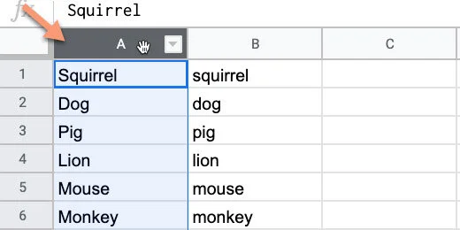
Click Edit and select Delete column. The column you are deleting is identified by the column letter.

The column that used the formula to convert the letters is filled with error messages. Click the column header and delete the column.
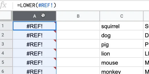
Keep deleting columns with the word lists you don’t want to use. Your list needs to be in the first or second column. You cannot have any content to the right of the column with your words.
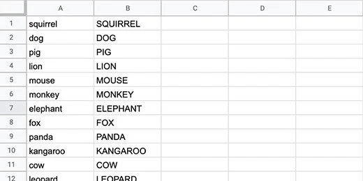
Segment the letters
The letters for each word need to be in separate cells. Again, we are using Google Sheets to help with this process. Sheets has a split function. We are using this function in combination with Regular Expressions. Regular expressions are a type of code used to manipulate text. It is used very often by programmers.
Click in the cell to the right of the first word. Type or paste the formula below. Replace the B1 with A1 if your words are in column A.
=SPLIT(REGEXREPLACE("" & B1,"(w)", "$1,"), ",")
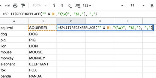
The regular expression finds each letter in the word. It adds a comma after each letter. The Split formula uses the comma to split each letter and place it on a different column.

Click back on cell C1. Use the blue square to copy the formula down the column.
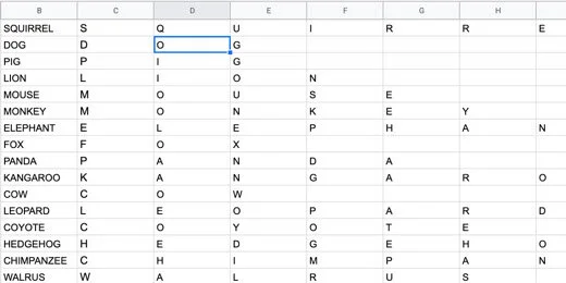
Random letters
Jumbled words need jumbled letters. Google Sheets has a tool to let us jumble the letters. The tool only works with words or letters listed in a column. We need to transpose the letters from rows to columns.
Create a new sheet. Click the Plus button.
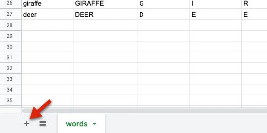
Rename the sheet Jumbles.

Return to the Words sheet. Select the columns with the word and the letters of the word. Make sure you select all the letters.
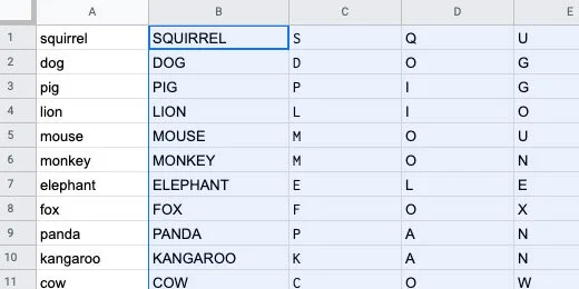
Go back to the Jumbles sheet. Click on cell A10.
Click Edit and go to the Paste Special option. Select the option to paste the values only.
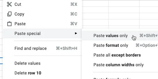
The contents are pasted and selected. Make sure the contents remain selected for the next step. Copy the pasted contents again.

Select cell A1. Click Edit and go to the Paste Special option. Select the option to paste transposed.
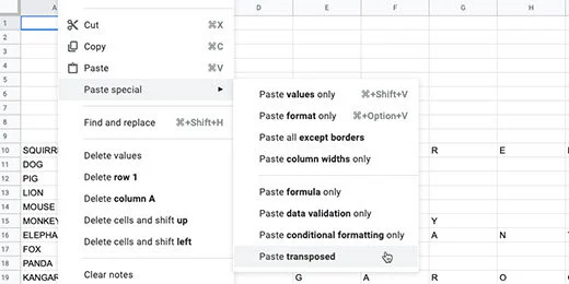
The contents are pasted so the letters go down the column.
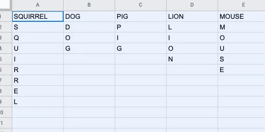
Select the letters in the column for squirrel.

Go to the menu and click Data. Select the Randomize range option.
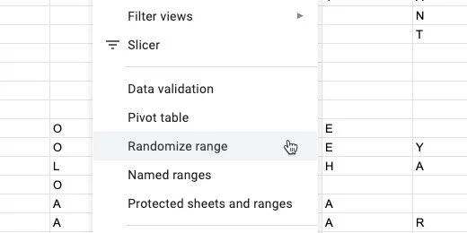
The letters are rearranged randomly.
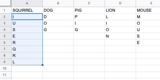
We need to repeat this process for all the words. The process is easy. It can get tedious if you have lots of words. I like to use a special tool in Google Sheets to perform routine tedious tasks.
We are going to create a Macro to handle the tedious repetitive task for us. A macro records a set of steps. It then replays those steps whenever we need them.
Click Tools in the menu. Go to the Macros option. Select the option to record a macro.
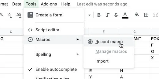
A macro recording box opens. This is not recording your screen. It is recording the selections, mouse clicks, and keystrokes. It is only recording actions taken on the Google Sheet.
Select the option to “use relative references”. This means we will be able to use the macro on any selected cells in the sheet.
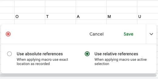
Select the letter for dog. Select all the rows down to row 13. The word dog is one of the shortest words we have on the list. We want this macro to work on longer words. The longest word length goes to row 13. The letters pushed the words down from the 10th row. Click Data in the menu and select Randomize range.
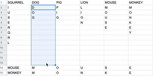
Those are the only tasks we want to record. Click the Save button to stop recording.
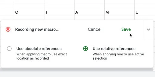
Set the name of the macro to random letters.

There is an option to create a shortcut key combination. The combination begins with three keys. They include Command, Option, and Shift on Mac. These keys on Windows or Chromebook are Alt, Option, and Shift.
There is a blank for a number of your choosing. I like using shortcuts. They help save lots of time. I’m entering the number 0 into the number field.
Click the Save button.

Click on the letter D in dog.
Click Tools in the menu. Go to Macros and selected the random letter macro.
The macro is a program script. The script is going to make changes to the sheet. We need to authorize the script to make changes. Click the Continue button.

Select your account when prompted. Click the Allow button.

Click on the letter D in dog again. Run the macro if the letters didn’t scramble.
Go to the next word and repeat the process. Use the shortcut key combination to go faster. Use the right arrow key to select the beginning of the next word.

Use this process to quickly jumble the letters for each word.

We can scramble the letters again. Click on the first letter of a scrambled list of letters and use the macro. This is helpful when creating more than one jumble exercise.
Range names
Ranges are a selection of cells. The selection of all the cells with letters is a range. Range names help quickly call up these cells with letters. We need to call the letters to form our word jumble puzzles.
Select the letters in the word squirrel.
Click Data and select Named Ranges.

A Named ranges panel opens. Change the named range name to squirrel. Click the Done button. Keep the panel open.

Select the next word. Go to the Named ranges panel. Click the Add a range button.

Set the name of the range to that of the word it represents. Click the Done button. Repeat this process for all the words.

The puzzle
Create a new sheet. Name the sheet puzzle.
Click the and drag along the column headers. This selects the columns.
Hover over one of the columns to display a selection arrow.

Click the selector. Choose the Resize columns option. The columns A - M should be shown.
Enter 35 for the column size. Click the OK button.

Click on cell A1. Type =transpose followed by an open parenthesis. Transpose is a function that changes the order of a range of cells. The cells in the word ranges are vertical. We need to convert them to horizontal ranges.
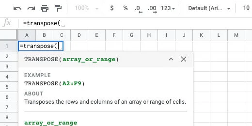
Type the word squirrel. Google Sheets provides recommendations. One of the recommendations is the named range we created. This is exactly what we want.
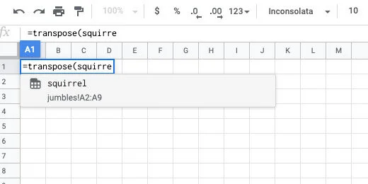
Finish typing squirrel. Finish it with a closing parenthesis. Press the Return key to see the result.
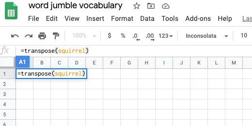
The jumbled word is placed in the row with each letter in a separate column.
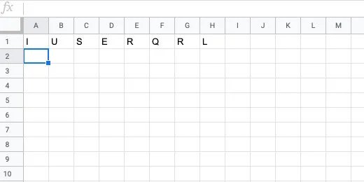
Skip two rows and type =transpose(monkey). The row below the jumbled letters is used by students to spell out the word.
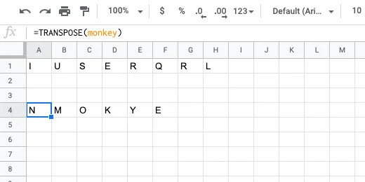
Repeat the process eight more times. Choose any set of words you like.
We need to prepare the table for transfer to a Google Doc. We need to number the word list. Click on cell A1. Click Insert and select Column left. Repeat the process one more time to insert two columns.
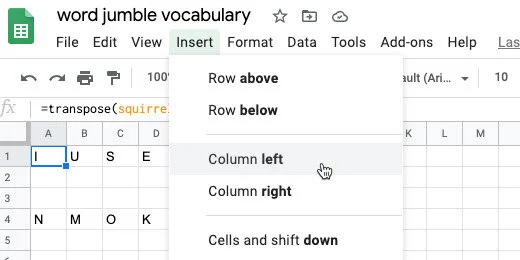
Number each word from 1 to 10.
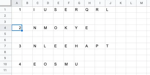
Google Doc preparation
In the next step, we are transferring the word jumbles to a Google Doc. This document will be distributed to students.
Open a new tab and create a new document. Here is an easy way to create a new document. Type docs.new.
Change the name of the document. Name it Mammals word jumble number 1. I am assuming you will be creating additional word jumble puzzles.
Return to the Google Sheets tab. Select all the word jumbles. Click Edit and select Copy.

Go to the Google Docs tab. Press the Return key three times. This space will be used for our title and instructions later.
Paste the contents. A paste format option appears. Choose the option to paste the contents unlinked.

We need to format the contents before it is ready to distribute.
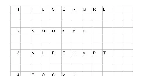
Select all the table cells.

Select a font for the word jumbles. I like Nunito normal. Change the font size to 14 points. Center align the text.

Right-click over the table to get the contextual menu. Select the Table properties option.

Set the table border at 1 point. Select middle for the vertical cell alignment. Click the OK button.

Deselect the table cells. Drag the left border of the first letter toward the numbers column. Move it as far as it will go.
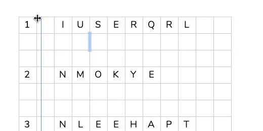
Highlight all the cells in the first row beginning with the first cell with a letter.
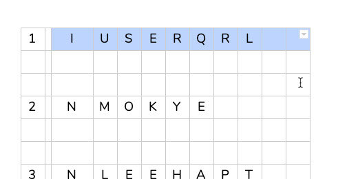
Go to the menu and click Format. Go to the Table option. Select the option to Distribute columns.
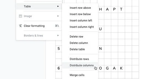
Select all the cells in the table again. Right-click and go to the Table properties option. Change the border width to 0 points. Click the OK button.

Select the cells with the letters for the first word. Include the cells in the row below each letter.
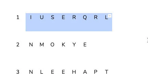
Click the border selector. Choose the all borders option. It is the first tile on the top left.
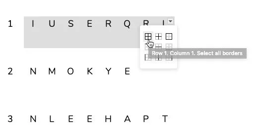
Go to the button bar. Click the border thickness selector. Choose the 1 point option.
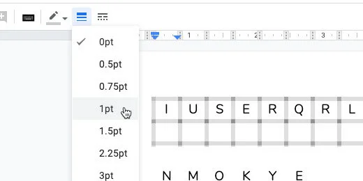
Repeat the process with the next word. Place the border around the word only. Repeat this process with all the words.

The last word does not have a row below. We need to add a row for the students to unscramble the word.
Click inside one of the cells in the last row. Go to the menu and click Format. Go to the Table option. Click Insert row below.
The last two word goes off the first page and into the next. My document has the default margins of 1-inch all the way around.

Go to the menu and click File. Go to the page setup option. Change the paper size to Legal. Click the Ok button.

Return to the top of the page. Provide an assignment title. Include some instructions.

Use the Title paragraph style for the title.
This is the basic word jumble. There are modifications we can make to the assignment if we need to provide differentiation. This is useful for struggling learners or second language learners.
Modifications
Word clues
On the second page, I often include a small table with the words. The words are not in the same order as the jumbled versions.
Go to the bottom of the page. In the menu, click Insert and go to the Break option. Insert a Section break. Use the next page option.

Type Word Clues at the top of the page. Use the Heading 1 style for the title.
To create the table, go the menu and click Insert. Go to the Table option and select a 5 by 2 table.
Type the vocabulary words in each cell. Place them in random locations. Center align the words in the table.

Sentence clues
Another modification option is sentence clues. The sentences provide context clues. The sentences can serve as definitions for the word.

Document outline
Using paragraph styles facilitates the use of the outline feature. Click the Outline icon.
Click one of the heading titles to jump to that section. This provides a way to quickly jump from one section to the next.

Student option
I like to include one more option for students. Select the cells below the word jumble.
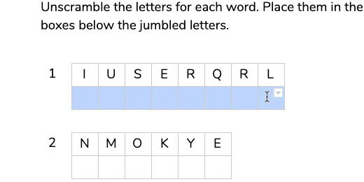
Use the font color picker. Select a dark color. I’ll select blue. Repeat this for each set of cells below the word jumbles.

How it works
The puzzle is easy to use. Students type the letters into each cell in the correct order to unscramble the words. Being in the first cell. Type the first letter. Press the Tab key to go to the next cell. Type the next letter and repeat the process.
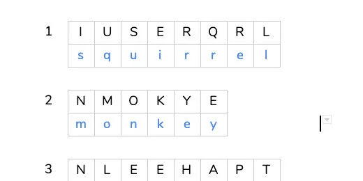
No tiles
You might not like the idea of entering letters into each tile or cell. You can merge the cells into one.
Select the cells in the answer row. Go to the menu and select Format. Go to the Table option. Select Merge cells.

The words will be entered normally.
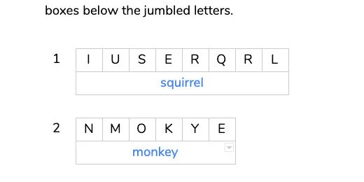
The choice is yours.
This is the student master. Use it to create versions with a word list or sentence clues. Erase any answers from this version.
Teacher master
We need to create a teacher master. This master contains the answer key. It is also the version to be used when reviewing the solution with students. This makes it ideal for guided practice or review.
Click File and select Make a copy.
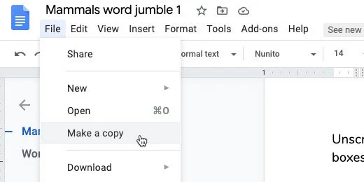
Update the name. Erase the words copy of. Append Teacher Master to the name. Click the OK button.
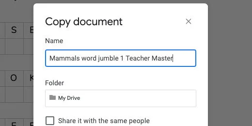
Click File and go to the Version History option. Select Name current version.

Type Original for the version name. Click Save.
Fill out the answers to the word jumbles. I like to use red to help the letters stand out. Format the answer key according to your preferences.

We are going to save this version with a version name too. Go to the menu and select File. Go to the Version history option. Select Name current version. Use "Answer key" for the version name.
Original and answer key
This is how you switch between the versions. Go back to the Version history option. Select See version history.
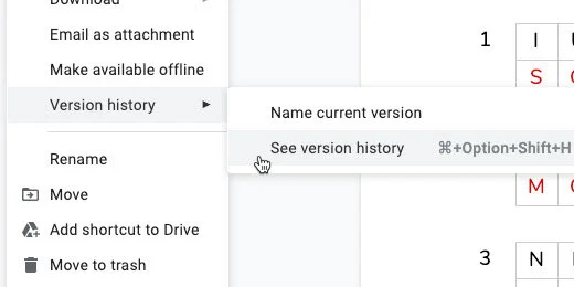
Enable the option to Only show named versions. You will see the versions we created.

Click the Original version name.

Click the Restore this version button. Click the Restore button when prompted to confirm.
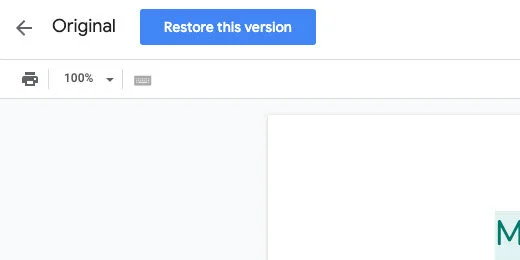
This version is saved and the document can be restored to this format at any time. Go ahead and solve the word jumbles on your own. Repeat the process above to restore the original version. Your changes will be removed and the document restored without any answers.
I like using this process when doing a guided practice with students.
Use the answer key to show students the answers. Use it to quickly check student work.
Normal Distribution Curve with Google Sheets
This lesson demonstrates how to use Google Sheets to create a normal distribution, Bell curve, chart. We use data from NOAA. We create a normal distribution chart for all the recorded earthquakes. Along the way we learn to use several statistical functions.

Introduction
A normal distribution curve is one of the more common tools used to analyze information. It is used to represent real values that appear at random. Most of the values tend to fall within the standard deviation.
Use the link below to get a copy of the completed project.
I want to go over some of the fundamentals before creating a normal distribution. These fundamentals are important in the creation of the normal distribution curve.
The curve is created from data represented as numbers. The data represents a population. It can also be a sampling of the population. The population can be anything. It doesn’t necessarily mean population like a count of people. A population is things like the number of scores on an assessment or the number of accidents on state highways. The data are usually large.
The data don’t have to include every occurrence. A representative same is often used. Representative samples are often used on surveys. This is done because not everyone can be interviewed for a survey. The best method is to get a sample of people to take a survey. This sample represents the population from one or more categories. Deciding on the sample data is difficult. We don’t have to do that here.
All collected data have some common characteristics. All data has a Mean, Median, and Mode. The Mean is the average of the numbers or data collected. The average falls in the middle of the numbers. The average is calculated by adding the numbers and dividing the total by the number count. Here is a simple example. We have five numbers. They are 1,2,3,4 and 5. The numbers total 15 when we add them. We divide 15 by the number count which is 5. The average or Mean is 3. We see that the number 3 is in the middle of 1,2,3,4 and 5.
Here is another example. A class of five students took a test. Their scores are 60,65,75,80,90 and 95. The total, when the scores are added is 465. Dividing 465 by 6, the number count gives an average of 77.5. The average doesn't have to be one of the values. The average of 77.5 does fall in the middle of the grades. Somewhere between 75 and 80.
The Median is the value that is exactly in the middle. This is different from the average. We don’t have to do any math to determine the Median. We do have to place the numbers in order from least to greatest.
Here is an example. We have exam scores of 60,70,75,80,85,85 and 90. The Median value is 80. Here is another way to figure it out. There are 7 scores. Add 1 to the number and divide by 2, 7+1 dividend by 2 is 4. The median number is the fourth number in the list.
The Mode is the number that appears most often. We have to place the numbers in order. Here is an example. We have weekly temperatures of 77,79,79,79,80,80 and 85. The Mode is 79 because it is the number that appears most in the list of values.
The range is another important concept. The range identifies the largest value and the smallest value. The Range is the difference between these numbers. The Range in the temperature example is 85 to 77, 77-85=8. The range in these values is 8.
The last concept is the Standard Deviation. The standard deviation is the distance of each value from the Mean. There are a few math steps required to determine the standard deviation. The math isn’t complex.
The first step is to subtract the mean from each value. The answer to each is squared. Add up all the squared values and divide by the count. Finally, we take the square root.
This provides the standard deviation. That is several steps. We don’t have to do all the math. Google sheets will determine the Standard Deviation with a function.
Gathering and formatting the data
The data for our distribution chart come from NOAA. I have used this data before. I like it because it is free and there is a lot of it. I also use it because students like to learn about earthquakes and volcanoes.
Use this lesson as part of a larger project. The link to the data is available below. It is the same data from previous lessons.
NOAA Earthquake database:
https://www.ngdc.noaa.gov/nndc/struts/form?t=101650&s=1&d=1
Google Spreadsheet data:
Query the data
The data we want is in the last column. This column represents the earthquake magnitudes. We will import this column of information into a separate sheet. The data we want is in column H.
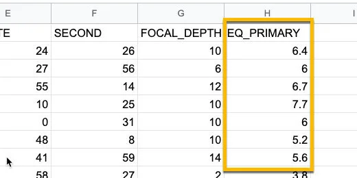
NOAA magnitude data
Click the Plus button next to the sheet name. Rename the new sheet Distribution curve.
Add a new sheet
Click on cell A1. Type =query(Sheet1!H2:H,”select *”,0).
This is a query function. It is used to import data from another sheet. This query imports data from Sheet1. The data we chose to import starts in cell H2. It goes all the way down to the end.
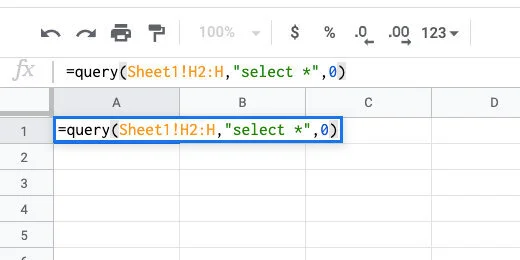
Query the data
Filter away empty values
I want to remove cells with empty values before creating the Named Range. Make sure cell A1 is selected. Click once after the asterisk. Use the formula bar.
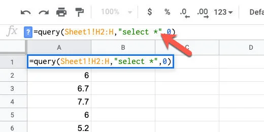
Append to the query
Add WHERE H is not null after the asterisk. This imports information in cells that are not empty. The not null part is referring to the not empty cells.
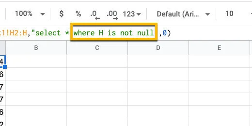
Filter away empty data
Sorting the data
Sorting the data is helpful when looking at the frequency distribution. Type ORDER by H asc after the word null. The content is arranged in ascending order.
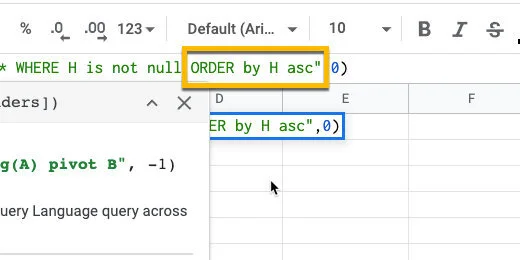
Sort the data in alphabetical order
The sorted data shows there are multiple occurrences of magnitudes. This will appear again when we use the Frequency function.
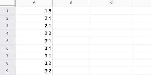
Repetition of magnitudes
Named Range
We are going to use this data several times. To make things easier, we are going to save the data in a Named Range. A Named Range allows us to call the same data with a word.
Click once on cell A1. We are going to select all the data to put into a data range. The easiest way to do this is to use a keyboard shortcut. Press and hold the Shift and Control keys. Keep holding these and press the down arrow once and let go.
Selected cells for Named Range
Click Data in the menu and select Named Ranges.
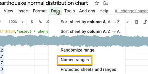
Named Range option
A Named Ranges panel opens on the right. Name the range ‘magnitudes’. Click the done button.
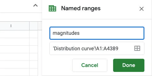
Named Range name set to magnitudes
Scroll back to the top of the sheet. Skip column B. In column C enter the labels for Mean, Median, Mode, and Standard Deviation.
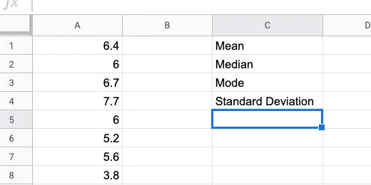
Titles for statistical data
Click in cell D1. Type =AVERAGE followed by an open parenthesis. Google Sheets does not have a function called MEAN. The average is the same as the Mean.
We supply the data range within the parenthesis. The data range is the beginning cell and the ending cell for the data. This is where we use the Named Range.
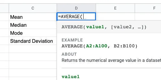
The AVERAGE function
Type magnitudes followed by closing parenthesis. The Named Range appears as a suggestion as we type the name.
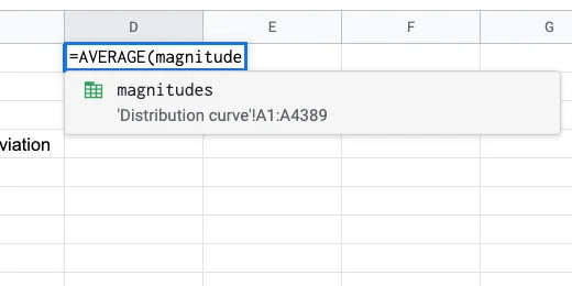
Magnitudes Named Range for AVERAGE parameter
Press the Return key to run the function. The average magnitude for all the recorded earthquakes in our data list is 6.459512417.
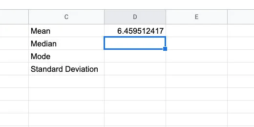
Calculated average
In cell D2, type =MEDIAN followed by an open parenthesis.

Median function
Type the Named Range followed by closing parenthesis.
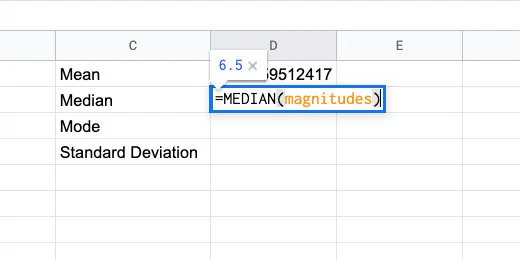
Median function with named range parameter
Type =Mode(magnitudes) in cell D3.
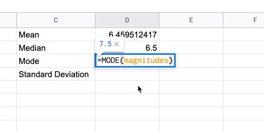
Mode function
Type =STDE in cell D4. There are several options for the Standard Deviation function. We want the standard deviation for our entire population. The function ends with the letter P.
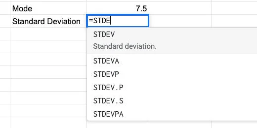
Standard Deviation function
There are two functions that end with the letter P. Use the STDEV.P function and supply the magnitudes Named Range in the parenthesis.
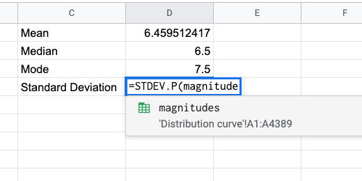
Standard Deviation for the population
These are the values you should see.
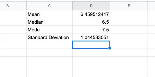
Calculated statistical values
There are two more pieces of information we need. Type Min in cell C5. Type Max in cell C6.
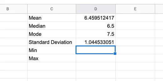
Min and Max titles
Type =MIN(magnitudes) in cell D5. Type =MAX(magnitudes) in cell D6. These numbers represent the smallest and largest earthquake magnitude numbers in our data.
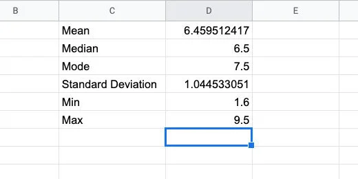
Minimum and maximum values
Skip column E. Type the heading Magnitude in cell F1. Type the numbers 1 through 10 down column F.
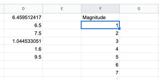
Magnitude data bin
Type Frequency in cell G1. Frequency is the count of how many times a value appears. This is like finding the mode. The Frequency function will count the number of occurrences for each magnitude.
Type =FREQUENCY(magnitudes,F2:F11) in cell G2. This counts the number of times a number between two magnitudes. The function takes the values in the data range and matches them to the classes. The classes in this example are the range of earthquake magnitudes.
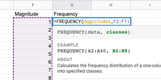
Frequency function
Frequency doesn’t count the exact number that matches the value in magnitude. This is how it works. For magnitude 1, there are no values from zero to 1. Between 1 and 2 there is one value. Between 2 and 3 there are three values. The largest frequency is between 6 and 7 with 1445 values.
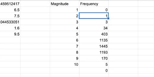
Frequency count for each magnitude in bin
The frequency numbers resemble the distribution curve.
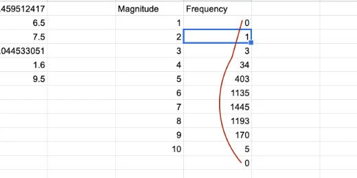
Frequency count resembles distribution curve
Let’s create a graph of this data to compare it with our normal distribution curve. Select the contents of both columns. Be careful not to select the zero at the bottom of the frequency column.
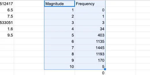
Selection of magnitude and frequency values
Click the Chart button.
Create chart button
This is looking very much like a normal distribution.
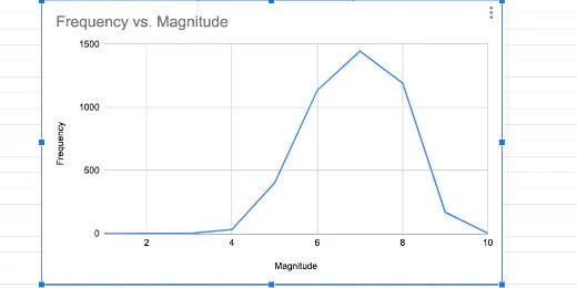
Histogram as line chart
Change the chart type to a column.
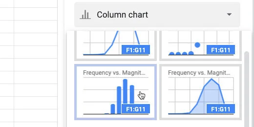
Select column chart option
This is known as a histogram.
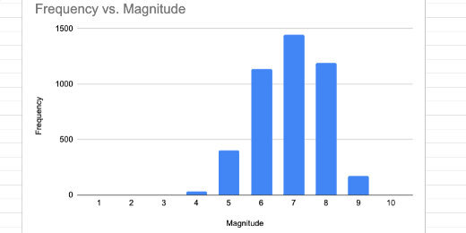
Histogram chart
We will return to this histogram later. For now, we will delete it. Click the actions menu on the chart. Select Delete chart.
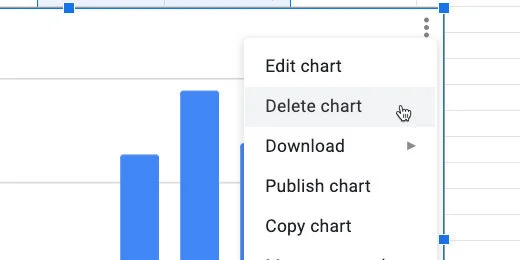
Delete chart
Normal Distribution
We are going to calculate the values for the normal distribution curve. The formula for calculating the normal distribution looks like the image below. We don’t have to go through all those calculations. Sheets have a function that does all the work.
Normal distribution function
Click on cell G1. Right-click on the cell. Select Insert Column.
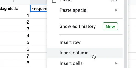
Insert a column
Title the new column Normal Distribution. Type =NORMDIST in cell G2 followed by an open parenthesis.
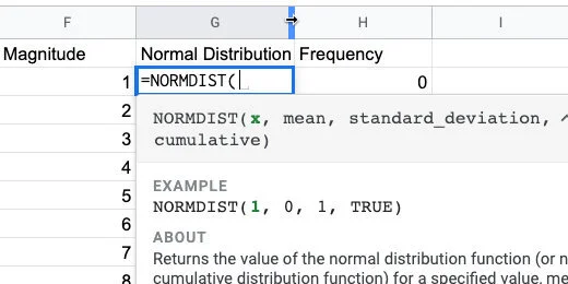
Normal distribution function and parameters
Type F2 after the opening parenthesis. This is the input for the normal distribution function. In our example, that is the magnitude value.
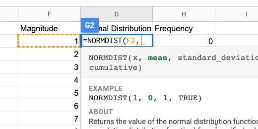
The first function parameter
The mean is in cell D1. We are going to copy this formula down the column when done. The reference to this cell needs to be locked in place. We are changing the cell reference to an absolute cell reference. All cell references are general references.
Type D1 and press the F4 function key on your keyboard. You might need to press the function button before pressing this key. It depends on how your keyboard is configured. The F4 function places dollar symbols before the letter and number.
If you can’t figure out the function key, type the dollar symbol before the letter and number. It needs to be $D$1.
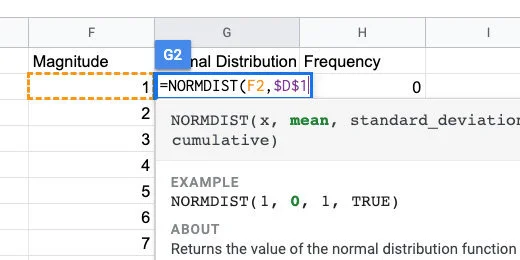
Mean parameter set as absolute cell reference
Type a comma followed by $D$4 for the standard deviation.
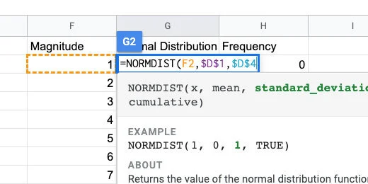
Standard deviation set as absolute cell reference
Type a comma followed by the word FALSE. We don’t need the distribution to be cumulative. Close the parenthesis and press the Return key.
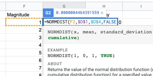
Normal distribution will not be cumulative
Clack on cell G2. Click the blue square and drag it down the column. Stop when you reach the last value for magnitude.
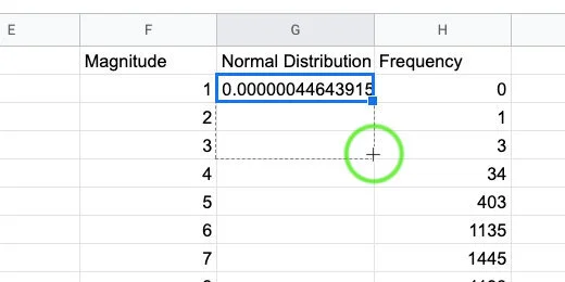
Copy the function down the column
We are ready to create a normal distribution chart.
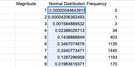
Normal distribution values
Select the contents of the Magnitude and normal distribution columns. Create a chart.
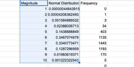
Selection for normal distribution chart
Select the smooth line chart option. We now have our normal distribution curve for the data. At this point, we are done. I would take it a little further.

Normal distribution curve
Compare normal distribution with histogram
Let’s compare the normal distribution with the frequency data. Click in the Data range field.
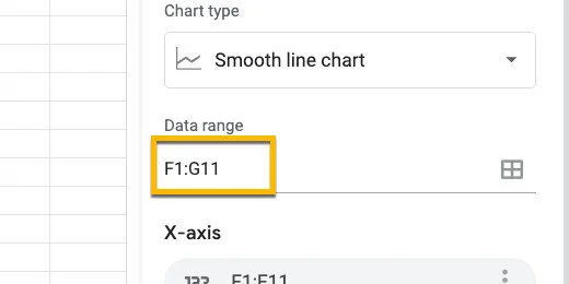
Chart data range
Erase G11 and replace it with H11.
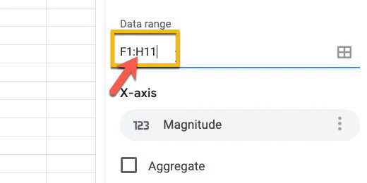
Update chart data range
Go over to the chart editor panel. Click the Add Series button.
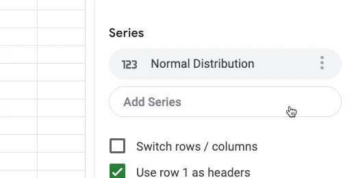
Add a series to the chart
Select Frequency
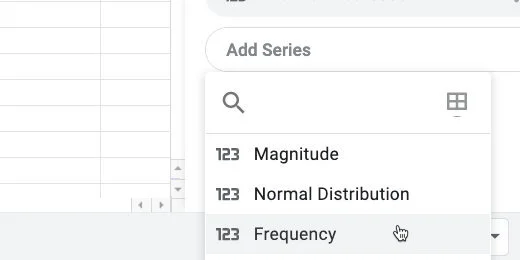
Select the frequency series
Click the chart type selector. Choose the Combo chart.
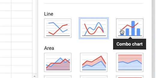
Change chart to combo chart type
Go to the Customize panel. Select the Series section.
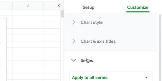
Series section in customize panel
Select the Normal Distribution series.
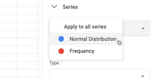
Select norma distribution series
Change the format from Column to Line.
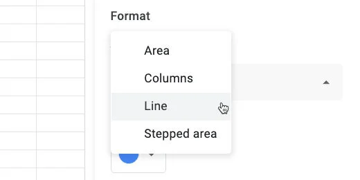
Set chart type to line
Select the Frequency series.
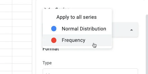
Change to frequency series
Change the chart type to columns.
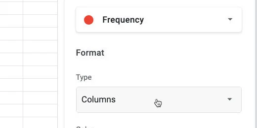
Change chart type to columns
Change the Axis position from Left to Right.
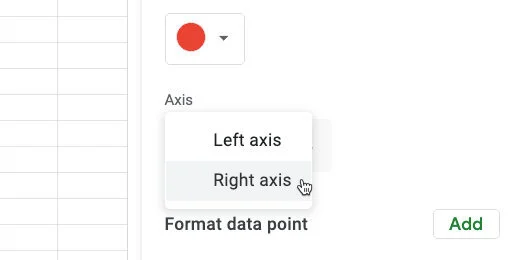
Change axis titles to the right
We see how the frequency distribution compares with the normal distribution. The frequency data is very close to the normal distribution. Some of the bars are outside the distribution curve. This is because we have a very small Bin sample.
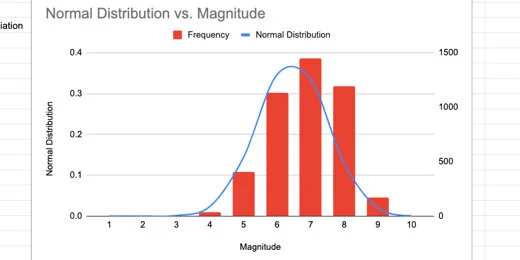
Normal distribution chart and histogram
Enlarging the Bin sample
We are going to increase the Magnitude values to see how that affects the relationship with the charts.
Move the chart off to one side. Click on cell F3.
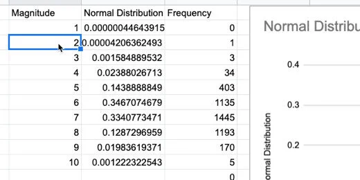
Return to magnitude values
Let's add more information by adding half values. This will include 1.5,2.5,3.5 and so on. Type =F2+.5 in the cell. This gets the value from the previous cell and adds 5.
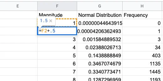
Increment each value by half
Use the blue square to copy the formula down the column. It will replace the values.
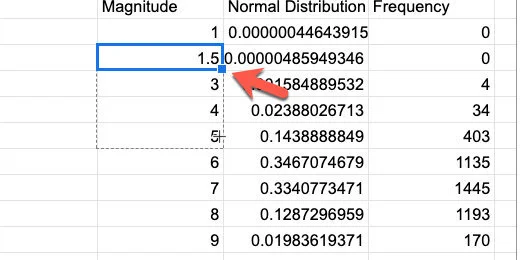
Copy the formula down the column
Keep copying the formula until the value reaches 10. I went down to row 20.
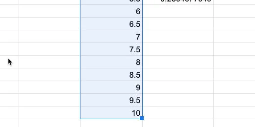
Magnitudes in increments of .5
Go to the normal distribution column. Select the last cell with the formula. Click and drag the blue square to copy the function. Copy it down to match up with the last Magnitude value.
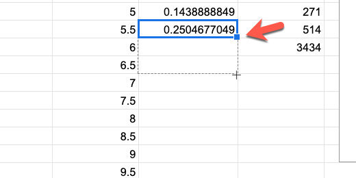
Copy the normal distribution function down the column
We need to update the Frequency values too.
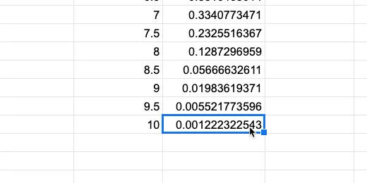
Match the normal distribution to the magnitude values
For the frequency values, we need to update the frequency function. Click on cell H2. Update the function using the formula bar.
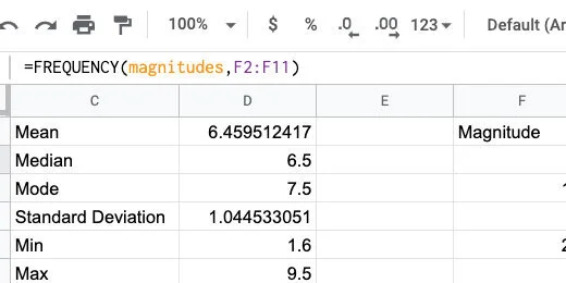
The frequency function in the formula bar
Update the F11 range to F20. Press the Return key.
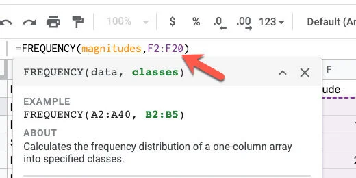
Update the range for the frequency function
We need to update the chart with our additions. Click the actions menu. select Edit chart.
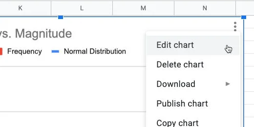
Edit the chart
Update the Data range from H11 to H20.
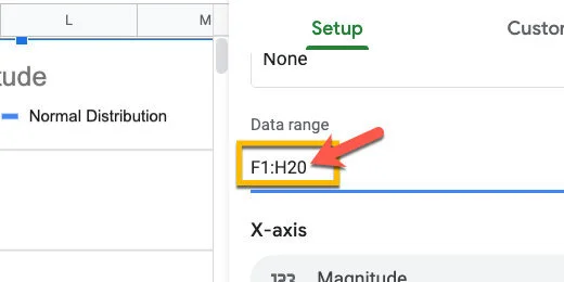
Update the range
More bars from our frequency are fitting within the normal distribution curve.
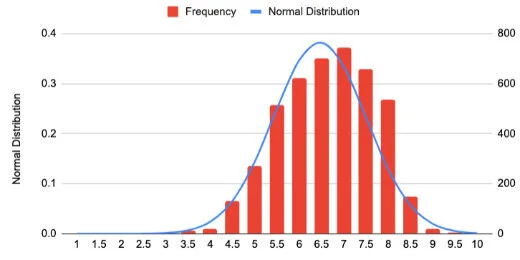
Chart with new values
I updated the values to get information for every quarter increase(.25). More frequency values are falling within the normal distribution curve.
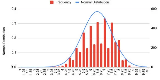
Chart comparison with .25 magnitude increments
Comparison Line Charts
In this lesson, we are going to create a chart that plots the data for two time periods. These periods range from 1998 to 2008 and 2009 to 2019. The chart is useful when making comparisons. We will be able to see twenty years of data and compare decades of earthquakes.

Comparison line charts with Google Sheets
Introduction
In a previous post, we learned to create a basic line chart. We used information from NOAA on recorded earthquakes. The graph charted the number of earthquakes that took place over a ten year period.
In this lesson, we are going to create a chart that plots the data for two time periods. These periods range from 1998 to 2008 and 2009 to 2019. We will be able to see twenty years of data and compare decades of earthquakes.
Comparison Line chart
The data for this lesson is available from NOAA. It is also available as a filtered version from my link. This is the data we will use to create the chart. You don't need to go to my first lesson on the line chart to follow along. I will go over everything from the beginning. Use the link to get a copy of the data.
NOAA Earthquake database:
https://www.ngdc.noaa.gov/nndc/struts/form?t=101650&s=1&d=1
Google Spreadsheet data:
Gathering the data
Create another sheet for the line chart. Click the add sheet button. The button looks like a plus sign. It is next to the sheet name.

Double click the sheet name. Change the name to "comparison line chart".

We are going to import the data we need for the chart. I know this is an extra step but it teaches you a few more skills. I love teachable moments. Click once on cell A1.
We are using a function called QUERY. This function imports data from other sheets. Functions and equations begin with an equal sign. Type an equal sign followed by the word QUERY.

The function needs parameters. These parameters are placed inside of the parenthesis. Type an opening parenthesis. Don't add a space between the word QUERY and the parenthesis.
Google Sheets provides useful information about the parameters. The first thing we need to do is point to the data we need to import.

The data is in the adjacent sheet. To point to this sheet we type the name of the sheet. Type Sheet1 followed by an exclamation mark. The exclamation mark is used to identify the name as the name of a sheet. The exclamation also serves as a separator between the sheet name and the data range.

We need the column that contains all the years for earthquakes. That is column A. The information begins with the first row and goes down for hundreds of rows. Type A1 and a colon. The colon is used to separate the first cell in the range from the last cell in the range. The last cell is hundreds of rows down. Instead of using the number for the last row, we can simply type the letter A after the colon. This instructs Sheets to get the data from cell A1 and go down the column to the last row with data.

We are done selecting the data. Type a comma to separate the parameter from the next. In the next parameter, we need to identify the information we want to import. Normally we would limit the import to specific data. I want to import everything and then filter it using different tools.
Type opening quotation marks followed by the word select and an asterisk. The asterisk is known as a wild card symbol. In this case, it is referring to everything. We are selecting everything in the column. Type closing quotation marks followed by a comma.

The third parameter identifies if the data includes headers. The header is the title at the top of the column. Type a number 1 to inform the function that the first cell has a title. Type closing parenthesis. Press the Enter key.

We are going to count the earthquake events every year. Skip a column and go over to cell C1. Type 1998 to 2008.

Go to cell C2. We are going to write the individual years. Begin with 1998 and enter a year in each cell down the column.

Go to cell D1 and type Quakes.

In the cells next to each year, we will count the number of quakes. Sheets will do this with another function. Type the equal sign followed by COUNTIF.

The COUNTIF function is used to count the number of occurrences. It will count something if it matches the criteria. The function needs two parameters. We need to tell it where the stuff to count is located. We need to tell it what to count. Type an opening parenthesis.

We need to pass in the range for the first parameter. The data we want to count is in column A. A Range needs a starting and ending value. Type A2:A for the Range. The Range begins at A2 because we don’t need to count the title. The ending Range is open so it includes the last row with data. Type a comma to separate the first parameter.

We want to search for the year. The year is in the adjacent column. In the parameter, we will point to this column. Type C2 and a closing parenthesis. Press the Return key.

We see that in 1998 there were 32 earthquakes.

We need to repeat this for the remaining years. We don’t have to manually enter all the functions. Google Sheets will help us. Click back onto cell D2. Click the little square in the lower right corner and drag it down. Stop when you reach the last year.

The number of earthquakes from 1998 to 2008 is ready. We are going to use the same process for the years 2009 to 2019.

Go to cell F1 and enter the title for 2009 to 2019. Enter the years down the column. Place the Quake title in cell G2.

In cell G2 type the function =COUNTIF(A2:A,F2). Copy the function to the corresponding cells.

Constructing the chart
We will begin with a simple line chart. Select the data set for the years 2009 to 2019.

Click the insert chart button.

Google should create a line chart.

The chart setup section shows the series that is being plotted. The series name is based on the title in the column. Click the Add series button.

The data for the years 1998 to 2008 is in column D. The data range is D1 to D12. Enter D1:D12 for the series Range. Click the OK button.

The data for both series is plotted. It’s difficult to understand the chart without more information. We will begin by changing the series names. Click in cell G1 and change the title to “2009 to 2019”. Change the title in D1 to “1998 to 2008”. Change the titles in cells C1 and F1 to Years.

The chart updates with the changes. That makes a little more sense.
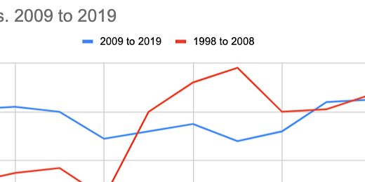
The titles along the horizontal axis show the labels for 2009 to 2019. The line for this data should stand out against the comparison line.

We are going to switch to another line chart format that treats each line as a separate graph. Click the chart selector. Choose the combo chart.

One of our lines is converted to a bar chart. No problem, we will change it back.

Switch to the Customize tab. Go to the series section. Select the series that is converted to a bar chart.

Change the format from Columns to Line.

Switch over to the 1998 to 2008 series.

Change the line color to a light blue. Change the line type to dash.

Switch to the 2009 to 2019 series. Change the line color to a dark blue.

Scroll down a little and click the Data labels option.
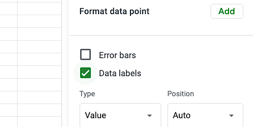
The chart is starting to come together.

Go to the Chart style section. Enable compare mode. Compare mode provides additional information when we hover over a data value.

Close the chart editor. Hover the mouse arrow over one of the data points. The comparison information is useful.

Edit the chart title. Change it to read Earthquake Comparison By Decade. The comparison chart is done.
Google Sheets Line Charts
A lesson I created a while ago on bar charts has gained lots of interest. I thought it would be a good idea to create a lesson for line charts. I like to bundle concepts in my lessons. So we are going to query and organize data before creating the line chart. The creation of line charts is easy. Gathering and organizing data is hard. The data for this lesson is from the National Oceanographic and Atmospheric Administration, NOAA. NOAA has interactive data for earthquakes, volcanoes, and weather. I have a link below to the site.

Introduction
A lesson I created a while ago on bar charts has gained lots of interest. I thought it would be a good idea to create a lesson for line charts.
I like to bundle concepts in my lessons. So we are going to query and organize data before creating the line chart. The creation of line charts is easy. Gathering and organizing data is hard. I find my students benefit from interacting with the data before the charting process. It gives them a better understanding of what the data represents.
The data for this lesson is from the National Oceanographic and Atmospheric Administration, NOAA. NOAA has interactive data for earthquakes, volcanoes, and weather. I have a link below to the site.
The data is available online through an interactive database. The data is also available for download. I downloaded the data for use in the chart. A link to the data is available on a Google Spreadsheet. The link is available below.
The sheet for this lesson does not contain all the data in the database. We only need part of the data for the lesson.
Use the link to get a copy of the data.
NOAA Earthquake database:
https://www.ngdc.noaa.gov/nndc/struts/form?t=101650&s=1&d=1
Google Spreadsheet data:
Gathering the data
Data is gathered in a variety of ways and there is often lots of it. This data needs to be filtered. NOAA has data going back hundreds of years. We only need a fraction of that data for this chart.
I like to work on a separate sheet from the original data. It is always a good idea to leave the sheet with the original data alone.
The earthquake datasheet contains date and time information for each earthquake. It also contains information for the depth and magnitude of each quake.

Create a new sheet by clicking the plus button. The button is at the bottom of the spreadsheet to the left of the current sheet.

The new sheet is added to the right of the existing sheet.

Double click the sheet name. The name will be highlighted. Change the name to Line Chart.

Each rectangle in the spreadsheet is called a cell. Cells are arranged in columns and rows. Each cell is referenced by the intersection of each column and row. The first cell is cell A1. Click once on cell A1.

This line chart to graph the occurrence of earthquakes over the last ten years. This is from 2009 to 2019. We only need the year of each earthquake.
We are going to query the data from the first sheet. A query is a function in spreadsheets. A function is a set of instructions. In the query, we need to provide some instructions. We need to provide the location of the data and the data we need. Functions begin with an equal sign. Type and equal sign in cell A1. Type the word query after the equal sign.
Google sheets are helpful. Information about the function appears.

The function needs to know where to get the information. The information is called a parameter. Parameters are placed within parenthesis. Type an open parenthesis after the word query.
Google sheets is providing more help. It is identifying the parameters we need in the function. It is also providing an example.

The data we want is in the sheet Earthquake data. Type a single quote and type the name of the sheet. The name must be exact. The name of the sheet begins with a capital letter. We need to include a capital letter. Type a closing single quote after the sheet name.

Type an exclamation mark. The exclamation mark identifies the name as a sheet.

The data range is from column A to column H. The data extends for over 6,000 rows. A range is a starting cell and an ending cell. Type A1:H6176 after the exclamation mark. Type a comma. This finishes the selection of data that will be in our query.

We need to identify the information we want from the Earthquake datasheet. The date is in the first column. Type opening double-quotes. Type select followed by A. Type closing double quotation marks and a comma.

Type the number 1 followed by closing parenthesis. The number informs the query that the first row has headings. Press the Return key on your keyboard to run the query.
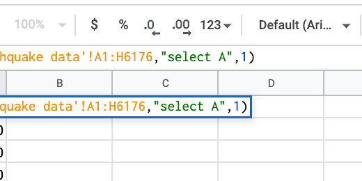
To create the line chart we need to count the number of times an earthquake was recorded each year. To do that, we are going to use another function.

Skip three columns and click on cell D1. We need headings for the data. Type Year in cell D1. Go over to cell E1 and type Earthquakes.

Go to cell D2 and type 2019. Type 2018 and 2017 in the two cells below that. We don’t have to type all the remaining years. Spreadsheets have a useful tool to help create repeating values.

Select the dates. A blue border surrounds the selected cells. In the lower right corner of the selection box is a tiny square.

Move the arrow over the square until the arrow changes to a plus. Click and drag the square down to row D12.

The spreadsheet will fill in the values down to 2009.

Click on cell E2. This cell will hold the number of times an earthquake was recorded in 2019. Type an equal sign followed by the function name COUNTIF. Type an opening parenthesis.
The function needs two parameters. It needs the range to look for values to count. Then it needs the criterion or things to count.

The data is in column A. Type A1:A for the range. Type a comma.

The criteria need an operator. There are several operators. We need an operator like equal to, greater than, or less than. We want an operator that looks for a specific year. We want to count all values that are equal to 2019. Type opening double-quotes. Type the equal sign followed by 2019 and closing quotation marks. Close the function with a closing parenthesis. Press the Return key.

There were 61 earthquakes in 2019.

This function needs to be copied to the other cells in the row. I want to rewrite the function to make it easier. Click back on cell E2.
The formula bar is above the column headings. The formula bar is used to edit formula cell contents. Place the cursor after the closing parenthesis.
The point of using computers and software is to make things easier. We don’t want to manually enter the date. We want the spreadsheet to do it for us. Erase the parenthesis and everything in the parenthesis. The year is in cell D2. Type D2. Press the Return key. We get the same count.

Select cell E2. Click the blue square in the corner and drag it down to row E12. This copies the function to each cell. The cell used to identify the count is updated as the function is copied to the cells. This is because of something called relative cell reference. The value looks at the contents of the cell to the left. It keeps doing this as the function is copied to each cell.

Now we have the data needed for the line chart.
Line Chart
We need to select the data to be used in the line chart. Select the cells from D1 to E12.

Go to the button bar and click the insert chart button.

Google Sheets the best chart for the data selected. We have our line chart. The Chart editor opens on the right. Use it to customize the line chart.

Google Sheets Bar charts with multiple groups
Bar graphs are great when working with multiple groups of data. They are helpful when looking for patterns. Groups of data provide opportunities to look at data from different perspectives.

Google Sheets bar charts
Bar graphs are great when working with multiple groups of data. They are helpful when looking for patterns. Groups of data provide opportunities to look at data from different perspectives.
The data for this chart is shared with you here. Click this link to get a copy and follow along. The second tab in the sample worksheet includes data from multiple campuses.
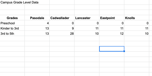
Select the headings and data then click the Insert chart button.
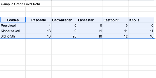
This bar chart includes more information. This chart includes a legend. The legend in this chart runs across the top. The data in the chart is grouped by campus. The bars for the data appear in the order that came from the table.
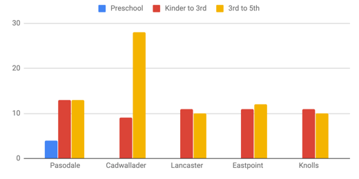
Google tried to help format the titles but they need some work. The horizontal title is missing and we need to change the title from Grades to something else. Change the title from Grades to Campus. Go to the Chart editor panel and change the font size to 16 points.

Click on the axis and titles selector. Choose the Vertical Axis title.

The vertical axis title is empty. Click once in the title field and type Teachers.

Change the font size to 16 points.
Change the title to “Teachers by Campus” and change the font size to 16 points. Change the text alignment to center align.

Showing the values on each bar would be helpful. Go to the Series section.

Scroll down a little and place a checkmark in the Data labels option.

The data labels work well with all the values except Preschool. Only one campus has preschool teachers. It throws off the values for the other campuses.
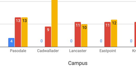
We can format each data series. Click on the series selector.

Select the Preschool series.

Go to the text color option. Change the value from Auto to white.

Changing the font color to white forces the color to change across all campuses. The value of zero is still there but we can’t see it because it matches the background color.

Data can be viewed from different perspectives. The data in our current graph is displaying values for each campus. We can also modify the view so we are looking at the values for each grade level. Switch to the Setup section in the Chart editor.

Scroll down and remove the checkmark from switch rows or columns.

The values are now grouped by grade levels. Switching the data grouping changed the formatting. Switching between data groupings causes this issue. The better option is to create two separate charts of the same data. Place a checkmark back on the switch rows or columns box.

Click once on the chart and click the actions menu. Select Copy chart. The chart is placed in the computer’s memory. Click Edit in the menu and select Paste.

The copy is pasted above the original. Click once on the pasted copy and go to the setup section. Change the switch row or columns box.

This takes us back to the version that needs formatting.

There are some bars without values. Let’s take care of them first. Go to the series section in the customize panel.

Place a checkmark in the Data labels box.
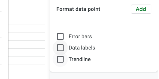
We need to fix the values in Preschool. We can fix this in one of two ways. Let’s take a look at the easiest way first.
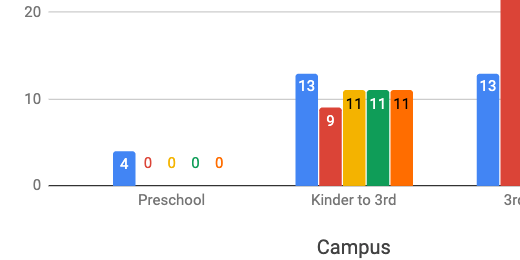
Click the Text color selector and choose white.
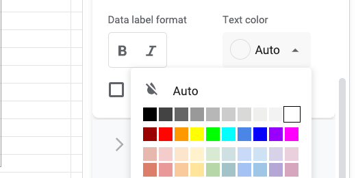
This works well when the bars are bright colors and the background is white. There is another option that allows us to target our customization. Place the text color back to Auto.

Find the Format data point option and click the Add button.

A data point selector dialogue opens.

Select a campus and the preschool that has a zero value. Click the OK button. Select white from the data color option.

Click the Add button again. Choose the next campus that has zero for the Preschool value. Change the data point color to white.
This option includes several steps but it does offer the flexibility to provide greater customization of text colors. Change the title of the slide to Teachers by Grade Level.
Bar Graphs in Google Sheets
Bar graphs are used to compare groups of information. Bar graphs compare groups of data at one point in time or across time. In this lesson, we will create a basic bar chart using Google Sheets.

Bar Graphs
Bar graphs are used to compare groups of information. Bar graphs compare groups of data at one point in time or across time. In this lesson we will create a basic bar chart using Google Sheets.
The dat for our graph compares the number of teachers in each grade level per campus. This graph will be a snapshot in a survey. It will be used for comparison with future surveys.
The data for this chart is shared with you here. Click this link to get a copy and follow along. You can skip over the next few instructions if you are using the link to the copied data.
Create a new Google Sheet. There are a couple of ways to do this. Click the Apps launcher and select Sheets. Another way is to open Google drive at https://drive.google.com and click the New button. Select Google Sheets from the list of applications.
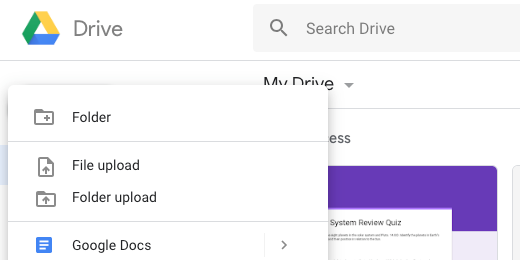
Create a new Google Sheet
There are are a couple more ways. Go to the Sheets portal. The portal is at https://sheets.google.com. Click the create blank sheet button. One more way is to type https://sheets.google.com/create in the address bar.

Create a blank Google Sheet
If you are using the link to the example data then you will be presented with a copy option. Click Make a copy to save a copy to your Google Drive account.

Make a copy of the chart data
Our graph doesn’t have much in the way of data. The point here is to understand the fundamentals and then apply them to other data later.

Chart table data
To create a chart we need to select data for the chart. The selection should include headings. The headings for our data include Grades and Teachers. Click and drag to select the eight cells.

Select data for chart
There are a couple of ways to access the chart tools. We can click Insert in the menu and select Chart. I prefer to use the chart tool button in the button bar.

Select chart button in button bar
Google Sheets Charts will try to guess the type of graph you want to create with the data. The data we selected has one column of numbers. One column of numbers usually represent a circle graph. This is why we have a circle graph representing our data.
A circle graph is not the same as a bar graph. Circle graphs are used to represent the values from one group as a whole. Circle graphs are not typically used for multiple groups.

Basic pie chart
The Chart Editor panel opens on the right side of the sheet. The chart type selected is shown as a Pie chart. Click the Chart type selector.

Chart setup and chart selector
Google Sheets will take a second look at your data and recommend a bar chart. Click the column chart option.

Suggested charts from Google
The graph is a better representation of our data. The bar graph is very nice. Google Sheets has done a lot of work for us. It has created a colorful graph with a title and labels. We’ll take it from here and put our own spin on the graph.

Bar chart
Click once on the chart. Hash lines appear in the title area. They also appear in the axis sections. These hash lines mean we can edit the information.
I will use the words chart and graph to represent the same concept. Some prefer to use the term chart. Others prefer the term graph. I hope this isn’t confusing.

Hash marks around chart
Click the chart title. The hash lines will disappear and the title will be highlighted. Change the title to read Teachers per Grade Level.

Update chart title
The panel on the right changes based on what we have selected. The available options are displayed to help format the title text.

Chart title text
All the options are selected for us. Change any of them by clicking the selector.

Chart title font options
Click the Title format alignment option and choose Center Align.

Center justify the title
Click the Bold button.

Select the bold text option
There is a title to the left of the chart and below the chart. These are referred to as the x and y-axis labels. Click Teachers on the y-axis.
Google refers to the x and y-axis as vertical and horizontal. I use the terms x-axis and y-axis in class to reinforce math concepts.

Data headings
The formatting panel updates so we have the tools needed to format the title.

Vertical axis title
Click on the Title font size selector. Change the font size to 18 points. Fonts are measured in points.

Font size selector
Click the color selector and choose dark green 1.

Font color selector
Repeat the process for the title at the bottom.

Updated axis titles
Click once on the bar graph itself. Resize handles should appear around the graph.

Corner resize handle
Click on the bar for Preschool. It will turn a darker shade when selected.

Selected bar in chart
Change the bar color using the color picker. I chose a dark purple color for mine. Choose the color you prefer.

Change bar color using color picker
All the bar colors change to match. All the bar colors are the same because they are part of the same group.

Chart with new color selection
In the same series panel, we have an option to display the data labels. Place a checkmark on this option.

Data labels option
The values for each bar appear near the top of each.

Data labels in chart
Change the font size to 16 points and change the font decoration to bold.

Data label font and text options
Scroll to the top of the chart editor and select Chart style.
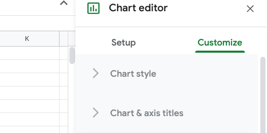
Chart editor customize section
Place a checkmark in the 3D option. This gives our chart a nice 3D look.
Chart 3D option
Those are the fundamentals.